


A couple weeks ago I came across an interesting tweet from Kim Thomas (@PPCkimpossible).
We’ve been trying to debate each other, but can’t b/c we agree. Who thinks users read ad copy (raise your hand)? @MaddieMarketer #ppcchat
— Kim Thomas (@PPCkimpossible) June 25, 2015
Working primarily with ecommerce accounts, I believe that the actual message of the text ad isn’t as important as the way the ad is presented. In other words, user attention gravitates toward ad features such as extensions, extended headlines (where description line one ends in a period and becomes part of the headline), and brand mentions, rather than the content. For example, let’s take a look at the ads we see for a search of “blue running shoes.”
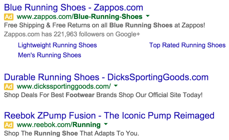
As I review these results, my immediate thoughts include:
- Recognition of popular brands (Zappos and Dick’s Sporting Goods)
- The first ad occupying more space than the other two
- The second and third ads having long headlines
- The messaging in the fourth ad speaking to the “Iconic Pump Reimaged”
Only one of these ads actually speaks to “blue running shoes.” Luckily for Zappos, their ad is also the most appealing so they would garner my click. But think about this concept. The ads for Dick’s Sporting Goods and Reebok also have appealing ads, even though they don’t speak directly to “blue running shoes.” In fact, if these ads utilized extensions I would be just as willing to click due to their ability to captivate my attention.
A core fundamental concept of PPC text ad writing is to include the targeted keyword in your ad. However, with all of the “add-on” features available for text ads, it’s now just as important to make your ad more prominent. It’s a case of quantity (larger, more eye-catching ad units) vs. quality (ads that speak directly to the search query regardless of size). To top it off, we haven’t even mentioned Shopping ads. Due to their visual nature, Shopping ads tend to get the first view, already putting text ads at a disadvantage.
So what is my conclusion based upon everything I’ve said? Are “good” text ads now more about filling the unit with as many shiny features as possible? I wouldn’t go that far, but I would argue that the traditional concept of writing text ads has changed. Though still necessary, utilizing targeted keywords and having a clear call to action aren’t as important as they once were. Having made this statement, proper ad group structure and the use of appropriate landing pages has never been more important.
Think about it. Much more effort is being put into the formatting of text ads rather the message. It’s great to have shiny ads that will boost CTR, but we know that the conversion is the more important metric. Take a look at the results for “white dress shirts for men.”
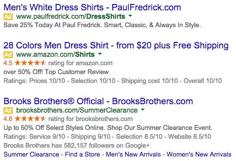
We see some pretty well-known brands here between Paul Fredrick, Amazon, and Brooks Brothers. We also see lots of shiny features between seller ratings, sitelinks, extended headlines and more. And the first ad also speaks to white dress shirts for men. The problem is that each landing page goes to a destination which doesn’t focus on white shirts (I checked). The pages present shirt options, but the white ones are either thrown into the larger selection of shirts or aren’t shown. Thus, CTR is probably good while conversion rate suffers.
You Can Have Your Cake And Eat It Too
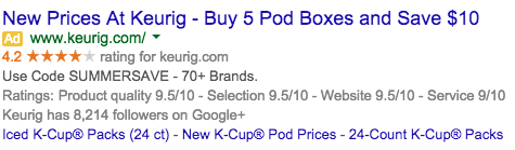
The solution is not rocket science and goes back to PPC fundamentals. Your ads can contain all the bells and whistles they want, but make sure their respective ad groups are structured correctly. That means if the user is searching for “donut shop k cups,” show that person an ad that speaks to donut shop k cups and an associated landing page that focuses on donut shop k cups. By all means, add all of the extra features to your ads. As long as the relevance from query to landing page is there, you have a win-win situation for both CTR and conversion rate.
As far as streamlining text ad formatting and ad extension creation, here are a few tips to follow.
Text Ad Taxonomy
Every ad group should have at least four ads. Two ads should be geared toward desktop users and two toward mobile. At least one ad for each device should have the opportunity to have an extended headline. If possible, try to utilize the specific keyword and/or offer as part of the extended headline in order to emphasize it that much more. In the example below, the offer is more pronounced as part of the headline.
Mobile ads should have no more than 60 characters between description lines one and two in order to avoid truncation. Also, with description line two sometimes getting cut off on mobile devices, at least one ad should have the call to action in description line one.
Finally, all display URLs should be written with proper casing. When the URL shows in its normal spot, it will always be lowercase throughout, but it can show in the headline as well. BestBuy.com looks better and fits with brand recognition better than bestbuy.com
Ad Extensions
At the very least, callout extensions and review extensions should be set at the account level while sitelinks can run at the campaign. If you want to go more granular that’s fine, but generally these levels will suffice. The seller ratings extension and Google+ followers will automatically be applied if criteria are met. Call, location, and app extensions are nice to have if relevant, but I consider them secondary.
Final Thoughts
Circling back to the original tweet from Kim, my answer is that users may skim the ad copy, but they don’t fully read it. Like many things in life, presentation tends to be more important than the actual content. That’s fine, but make sure you are consistent from search query to landing page in order get the best of both worlds.
