


I’m amazed at how many PPC account managers don’t know what happens after someone clicks an ad. Don’t get me wrong, I know there are scenarios when the goal is to drive as much cheap traffic to the website as possible. However, if you’re managing an account where conversions are the goal then understanding what happens post-click is vital to your PPC performance.
To better understand what happens post-click on my social media ads, I rely on the Social Users Flow Report in Google Analytics to find insights needed to make optimizations and recommendations.
What is the Google Analytics Social Users Flow report and when should you use it? Here’s what Google says:
“the Users Flow report compares volumes of traffic from different sources, letting you examine traffic patterns through your site, This report can show you how your various marketing channels are sending you traffic. You can see how that traffic is engaging with your content and look for especially overperforming or underperforming pages or paths.”
For this post, I analyzed the social user flow data for Treatsie. As one of our clients, they run Facebook ads to engage new customers with their monthly subscription box of artisan sweets. Thus, it’s very important for our team to understand what happens after the click.
Below are 4 reasons why you should be analyzing your User Flow report in Google Analytics.
1) Understand The Customer Path To Purchase
As an Account Manager, it’s key for me to understand the customer’s path to conversion when I’m being held responsible for that goal. Whether that conversion is a purchase or whitepaper download, knowing that path will help your campaigns.
Let’s say I’m wanting to analyze the purchase path for customers coming from Facebook. Navigate over to Acquisition -> Social -> User Flow in Google Analytics.
Click on Facebook and three options will pop up. Select “View only this segment” to only see User Flow that came from Facebook.

Start analyzing the landing pages and see what pages people are going to next. The default is 3 interactions (moving to the right), so click on the home button to scroll through the interactions.
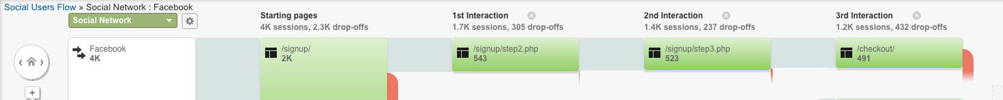
In this example, the traffic shows:
- 4k people came from Facebook,
- 2k landed on the signup page and around 73% dropped off
- 543 made it to Steps 2 of the signup process
- 523 visited to Step 3
- 491 finished the checkout process
So 491 of the 543 people (90%) who made it to Step 2 of the checkout process went on to purchase. However, 73% of the traffic dropped off of the 1st step. This shows me that we need to work on the Sign Up page because once someone makes it Step 2 they are very likely to convert.
TIP: To add more steps to the customer path click on the “Step” to see up to eight interactions.
2) Compare Across Social Channels
By default, when you land on the Social Users Flow report, your top traffic sources are ordered from top to bottom. It’s a quick and easy way to see the volume of traffic coming from each source.
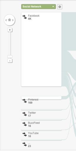
While this information can be accessed in several different places in Google Analytics, it’s really easy to see across various sources at a quick glance.
This time, select a source and “Highlight traffic through here” to see the customer path for the selected source.

By highlighting the traffic for Pinterest, I’m able to see all the different paths people took when navigating through the website. I can also hone in on specific interactions and see which sources lead people to that page.
From here we can start asking, what pages are people viewing and in what order? Are they different than other social sources? I can also add different segments to analyze mobile and desktop traffic because they don’t perform differently.
TIP: Refine your analysis with advanced segments to get more granular audience data. Keep in mind that flow reports support only session-based segments.
3) Evaluate Landing Pages For CRO
Which pages are working really? Where are people getting stuck? Where are they giving up and dropping off? These are great questions to ask when evaluating your Users Flow report.
In this situation, I was curious about people going to the signup page, but not going to Step 2. I wanted to know what their next page was.
In order to find this answer, I highlighted the traffic through the /signup/, and noticed at the bottom there were 48 more pages or paths people took. That’s a lot of different paths so I’m wondering if there’s any significant trends.

Therefore, I clicked on node to see the group details and found that 12% of traffic was going to the cart and another 10.8% were viewing the FAQ section.

While I’m encouraged by the percentage of people visiting their cart, it still shows that 1 in 11 needed more information before making a purchase.
With this information, we can now focus our CRO efforts on this signup page to help reduce the amount of people visiting the FAQ next.
TIP: Flow reports cannot display data for more than 100,000 sessions. Make sure to adjust your data ranges or segments to avoid the data being sampled.
4) Exporting Reports To Share
People are visual learners. Thus, when I’m creating client reports to share my findings, I try to make them visual to help convey the data.
One of my favorite features about this report is the ability to export it as a PDF. It makes all your analysis, insights, and hard work easily shareable with the people who need it most.
Once you get to a point where you’re ready to share your findings, click on the Export button on the top left and select PDF to the download the report. From here, you can share the flow chart with your client, boss or teammates.
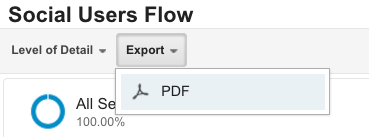
Another feature is the ability to jump right into the Google Analytics Social Users Flow directly from this PDF. In the top right corner of the report just click on “Go to this report” and it will open a tab showing your report. Now they can pick up right where you left off!
TIP: Create a different report for each segment you apply. That way you can easily compare and contrast audiences.
Final Thoughts
These are only four reasons why I like to use the Social Users Flow report. Why do you use the report? Have you ever used this report to analyze your social traffic? Let us know how you use it in the comments section!
