


From time to time, PPC Hero will publish a stellar post from an equally stellar author, and this is one of those times. This post was written by Oli Gardner, landing page expert and co-founder of Unbounce, one of our favorite optimization and testing tools for landing pages and CRO. Follow him at @OliGardner.
—
If you care about your conversion rates, you know that every marketing campaign needs a dedicated landing page.
This is especially true when it comes to PPC where you’re paying for every click.
Knowing that you should be using a landing page is one thing. Knowing *how* to design a great landing page another thing entirely, and it’s what separates average marketing from exceptional marketing.
In this post I’m going to show you a very different approach to landing page design. I’ll walk you through a process that I use to create conversion experiences which speak to your visitors in terms of *their* pain, and how your product or service can relieve that pain.
Here’s the skinny:
- Step 1: Set your campaign objective
- Step 2: Define the customer pain and pain relief
- Step 3: Write your campaign story
- Step 4: Design your form
- Step 5: Design the page around your form
- Step 6: Do the congruence test
- Step 7: Run through the Conversion Centered Design checklist
Bonus tip: Dynamic keywords for PPC
To make the process as actionable as possible, I’m going to create a fictitious company and we’ll create a real campaign for them.
Introducing SaaSProject.
SaaSProject is an online project management solution created specifically for Software as a Service (SaaS) businesses. Their value proposition is that they have designed their platform specifically for the online software industry – and it has features closely tied into how SaaS businesses operate.
(Don’t even think about starting this company for real without getting me involved!)
Let’s create a campaign for SaaSProject.
Step 1: Set your campaign objective
This is a crucial step in the design process. Far too often marketers build generic pages without really focusing in on what they’re trying to achieve.
The primary objective of this campaign will be to gather leads, by providing educational content about managing SaaS projects.
Most of the marketing SaaSProject does is content marketing, so a PDF ebook (guide) called ” The Quick Guide to Project Management for SaaS Businesses” is going to be written to give away in exchange for people’s data. This is a very common content marketing approach that you may also be considering for your own business.
A secondary objective is to get as many leads as possible to opt in to watch a product demo. There are 2 ways to achieve this goal, which comes down to where exactly you ask for the opt-in. I’ll explain both methods when we get to the page design.
Step 2: Define the customer pain and pain relief
The best products or services are created to address an observed pain in the marketplace. Writing down a pain statement helps you focus on your customer’s needs, and can make the definition of how your solution addresses this pain a simpler practice.
In the case of SaaSProject this can be described as follows:
The Pain
Project management software is often so complicated that team members don’t want to use it, or so simplistic that it’s not configurable enough to do what we want it to do.
The Pain Relief
SaaSProject was designed specifically with a SaaS business model in mind. It has role-specific functionality that speaks directly to developers, designers and marketers. Developers have detailed tech task specific to-do lists with full Github integration. Designers can upload a PSD which turns into a series of layer previews for stakeholders, and writers have copy commenting, versioning and approval modes. To cap it off, the project manager has a 10,000ft-view mode to easily manage the project at a glance.
You really want to start this company with me now don’t you?
What these two descriptions do is give you a balanced approach to telling your story. You can address your prospects in a way that they’ll understand, based on reflection of their most pressing concerns.
Step 3: Write your campaign story
Our next step in the process is to craft a compelling story that weaves together the pain and pain relief descriptions into a narrative that can be used as a guideline for the ebook and then your landing page.
How do you write a campaign story?
Using a story skeleton can make the writing process easier. A common plot structure is defined by the Freytag Pyramid, which we’ll use to create our base story, and then translate it into the anatomical parts of a landing page. The Freytag Pyramid breaks a narrative down into five stages:
- Exposition: Establish the setting and introduce a protagonist and her conflict
- Rising action: Build the tension associated with the conflict and introduce further obstacles
- Climax: The turning point where the situation starts to get better (or worse) for the protagonist
- Falling action: This is where the protagonist’s situation is starting to resolve and she is shown to be winning her battle
- Conclusion: The protagonist achieves her goal and resumes her normal life – now with the heightened experience of the benefits of her win
I bet you didn’t think you were going to be writing short stories when you opened this post. Just imagine how sophisticated you’ll sound at your next marketing meeting when you break out the Freytag!
Here’s an example campaign story for SaaSProject:
Once upon a time (couldn’t resist) there was a project manager in a company with an online product. She was responsible for delivering projects that involved multiple teams. She’d tried many project management software solutions, all of which worked “okay”, but almost always ended up creating more problems than they solved.
The software development team had almost entirely stopped using the system because it added an extra layer to their work and the sign-off points never really correlated to how they broke down their work. The design team was frustrated because when they uploaded comps, you couldn’t comment on them individually – which meant you’d need to do a single task for every page design. Meanwhile, the marketing copywriter was pulling his hair out because he needed to be able to upload content that could be edited rather than just a Word document attachment.
She did a search for “project management for teams” which turned up an ad for SaaSProject:
Project Management Software for SaaS Teams
sassproject.com
Get your team working together with features
created for developers, designers and writers.
A glimmering light shoots through the clouds as unicorns and rainbows dance across the sky… Too much?
Elaine clicks the ad which leads to a landing page describing the SaaSProject product. The feature list makes it sound like it would make her teams happy, but she needs to find a way to communicate how it will work to all of the department heads before she invests time in trying out the software.
The page she’s on has a form to request a demo, which is useful because she knows how complex some project management software can be. After filling out the form to request a demo, a confirmation dialogue appears that says:
“Thank you for requesting a demo. A member of our success team will be in touch within the next 3 hours. In the meantime, you might like to read our free guide to managing SaaS projects.”
The document she downloads is loaded with actionable tips that demonstrate how easy project management can be when dealing with multiple functional teams – when it’s done right. The content breaks it down by department, which makes it easy for Elaine to set up meetings with the department heads to discuss the solution.
After meeting with the dept. heads, everyone is engaged and excited about the potential for using the new product, and each agrees to sit in on the demo scheduled for the next day.
The demo goes great. Elaine and the team leads all agree to commit to using the software for 3 months with a check in at that time. During the first month, she receives multiple emails from employees on all teams, thanking Elaine for the great new workflow, many mentioning that they’ve recommended SaaSProject to their friends.
The end.
Having this story written down will help focus all of your campaign designs – and is a great way to communicate to others on your team.
Step 4: Design your form
It might seem a strange twist to move from Alice in Wonderland to talking about form fields, but a form is more than just a collection of requests for data.
You can create an entire landing page with only a form. If you do it right.
Now we have our story, it’s time to start translating it to a landing page. And to continue the somewhat unconventional approach we’ve followed thus far, we’re going to build the page from the inside out (as opposed to the more conventional top-down approach).
We do this by designing our form as if it’s the only thing we’re allowed to put on our page.
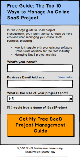
Your form consists of the following elements:
- A headline to introduce the reason for the form
- A description with bullets to highlight the benefit and contents of what you’re giving away upon completion
- The form with descriptive form fields (original label names and questions can capture attention)
- A Call-To-Action
- Trust statements or links
- A closing urgency or context-enhancement statement
Taking our story, I’ve broken it down into the 7 essential elements of a high-converting form, which you can see in the wireframe below:
In Step 1, I mentioned that there were *two* places where we could to ask people to register for the demo.
The decision of where you put it is based on the psychological concept of reward vs. reciprocity.
Reward
Give the demo in exchange for something. In this case, you would add a checkbox to the form, asking people if they would like a demo, prior to submitting the form. This is based on someone’s proclivity for giving permission for something prior to experiencing what you’re giving away.
Reciprocity
Reciprocity, on the other hand, works on the idea that people will be more inclined to do something for you *after* you’ve done something for them. In our example, the visitor has just been given a free guide, and we’re politely asking if they’d like to partake in something else.
Checking an opt-in box for the savvy online professional (which the SaaSProject target market is), implies that you’ll start receiving a bunch of email. This can applying extra friction to the form regardless of whether a visitor checks the box or not.
Responding to a post-conversion request is a very different proposition.
Which method should you choose? You’ll need to A/B test it and then compare conversion rates (for form completion) and opt-in rates.
Step 5: Design the page around your form
Now it’s time to go back to our campaign story and break it down into the anatomical elements of our landing page. The list below summarizes the main elements that will appear on your page, and I’ll do a quick run through each of them to create our page copy.
- Headline
- Subhead
- Introduction – pain
- Solution benefits – pain relief
- A hero shot that shows your giveaway
- Social proof – someone who has experienced the pain relief
- Your form as designed from the earlier part
- A closing statement that caps off the story and redirects them back to the form to convert
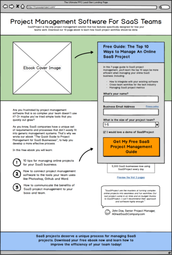
Headline
Remember that you need to match your landing page headline with the ad, so our headline will be:
“Project Management Software For SaaS Teams”
Subhead
The headline is what holds people’s attention because it matches the ad. The job of your subhead is to expand upon this and round out your value proposition. It is often good to make it match the 2nd and 3rd line of your ad copy, or say something closely related but slightly more in depth.
In this example, we need to remember that the goal of the page is to download an ebook, so we need to mention that here:
SaaSProject is the only project management solution that has features specifically designed for how your teams work. Download our 10-page ebook to learn how SaaS project workflow should be done.
Introduction
Now we get into the meat of the story and set up an association with your visitor’s pain point.
Are you frustrated by project management software that is so complex your team doesn’t use it? Or maybe you’ve tried simple tools that you quickly out grew?
As you know, SaaS companies have a unique set of requirements and processes that don’t easily fit into generic management systems. That’s why we wrote our ebook “The Quick Guide to Project Management for SaaS Businesses”, to help you develop a more effective process.
Benefits
Breaking some key points down into bullet points helps people scanning the page to easily see the benefits of your offering.
In this free ebook you will learn:
- 10 tips for managing online projects for your SaaS business.
- How to connect project management software to the tools your team uses like Photoshop, Github and Word.
- How to communicate the benefits of SaaS project management to your boss and team.
Hero Shot
This would be a large photo of the ebook cover.
Social Proof
A quote from an existing customer would be great here:
“SaaSProject are the masters at turning complex online projects into seamless and fun workflow. Our last project came in on time and on budget thanks to SaaSProject. I can’t recommend their approach and software highly enough.” – John Doe, Senior Project Manager, AGreatSaaSCompany.com
Form
We’ve already done this.
Closing Argument
This is a powerful statement that you end the page with.
SaaS projects deserve a unique process for managing SaaS projects. Download your free ebook now and learn how to improve the efficiency of your team today!
So there we have it. A full set of landing page content for our PPC lead gen campaign. Here’s a wireframe of how the page could look when built.
Step 6: Do the congruence test
What is congruence? Congruence is the principle of aligning every element on your page so there is one unified message. When something is incongruent, it’s fighting in opposition to the goal of your page. Think of it like a rowing team. If one team member turned around and started rowing in the other direction it would slow their progress and provide unwanted friction.
The congruence test is fun to do on your page. What I want you to do is this: write all of your page copy down in a single column so it can only be read in a linear manner. Replace any imagery or videos with a text description of what they are communicating.
Once you have this printed out, I want you to stand up, and pace round the room while reading it out loud. Reading out loud makes any incongruent words or phrases much more apparent, and walking serves to provide a level of interference or distraction that a visitor may have when they are looking at your page (at work, on the bus etc.).
If at any time, you read something that seems at odds with the goal of your page, or detracts from a smooth reading experience, it’s incongruent. You need to rewrite or remove these phrases.
There are certain incongruent words you want to avoid on your landing page. Examples include “spam” and “gimmicks”. The reason they are bad is that they make you think of negative connotations that you otherwise wouldn’t have been thinking about.
People often write expressions like “We will never spam you.” Right beneath their call-to-action, which is the absolute worst timing.
You don’t want to sow seeds of doubt at the point of conversion.
Step 7: Run through the Conversion Centered Design checklist
Now that you’ve got your landing page ready, it’s time to take a step back and look at it through the eyes of a Conversion Centered Designer. The goal here is in part to get a reality check in that your page isn’t actually ready yet, and then to apply a set of principles and design guidelines to your page to make sure it’s presenting itself in the best possible way when you unleash your PPC traffic on it.
Before we get to the checklist, here are a couple of important definitions:
Attention Ratio
Attention Ratio is the ratio of interactive elements (links) on your page, to the number of campaign conversions goals (which is always one).
On a typical homepage, there are approximately 40 links, so if you are driving campaign traffic from your PPC ad to your homepage, the Attention Ratio is 40:1. Meaning that your campaign goal is fighting for attention with 39 other links.
On a campaign specific landing page, there should only be a single call-to-action, giving an Attention Ratio of 1:1. This is the ideal scenario for campaign success.
Message Match
Message Match is the idea of matching the pre-click message to the post-click message on your landing page, with the goal of making people think they made a “good click”. When the copy in your headline matches your ad copy, the user experience is improved and the AdWords bot is also happier because there is a strong coupling between source and destination.
Design Match
Design Match is the same as Message Match but in relation to the visual design of the ad and landing page. This is appropriate for display ads or Facebook ads. When the design match is strong, you improve the experience for your visitors and they can very rapidly decide that they are in the right place.
Using the checklist:
Take a good cold hard look at your page, and objectively critique it against the following 20 questions.
As a general rule, you should say yes to any question that doesn’t apply to the scenario of use for your page (e.g. “Does your form have a…?” isn’t relevant if it’s a click-through landing page without a form).
When you’re done, anything you’ve answered “No” to is now on your “to-do list”. It’s a powerful technique for self-reflection (in a marketing sense), and I guarantee it will help your subsequent page designs.
The CCD Checklist
- Does your page have the 5 essential elements: Value proposition, hero shot, benefits, social proof and a Call-To-Action (CTA)?
- Is the Attention Ratio 1:1? You can check ‘yes’ if it’s 3:1 and the two extra links are a privacy policy link and a link to access a preview of your offering.
- Is your CTA green or red or orange or blue? Yes, that’s a sarcastic trick question. The real question is about contrast. Does your CTA have a unique and contrasting color to the rest of the page?
- Are you using directional cues to point at your CTA?
- Is your lead gen form encapsulated in a bounding box that separates it from the rest of the page?
- Read your headline and subhead out loud. Does it describe what you will get by participating in the page’s goal?
- Do you have some areas of page content broken down into bullets?
- Does your form have a headline that describes what you will get for filling it in?
- If there is a photo of a person, are they looking either directly at you or at the CTA?
- Do your social proof elements talk directly about what you are offering on the page?
- Is there lots of white space to provide clarity and an enjoyable reading experience?
- Is there a way of demonstrating a preview of your offering? (Not always applicable). Previews can include: ebook previews in the form of a short PDF, HTML chapter, slideshare embed, or demo video.
- Information hierarchy: Is your eye naturally drawn to the headline first when you look at the page?
- If you are doing PPC, does the headline closely match the copy in your ad headline?
- If you’re doing display or Facebook ads, is the image in the ad repeated on the landing page?
- Are zero negative words (e.g. spam, gimmicks) placed close to your CTA? (Even if they are written in a positive way). If you did the congruence test you’ll have already fixed this.
- Framing: if you are presenting numerical data on your page, it should be numbers for good news, and percentages if bad news.
- If you have a form, do you ask for a second conversion (tweet, follow, subscribe) on the confirmation page?
- If you have a form, do you have a privacy policy link either beside the email address form field or in the page footer?
- Do you split your value proposition over a headline and subhead?
How’d you do? Remember that you now have a to-do list, so get to it! Your conversion rates will thank you.
Bonus Tip: Dynamic Text Replacement
One of the questions I get asked most is “How many landing pages should I use for my AdWords campaigns?”
Here’s my canned response:
“Ideally you’d use one for every ad, but that can be really impractical when you have hundreds of ads. What I would suggest is to have one per ad group so that the message match is still strong and your workload is reduced.”
However, Unbounce just launched a new feature, and I’m mentioning it because it’s going to be a game changer for many PPC marketers. It’s called dynamic text replacement, and essentially what it does is to insert the keywords that you have in your ads directly into your page so there is a stronger correlation between ad and page – something called Conversion Coupling (Message and Design Match).
The stronger the coupling, the more likely your visitors are to understand that they’ve arrived in a place relevant to their search. This is when higher conversions happen. It’s also looks very good to the AdWords bot and has also been shown to lower your Cost Per Click (CPC).
You can learn more about how dynamic text replacement works here.
In summary
Okay, so you’ve learned a brand new process for landing page design. What now? You need to start by whipping out the Freytag Pyramid and applying it to your own business.
Storytelling is a key part in being a successful marketer in this age of branding, and if you can apply the lessons you learned today to your PPC landing pages you’ll be way ahead of your competition. As proof of that, go and click on some ads and see how horrible the experience is.
It’s your responsibility as a smart marketer to help create better marketing experiences.
If you have any questions or ideas about the process, please jump into the comments below.
p.s. As a PPC marketer, you should definitely check out “The Ultimate Guide to PPC Landing Pages”
