


In most PPC account management or analysis roles, a huge part of the job is looking at the data and turning it into something easily understood. Someone who isn’t a PPC expert should be able to get some key takeaways from reports. As you would imagine, charts and graphs are a large part of this reporting. Unfortunately, it’s easy to either include unnecessary metrics, unnecessary charts, or create confusing visualizations.
As an added bonus, nice visualizations can make it much easier for the account manager to find key takeaways and/or understand what’s happening in the account. A well-put together graph is much easier on the eyes than a spreadsheet full of raw data.
Below are five rules to guide you as you create graphs and charts for PPC data.
Rule #1: Make Sure Your Visualization Answers A Question
This could potentially be the most important part in the data visualization process. If your graph or chart doesn’t tell a story, what’s the point of creating or including in a report?
Ask yourself these 3 questions before beginning chart creation:
- What is the problem I’m trying to solve / what question am I answering?
- What’s the message I want to convey?
- What metrics do I need to include in order to answer the question?
The reader should easily be able to look at the graph and understand what the purpose is. If you have to explain in depth what the meaning is, you might have some work to do on the visualization itself.
Rule #2: Use The Right Method Of Visualization
Once you have a clear idea of what the purpose of your graph is, using the right type of graph is just as important.
As a general rule, line graphs are used to illustrate changes over time, while bar and pie charts are used to show categorical data.
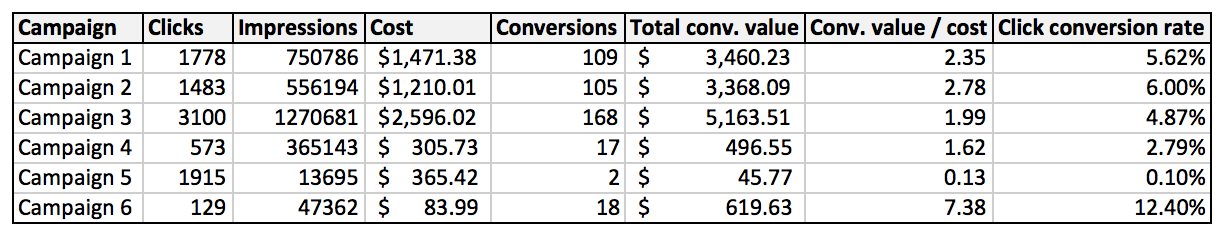
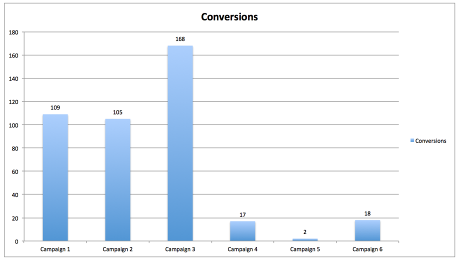
Let’s look at an example. Below I have campaign data broken out three different ways. Neither of them is incorrect, but they all have their purposes.

Rule #3: Make Your Graphs And Charts Readable
If you clutter your graphs with a bunch of unnecessary metrics, you’ll lose the impact and just make it harder to understand. Keep it clean, folks!
According to this article, there are four steps in the chart-making process:

Another thing I sometimes see in graphs is the use of hard to see color schemes. Make sure whatever colors you are using stand out from one another. Excel by default typically uses blue and red, but feel free to mix it up and use other colors.
I personally like adding data labels to my graphs, but you don’t have to if it makes it too cluttered.
Rule #4: Use The Right Data
This might seem like an obvious one, but make sure the data that you have pulled to create the graph is correct! As always, QA is a very important step in everything PPC.
For example, if you’re looking at the past six months worth of conversion data, it may not be important to include average position here. Instead, you might include metrics such as conversion rate, and cost per conversion. The key point is to make sure you’re using the metrics that make the most sense for the story you are telling.
Rule #5: Consider Your Audience
Take a minute to think about who will actually be looking at these graphs. What’s important to them? Do they prefer charts with a lot of information or a few simple graphs? For example, I worked with a client who prefers to have line graphs that span over a long period of time, with one for each campaign group. While I normally wouldn’t create them in this manner, it was important to the client, so I included it in the report.
Also, keep in mind the level of knowledge or understanding that your audience has. Don’t use a ton of PPC jargon or abbreviations if your audience doesn’t know what it means (or provide an explanation on the side).
Putting It All Together
Now that we’ve talked about things to consider when creating a graph or chart, the next part is to actually do it. I like to create the graph several different times, in different graph types and with different formatting. That way I can weigh my options and pick the one that makes the most sense and clearly represents the story I’m trying to tell.
