


You work hard all month to get your clients great paid search results. What’s the best way to help them understand – and appreciate – the performance you’re driving?
Whether you need a “hands-off” automated dashboard solution, or a curated, high-impact report, you can build it with Data Studio, Google’s data visualization platform. While Data Studio does not distinguish between “dashboards” and “reports,” you need to choose the format for how to build out and share your visualizations to best meet your client’s needs.
The Case for Client Dashboards
When most marketers think of Data Studio, they think of automated, “set it and forget it” client dashboards.
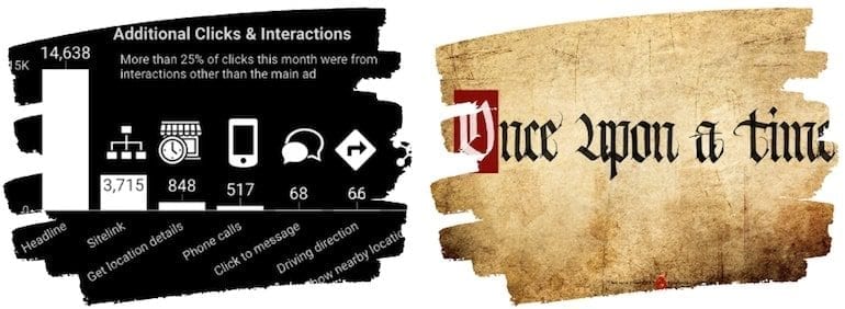
What’s included in a dashboard? There aren’t any specific constraints, but it tends to showcase high-level key performance indicators (KPIs) rather than more granular data (although it can easily contain both).
Users can typically customize dashboards, with built-in controls and filters for date ranges and dimensions.
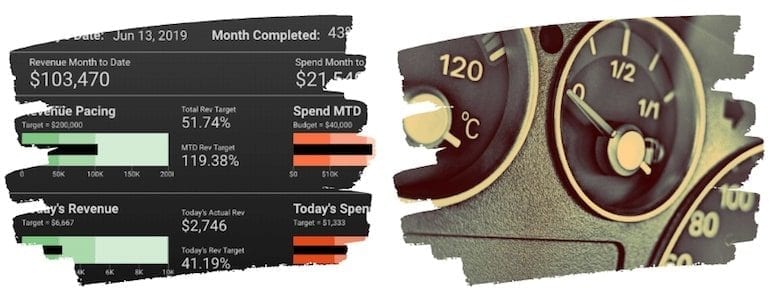
Finally, much like the instrument panel on a car dashboard, a marketing dashboard aims to tell you “what” is happening, while the diagnosis and “why” happen separately.
When and how to use dashboards
If your client needs easy, customizable, on-demand access to high-level performance metrics, a Data Studio dashboard can be a great deliverable.
Dashboards give your clients real-time performance data, so they aren’t waiting to find out how much budget was spent or how much revenue was generated. By including filters that allow your clients to compare and analyze data, they can engage in more ways than they could with a static, predefined report.
To create an effective dashboard, start by asking your client the most important questions they want answered. Once you know what to include, your goal is just to clearly and cleanly provide that information in a simple format.
How to share a Google Data Studio dashboard
When you share a Data Studio dashboard, you’re not just sharing the visualizations you created, you’re sharing access to the data source.
Because of this, Google gives you several options to control who can see that data, including whether they need to have their own data source credentials or they use yours (the owner’s).
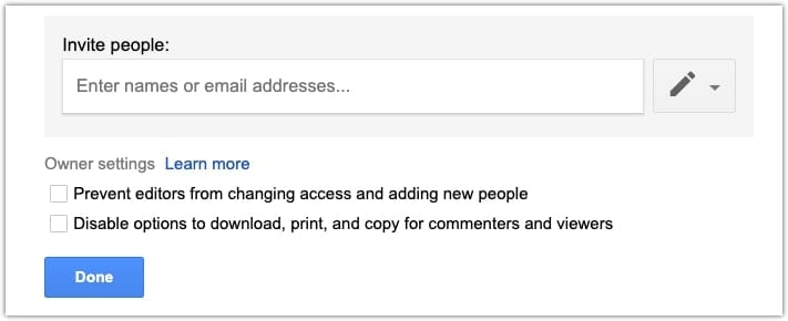
The simplest sharing option is to share a link to the report:
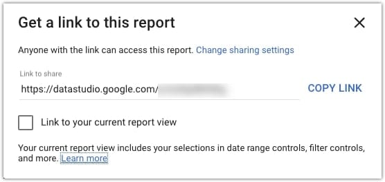
For more control, you can also provide specific people with access and set permissions for whether they can download or copy the report.
While evergreen, ongoing access to a dashboard is perfect for some clients, other scenarios demand more robust reporting.
The Case for Client Reports
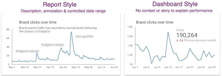
Unlike dashboards, reports typically cover a specific time period (often a month, but you can create weekly, quarterly or even yearly reports).
Reports have a beginning, middle, and end, and can be used to tell a story with context and narrative.
Reports usually include insights and analysis, and answer both the “what” and “why” (and often “what next.”)
The data that’s contained in a report might mirror what’s in a dashboard. However, because it is effectively a “snapshot,” the report can include explanations, deep dives, and additional visualizations to illustrate key concepts.
When and how to use reports
If your client wants context and insights along with performance, a curated report is a great option.
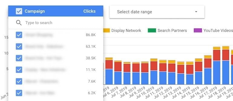
Here’s an example of a Data Studio time series chart that includes annotations of key events that impacted click traffic.
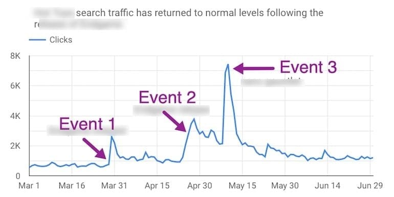
The same data in a dashboard format would not help the client understand the actual impact of these events.
Creating a report is similar to creating a dashboard, but you’ll usually add information such as an executive summary, recommendations or next steps. You can also add in-line details describing performance, opportunities or competitive threats as they occur.
How to share a Google Data Studio report
You have a few different options for formatting and delivering your Data Studio report.
You can share a link to a live Data Studio report as described in the “dashboard” section of this article. But unlike a dashboard, your report will include important analysis specific to the time period.
Since the analysis you provide will change over time, you should create new versions of your “live” report and/or archive past reports.
You can also simply send a PDF report to your clients. You lose some interactivity and dynamic visualizations, but reports shouldn’t require clients to hover and explore to find meaning in the data.
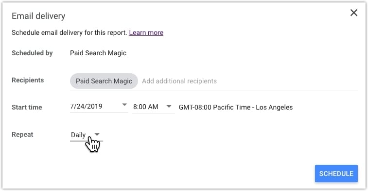
You can either save your report as a PDF to send to clients or schedule it so that it sends automatically. A scheduled report can be emailed daily, weekly, or monthly.
Decisions and Visualizations
Along with choosing the format and cadence of client reports, you’ll need to decide which visualizations to include.
How to decide which reporting format to use
Because fully-automated dashboards require little ongoing updates or maintenance, many marketers are drawn to their time-saving promise. While freeing up time is certainly enticing, it’s important to consider what your client actually needs before deciding which deliverable to provide.
Unfortunately, many clients feel overwhelmed by dashboards and are unlikely to benefit from them, if they look at them at all. In those cases, a report might be more appropriate. You may find that your clients need both: a dashboard for on-demand metrics, and curated reports for analysis and insights.
The best time to determine the right format is before you sign a client, when you’re first assessing their needs and can include the appropriate reporting solution(s) as part of your management services proposal.
If you’re switching an existing client’s reporting to Data Studio, consult with them to decide the best option for their needs. If what they need is more involved than your previous solution, this can be a good time to revisit your scope of work and pricing as well.
How to create impactful visualizations
Most marketing dashboards, templates, and reports don’t take full advantage of the power of data visualization. The bad news is that it’s hard to find great examples to model from. The good news is the low bar almost guarantees your work will stand apart.
Many charts and graphs are almost decorative, featuring metrics that don’t provide insights or inspire action. For instance, the first chart below compares clicks to CTR with a daily breakout. There’s not much for your client to learn.
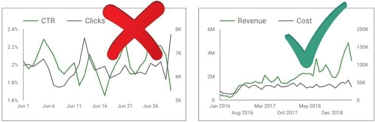
The second chart compares cost to revenue, providing a clear understanding of account performance over time.
Know the story you’re trying to tell before choosing a chart. Every chart you add should have an objective, with dimensions and metrics that support it.
How to enhance the focus of your visualization
Any story becomes confusing if there are too many characters, timelines, plotlines or other details. The story of your data is no different. Clarify key ideas by using preattentive attributes like color, form, size, and positioning.
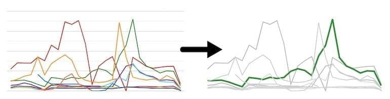
In a curated report, you can manually adjust preattentive attributes (like line weight or color) to draw your client’s attention to important elements. While you won’t be manually adjusting dashboard reports, you can still enhance formatting so that essential data is clear.
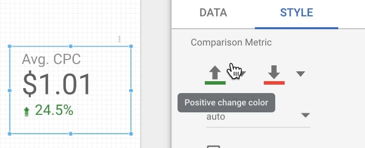
For instance, the default comparison metric colors are green for “up” and red for “down.” You can adjust the colors for metrics like CPC, so your client easily understands that lower click costs is a win (green!) rather than a (red) loss.
Whether you’re using dashboards or reports, spell out acronyms, define metrics, use headings and subheadings. Do everything you can to help your client understand the data.
Conclusion
The best client reporting solution is the one that helps your clients accomplish their goals. By building your dashboards and reports with Data Studio, you get the time-saving benefits of automated reporting and the flexibility and power to include context and details that educate your clients and support their business goals.
