


Figuring out the “why” behind account performance issues can be a very tricky proposition. At best, it’s a quick dive in to the change history and noticing that someone added 500,000 negative phrase match keywords. At worst, though? Well, the worst-case scenario is that there may not be an easy answer, and you’ll need to get creative to figure it out.
Recently, I was faced with such a scenario, so let me paint a picture for you:
- Conversion volume was up. Technically, this was a good thing.
- ROAS was down. As this is a lead generation account, that tends to be a bad thing.
- Spend was fairly steady, with the majority of funds going towards display with some search thrown in.
So with more conversions than ever, at a better Cost Per Conversion than ever, what could account for the change in overall ROAS? The change history provided no clues – the account had consistent maintenance, routine ad tests, and generally followed all our best practices. While it’s easy to point fingers at the poor salespeople trying to turn those leads in to sales given the state of the account, we’re definitely not blameless in this case.
So what’s going on?
For me, the first step in analyzing a problem like this is to take a look at where things were versus where they are- and then trying to figure out what’s changed. This shouldn’t come as a surprise to most of you, but I like to do this using Excel. I graphed out the campaign metrics by month for 18 months, going from January 2013 – June 2014, and you’ll find them below in the order I looked at them.
We’ll start with Impressions:
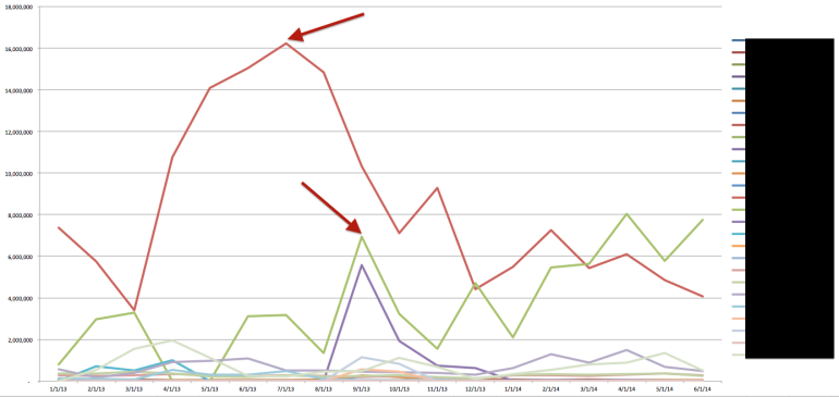
Immediately, our attention is drawn to the two high-Impression campaigns. The red line comes from a normal Display campaign making use of contextual keywords coupled with the conversion optimizer. The green line comes from a similar display campaign making use of the Display Campaign Optimizer. The reduction in impression volume for one is countered by the gradual rise of impression volume in the other. But does this relationship translate to other metrics?
(Hint: It does.)
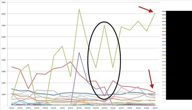
Here’s the click volume. Notice how for almost every spike in the DCO campaign, we see a corresponding drop in click volume in the regular Display campaign? Looking at the interface, the Display campaign is not limited by budget, and the Impression Share is fairly high (for display). Conversely, the DCO campaign is highly, highly limited by budget, and has been used as the primary controller on spend in this account.
Here’s the spend:
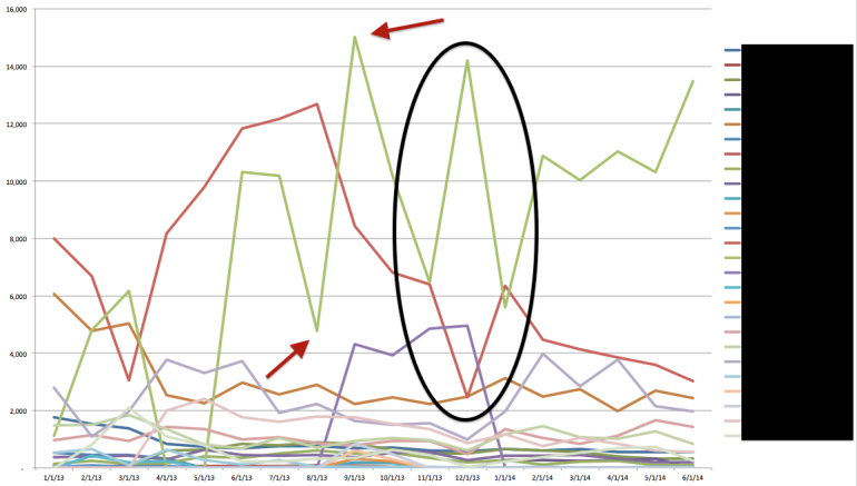
It’s a pretty obvious correlation at this point. By scaling that DCO campaign’s budget, it’s inadvertently cannibalizing the traffic of the regular Display campaign. That DCO campaign is entering in all the same auctions that the other campaign normally would, and in doing so is severely limiting the available impressions in the regular campaign.
This negatively impacts the overall account ROAS, as it’s been proven that those DCO leads are less likely to convert in to sales on the back end (Note: we do that with Excel, too). It’s just been taken at face value that the original Display campaign, with a much higher ROAS, was seemingly no longer capable of spending what it once had.
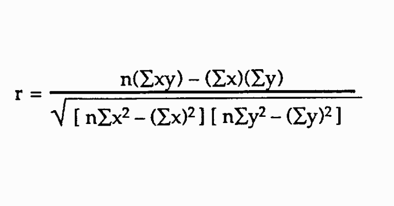
To be certain that I’m not just throwing out wild accusations, we *can* double-check this with a simple equation: the Pearson Product-Moment Correlation Coefficient. This correlation coefficient is a measure of the degree of linear relationship between two variables- variables like impression volume, click volume, and spend.
It looks like this:
So if we take the DCO campaign’s spend as X, and the Display campaign’s spend as Y…
I’m just messing with you. We can totally do this in Excel. It’s the PEARSON function.

Basically, line up your data points next to one another, and then use the PEARSON function to determine if there’s a statistical correlation between the two. Above, we have our campaign spend totals pitted against one another- using each line as a different array. The outcome of this function is on a scale from -1 to 1. That means:
- -1 = a perfect negative correlation. Where the increase in one variable is directly tied to the decrease in another variable… such as the spend in one campaign causing the spend in another to decrease.
- 0 = no correlation whatsoever. For instance, the weather outside versus the color of my socks would have no correlation whatsoever.
- 1 = a perfect positive correlation. Where the increase in one variable is directly tied to the increase in another variable, like an increase in campaign spend and impression volume.
For our above data set? We have a negative correlation of -0.36, indicating that the decrease in the spend of our regular Display campaign is loosely tied to the increase in spend of our DCO campaign. Obviously, this isn’t a perfect measurement (because I am definitely not a statistician). Campaign spend is something we can control, so there are a few confounding variables in this equation. However, looking at the account’s history, and understanding its current challenges… it fits.
The solution here is a little more tricky: the account is dependent on DCO spend to make it’s monthly budget. The real solution is a wholesale pause of that DCO campaign in order to kickstart the regular Display campaign, but a gradual tapering off should also do the trick.
What about you, PPC Heroes and Heroines? Any entry-level Statistics tricks you can share? Have you tried to do the Pearson equation by hand? Let us know in the comments and, as always, thanks for reading!
