


Do you cringe when someone says, “button color?” Do you automatically shut down when a test is recommended to you that seems like just a minor change? Today I want to encourage you to shift your mindset. What may seem like a “minor” change to you may bring $21,000 more in revenue to your company. Now it doesn’t seem so “minor,” does it?
You may hesitate testing something as simple as a color change. It could be because you don’t personally think a different color would have a significant impact. Maybe it’s because you haven’t had success with it in the past. Or is it possible you’ve just read too many negative blog posts about testing button color and you don’t want to waste your time?
I assure you, it’s not a waste of your time. Testing button color, or the color of any element on your page can be extremely rewarding—if it’s done correctly. What do I mean by this?
In the case of changing a button from red to green, let’s walk through some scenarios and determine if it’s the right or wrong way to go about testing.
- Are you testing green because you’ve read that green performs best? Wrong.
- Are you testing green because it looks better? Wrong.
- Are you testing green because your competitor is doing it? Wrong.
- Are you testing green because the main color on your site is red and it blends in? Right.
- Are you testing green because your existing color creates a negative emotion or scares users away? Right.
- Are you testing green because your existing color combination makes it difficult to read? Right.
Testing for the sake of testing likely won’t get you the results you want, but even minor or simple tests can be successful if you’ve done your research. Understanding your users’ want or need will help you test logically, therefore setting you up for success.
A Case Study
An e-commerce client sells high-end doors for homes, which naturally come with a high price tag. In addition, the more a customer chooses to customize their door, the more dollars they will spend. See the customization process as it appears on mobile and desktop devices when customers first visit these product pages:
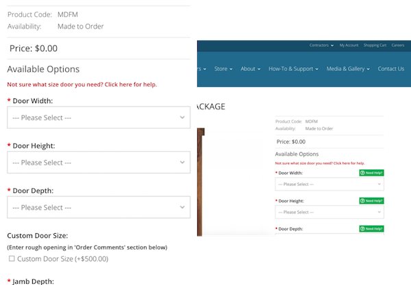
What we noticed as we began customizing a door, specifically on mobile devices, was a very scary price tag. We’ll call this the pricing calculator because it dynamically changes your price as you work your way through the customization process. Check out the mobile and desktop screenshots below to see for yourself.
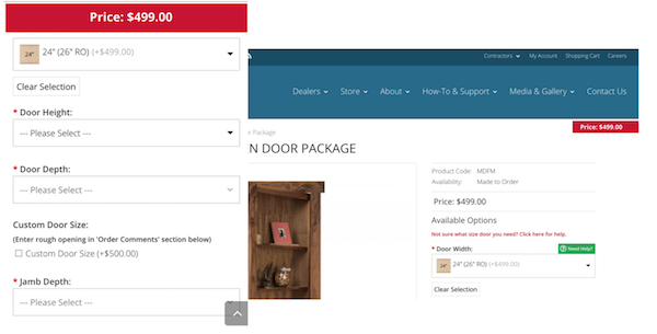
BOOM! $499.00 right out of the gate and there’s nowhere to go but up. Imagine continuing this customization process, creating a door that costs $1,000+, and having the price tag flashed in your face the entire time.
So, what’s the problem?
The color red.
In this instance, it wasn’t a problem that the price tag follows users during the customization process. In fact, this eliminates any questions users may have about how much they’ll end up spending. It all boils down to the color. Some might argue that the price tag should be, and currently is, contrasting from the rest of the branded colors. Therefore, we shouldn’t change it. However, red is said to represent violence, danger, and anger. It’s also said to increase heart rate and raise blood pressure. We don’t want this to be the experience users have as they’re trying to purchase a door. Instead, we want them to feel comfortable and secure doing so.
The Hypothesized Solution
The color blue.
The color blue is said to symbolize trust, loyalty, wisdom and confidence. It’s also said that blue produces a calming effect. This is what we want users to feel when they’re purchasing a door—especially a door that costs $1,000+.
We hypothesized that changing the pricing calculator to blue would increase overall revenue. Why? Because of the calming effect! We’re no longer going to scare users or create a sense of fear. Instead, they should feel calm and secure in their purchasing decisions. Does this make you feel more comfortable?

The Results
$21,135.27 more in revenue
16 more transactions
Over the course of two weeks, we saw phenomenal results from such a simple change.
- 46.06% increase in revenue
- 45.44% increase in revenue/visitor
- 29.17% increase in e-commerce conversion rate
- 10.29% increase in average order value
- -12.74% decrease in bounce rate
- 3.23% increase in average time on page
Final Thoughts
At the end of the day, it doesn’t matter that the rest of the site is blue; it doesn’t matter that it didn’t stand out from the rest of the site. Ultimately, what matters is that it does its job. The pricing calculator is supposed create a user experience with no surprises. It’s still there for reference during the entire process, but without causing fear in users, or putting pressure on their wallets. Instead, it now acts as a friendly reminder.
The next time you have a “minor” change you’d like to test, I hope you don’t push it aside because it’s too simple, or immediately shut it down. I encourage you to dive into the reasoning behind the test: what led to this test recommendation and what’s hypothesized to come from it? Don’t miss out on $21,000 in revenue because you feared the test was too simple.
