Learning how to use Pivot tables in your PPC reporting helps you find insights in a quick and easy manner. I create Pivot tables to look at how our campaigns are performing across different marketing platforms for brand, non-brand, and specific client goals. Let’s dive into how you can feel confident with your data and start pivoting your way into data analysis.
The Hurdle
The biggest hurdle in creating a pivot table and getting your data organized first so you can perform the magic that is the pivot table. By having a consistent naming convention across your campaigns in your accounts it helps you break down your data in a pinch. Brittany Sager has a great blog on “How To Create a Great PPC Campaign Structure” which stresses the importance of organizing your campaigns for performance but also for when someone is covering your account or to pull reports.
For this blog, my naming convention consists of Platform, Location, and Program. Example below:
Google_Nashville_Rad Tech
This campaign expresses what I need to know very quickly by showing me where the data came from, where my campaign physically targets, and what type of keywords are in the campaign. Now let’s jump to the fun stuff, playing around with the data and see what insights we can pull for this account.
The How-To
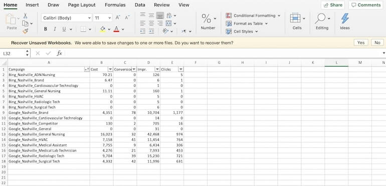
To begin, we are going to pull campaign level data in Google and in Bing and I only care about capturing these metrics at this time: Cost, Conversions, Impressions, and Clicks.

After I have pulled both reports for my preferred time frame, I combined my Google and Bing data making sure my columns for each platform match up.
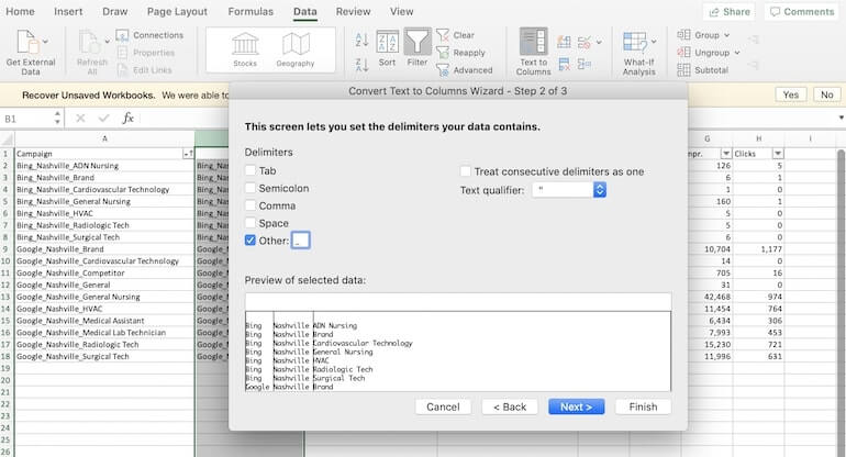
Now I am going to insert a few columns after the campaign column because I want my data to be more granular. Because my naming convention uses brackets I can use the Text to Column in excel to break my campaign name into new segments of data.
Series of steps below:
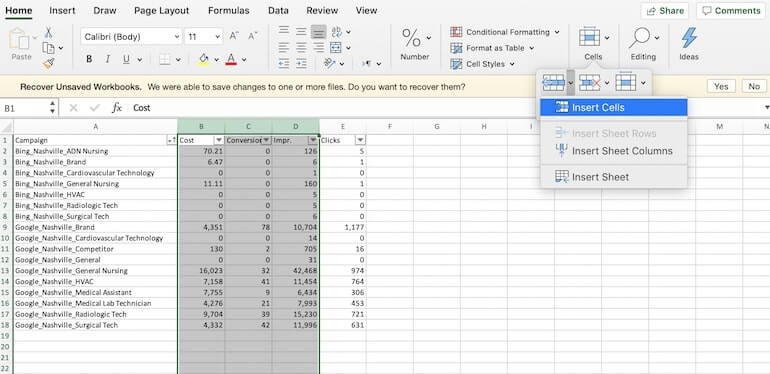
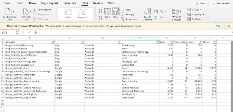
Make sure to add column headers for your new data segments so the Pivot Table will know what your data is and how to manipulate the information in your chart. In my data, I have used: Channel, Location, and Program.
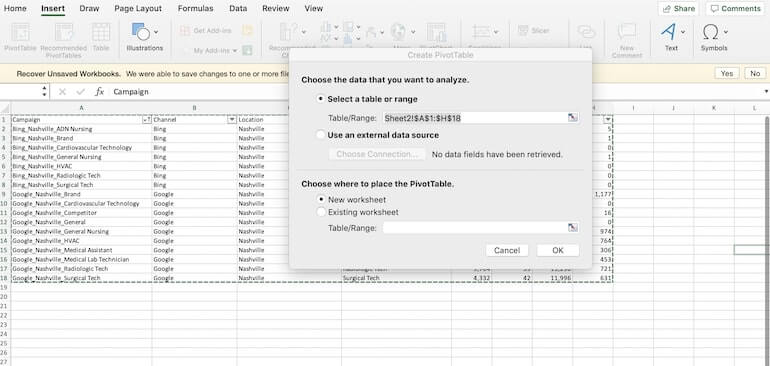
Now we can get to do the actual pivot! You select all of the data you want to use and go to the Insert tab in Excel and select Pivot Table. When you select this a window will pop up with your range and you select OK.
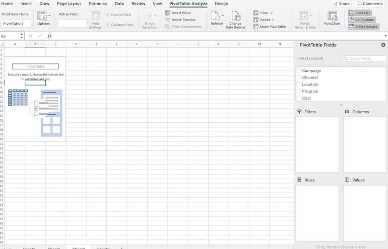
Once this happens a new worksheet will appear in Excel and the Pivot Table will be open with the Pivot Table Fields. It will be empty when you begin with, but once you select your fields, the data will pop up immediately.
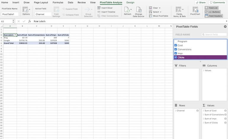
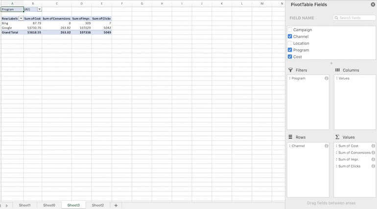
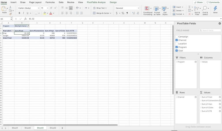
We will start off easy and look at how the channel overall is performing for cost, clicks, impressions, and conversions.
You will select the Channel name and it will move underneath the Rows section.

Now select the metrics we want to see and those will go underneath the values section of the Pivot Table Field List.
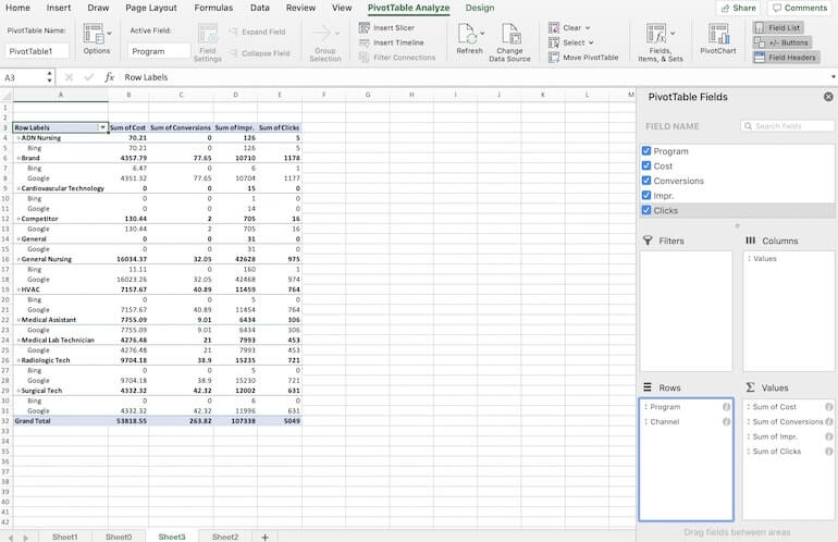
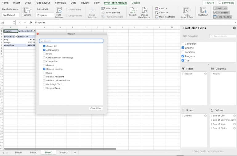
If you want to see more granular information, we can select Program and drag this to the Rows section. Once we do that we can see how each program has been performing in each channel. If I don’t like this set up I can switch the options or “pivot” my data the other direction by dragging Program to appear before Channel in the Rows section of the PivotTable Fields

Here I can compare side by side how the programs are doing in one channel versus the other channel. I can also move Program once again to the Filters section so I can look at my data in a different way.
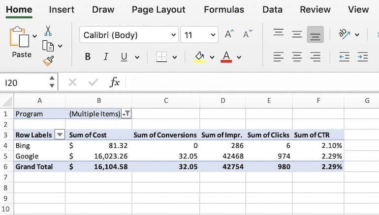
For this example, the client was requesting information about our nursing programs and how they were performing in Google and Bing. With the filter I can select both General and AND Nursing and the numbers in the chart will be the sum total of both programs.
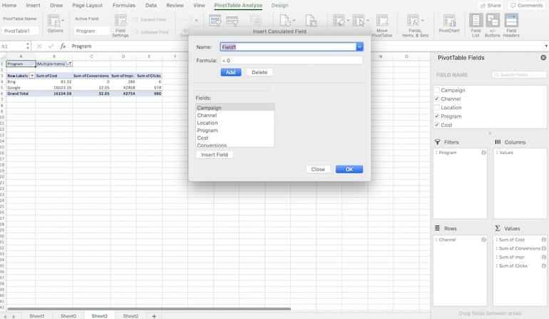
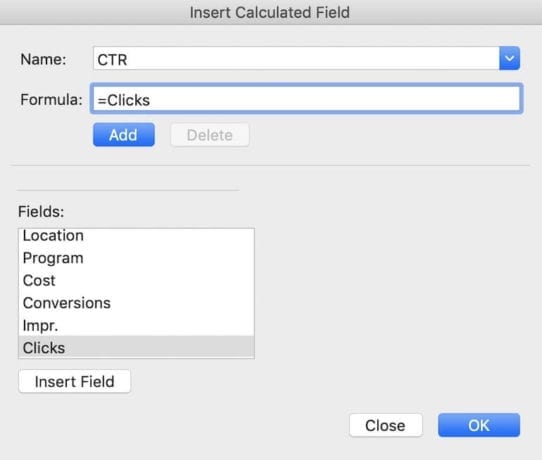
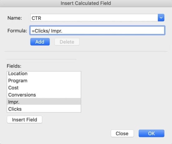
Now you may have noticed that I didn’t download and rate type of metrics and that is because I wanted to show you have to create your own fields in the Pivot Table. We are going to add Click Thru Rate which is Clicks divided by Impressions. Go to the Field, Items, and Sets and hit Calculated Field.
Once you are in there you can rename Field1 as CTR and select Clicks and hit Insert Field. Do the same thing with Impressions but make sure to add the backslash for the division symbol and hit OK.
Now we can format the value as a percentage and the cost as a currency to make this table a bit prettier.
The Why
Ther are many ways to use pivot tables but today I covered how you can move the data around quickly bouncing between channels, locations, programs, and even campaign type if you want to compare Search and Display. I have used Pivot Tables to look at A/B tests for ad copy to see which Headline performs better on based on my client’s metrics. Once you are comfortable with playing around with Pivot tables you will find new ways to look at any report you pull from Google and Bing and show the information in a clear and simple format for your client. If you are interested in learning how else to use Excel in digital marketing here is our Complete Guide to Using Excel for PPC.