


You are running a lead generation campaign, at least in theory.
What you are actually running is just a campaign, because the leads are not coming in. You continue to pay for users to click on the ads and the users continue to leave your landing page without submitting their information.
This is not a good situation.
You are sure that the keywords are on target, that the ads contain an appropriate call to action and that the landing page headline matches the keyword and the user intent.
So what is the problem? Why won’t users fill out their information?
This is the financially and emotionally draining situation that many PPC marketers find themselves in, and it is often because they have neglected to focus on one of the most important and easy to change elements of their landing page.
So Many Clicks, With So Few Form Completions
I hate to say it, but your form is probably not optimized for conversions.
In fact, you probably didn’t think about your form much at all.
However, not all landing page forms are created equal – and the difference is vital for conversions. This vital difference helped Expedia gain an extra $12 million in revenue by simply removing one form field.
No matter how compelling your value proposition is, if your form provides too much friction to users you just aren’t going to get the leads. Simple acts like removing a form field can reduce this friction.
Friction on forms comes in many different varieties, including:
- Form headlines that are too vague
- Call to action buttons that don’t inform users of the benefits they receive from filling out the form
- Asking for too much information
I have seen poorly designed forms on generally well-designed campaigns and they just crush the conversion rate. It is not entirely the marketers’ fault. There is so much that goes into a successful PPC campaign that the forms are a complete afterthought when the landing page strategy is being created.
Before we go into what makes a highly converting form for lead generation, let’s look at an example of a poor form on a well-designed and expensive campaign from a live landing page for the keyword DUI Attorney (which is a mighty expensive keyword!):
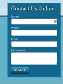
This form looks simple enough but contains many common errors. The best way to deconstruct this form is to view from the user’s perspective and all of the points of friction which would prevent a user from filling out the form:
1) Vague Form Headline With No Incentive
The form headline is “Contact Us Online.” The friction is that this form headline is much too vague and it provides no incentive for the user to submit the form. The headline doesn’t explicitly tell the user what is going to happen once their information is received. If you contact this lawyer online will they call you back? If so, when? Does this mean they take your case? Do you now owe them money? What is the user’s motivation to submit the form?
2) Too Many Required Fields
The top three fields in the above example are all required. The friction is users may not want to be contacted in a certain way and for this reason they may be reluctant to provide this information. Especially for sensitive matters such as DUI’s they may want to avoid phone calls. The marketer should let the user submit only the very minimum amount of information necessary to get in contact with the lead.
3) Submit As a Call To Action Button
Using the word “submit” as the call to action button is my personal pet peeve. What kind of person wants to submit? Nobody! Users want to know what is in it for them. The call to action button is a great spot to remind users of what they get in return for submitting their valuable contact information.
4) No Reassurance
Highly converting forms have some sort of reassurance to users that their information is not going to be mishandled and that it is safe. This example form completely lacks any of these trust indicators and users will be leary as they don’t know how their information will be used or sold.
Create High Converting Lead Generation Forms By Removing Friction
These are the steps that we follow at Nerds Do It Better to make sure that forms on landing pages convert highly and generate leads. All of these tactics help remove friction and make it as easy and pain-free for the user to submit the form as possible.
1) Include the Value Proposition in the Form Headline
Mystery can be a good thing in romance, but it is bad with forms.
In the headline you want to do two things:
- Tell users exactly what they can expect when they fill out the form.
- Provide them with the incentive to fill out the form.
These two tasks should be stated as clearly as possible – as Oli Gardner of UnBounce states, your form should be able to stand alone on your landing page.
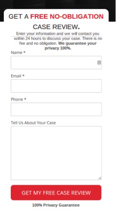
In this example you can see that the headline of the form tells users exactly what they will get when they fill out the form as well as what they receive in exchange for providing their information, which, in this case, is a free no-obligation case review.
2) Remove Unnecessary Form Fields
Having too many fields in your form is an absolute conversion killer. When users come to the page they do some quick math in their head and decide whether the reward of submitting the information is greater than the cost incurred from filling out all the form fields. Each form field that must be filled out adds some friction. In fact, according to one study conducted by HubSpot, reducing even one form field increases the conversion rate by 50%.
When we create landing pages for clients I ask, “What is the absolute minimum that they need to be able to begin building a relationship with the lead?” Often this ends up being much less than they initially thought. They often don’t need the phone number initially, and will be able to get it as they build a relationship with a client.
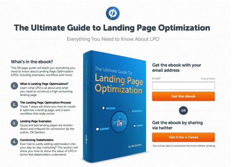
In the example, you can see that UnBounce has only one form field and it is for the email address. An email is often enough to get the prospect in your CRM and begin building a positive relationship, and it is not that big an ask.
3) Make a Call to Action that Specifically Tells the User What they Get From Submitting the Form
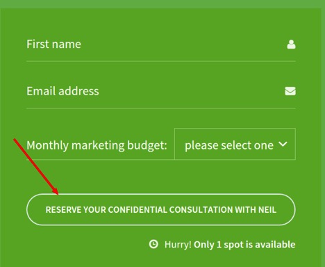
As I noted before, my personal pet peeve is call to action buttons in forms that say submit. Your call to action button is the last thing that a user sees before they complete the conversion. It needs to be as persuasive as possible and should tell the user what they receive.
In another study, also conducted by HubSpot, the company found that lead generation landing pages with the word submit convert at about 14% while those without the word submit convert at about 17%. Over the course of thousands of users this is a huge difference in the number of leads that this one simple change produces.
You can see in the example above from Crazy Egg that the call to action tells the user that they get a confidential consultation with Neil. This specifically shows the value that the user gets from submitting the form.
4) Provide Some Reassurance
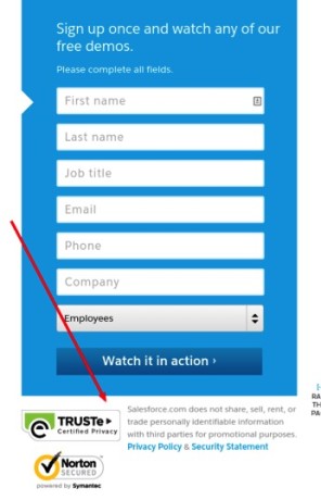
Many users are still wary of the Internet. In fact, according to one study in the Guardian 6 out of every 10 users is worried about online privacy. These types of fears can hurt your conversion rates, as they provide internal friction in the user’s mind.
Including reassurance about how your company intends to utilize the information the user fills out can put the user at ease and removes some of this friction.
In the example from SalesForce you can see that not only do they explicitly state what they plan to do and not do with the information, they also link to their privacy policy and display trust symbols from Norton.
What strategies and tactics do you have to make more users fill out forms on your landing page?
