


Advertising isn’t always a one step process. There are often multiple steps along the pathway from visitor to purchaser. Each step along the path presents an opportunity to lose a potential sale or lead, making it vital to examine each touchpoint. Funnel charts can help clarify the numbers to analyze performance by step.
If you are losing too many potential leads at the start of the path, you could be aiming too broadly or have a great filtering system upfront. On the other hand, if you are losing disproportionately at the late stages you might have everything right up until the final steps and will see a dramatic uptick from performance changes on the backend. Knowing which area to focus on can lead to large performance gains.
Today we’ll use Gmail Ads as an example. Gmail Ads are a perfect example because of the multiple steps from the first click to website and sale. It isn’t one click and to the website, you have multiple chances to lose users before they even see the site.
We’ll create a simple funnel chart outlining performance from inbox impression to sale. Even if you don’t have Gmail Ads, you can easily adapt this method to your own needs.
Compiling The Data
First, we must gather our data. In this example, we’ll use a single ad. A single ad is preferred due to differences in ad copy and targeting, but you can just as easily aggregate the numbers across if needed.
The basic funnel looks like this:
- User sees ad in inbox
- User clicks ad and sees expanded ad
- User goes from expanded ad to website
- User converts on the website
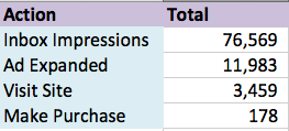
Based on this outline we need impressions, clicks, Gmail clicks to the website, and conversions. You could also include actions such as saved or forwarded ads, but they don’t fit as cleanly in this example.
The Set Up
Once we have the numbers, we’ll start setting up our tables. Along the left-hand side of the table, we’ll list the funnel steps. From there we’ll fill in the required numbers.
Our first metric is the total actions. In the screenshot below I’ve included the total impressions, the number of ads clicked, the clicks to the website, and the total conversions.
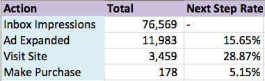
The next step is optional but is useful when creating labels. The second metric, next step rate, is how many users passed through to the next step from the previous step
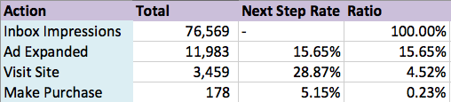
Now, we’ll get back to the graph set up. We’ll modify a bar chart in order to get our funnel. A funnel can be thought of as the number of users that make it through each step. This means we can easily use a percentage as our axis. The initial impressions make up 100% of the possible visitors and we can further break down the steps, chart them, and ignore the actual values.
Since each step has a specific proportion of the total, we will start by calculating that number. Since the first step contains all users, it should span 100% of the chart. If 25% of users make it the next step, we want the bar to span 25% of the chart. To get the number, simply divide each row’s total by the absolute total impressions.
The problem with the basic ratio is that we want our graph to look pyramid like. Try creating a bar chart based on these numbers and you’ll end up with a standard bar chart.
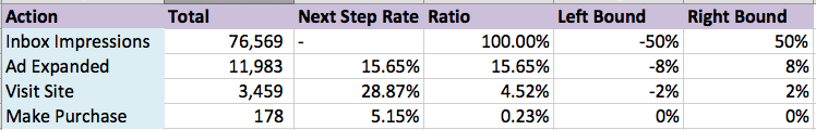
We need to center our data. There are multiple ways to do this but today we’ll simply center our numbers on 0. Half will go on one side of 0, half will go on the other.
Our next step it to create these bounds. Since we are centering on 0, we can reconfigure our percentages. For 100%, 50% will be positive, and 50% will be negative. For 50%, 25% would be positive and 25% would be negative.
Create two columns, one for the right side of the graph and one for the left. In the left-hand column, you’ll divide the ratio column by 2 and subtract that total from 0, putting half of the total on the left-hand side. For the right-hand side, you only need to divide the total by 2 since it is already positive.
Creating The Graph
Now we’ll create the graph. The first step is to select your data and create a bar chart. You’ll plot both bounds on the axis and set the axis values as your action names.
The first thing you’ll notice is that the bars don’t line up. It is an easy fix, though. Right click the chart and format your data series. You’ll set the overlap rate to 100% and the bars will line up. While you are in there, you might as well change the gap. In the screenshot above, you’ll notice the gap between bars is pretty large. Decreasing the number will lead to something like this.

Problem solved. Now we need to reverse the order of the bars to invert the pyramid shape.
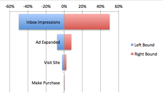
Now we need to change the colors of the bars. Click the bars on one side and choose whatever color you prefer. Now do the same to the other side.

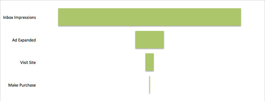
Let’s do a little clean up now. We don’t need the axis labels, the legend, any titles, grid lines, etc. Go ahead and delete them. If you don’t want the centerline along the y-axis, be sure to set the axis to “no line” in the formatting menu.
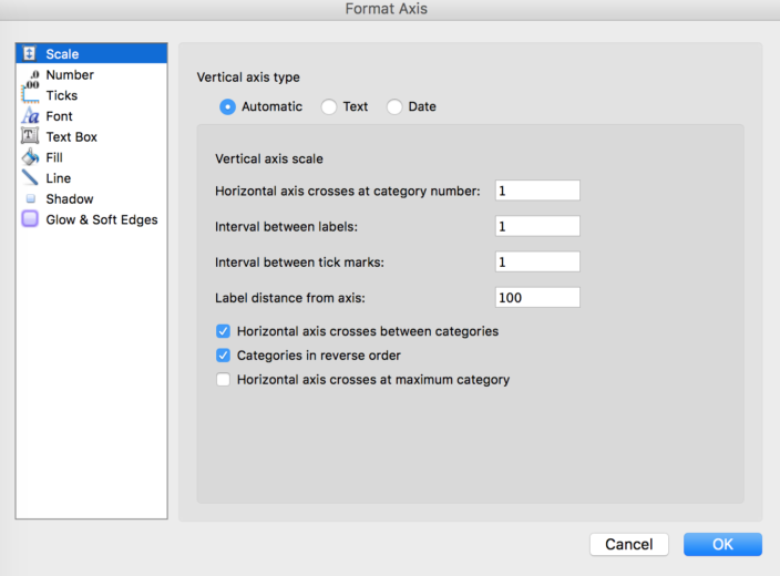
The action steps are more readable by shifting them to the edge of the graph. Click on the graph and format the axis. Change your axis labels to high or low to move them to the left or right, respectively. Depending on the size of your bars, you may need to adjust the width to compensate for the screen space taken by the offset text.
Other Tips
If you’d like to insert additional values, such as the next step rate, or totals, you can include them in the graph. If you try to add data labels in the current graph, you’ll only see the bounds, which isn’t as helpful.
If you don’t want to include manually inserted labels, you can include the columns with the data you want. This will create bars that overlap and occlude your funnel. Simply increase the transparency to 100%, making them invisible. Then insert the data labels based on the desired metrics and you are done. For reference, I’ve included the highlighted bars for the next step rate.

Conclusion
Funnel charts help make sense of any type of user flow. You could use it for other types of paid search campaigns, your social strategy, or general web traffic flow. It is an extremely useful chart for examining any sort of marketing and sales path, and an even better tool for explaining marketing performance, beyond basic CTR and conversion rates.
