Successful Landing Page Components – 2019 PPC Hero Summit Recap
Are you putting as much emphasis on the post-click experience as you are on the pre-click experience? Without enough emphasis on what happens post-click, you may be doing a phenomenal job capturing traffic, but a poor landing page experience will ensure you’re not capturing those leads. In March, Unbounce’s Oli Gardner and I participated in PPC Hero Summit to help marketers understand the importance of landing pages, but more specifically, the important elements that should be included on these landing pages. If you missed the Summit this year, don’t worry; you can still download the sessions.
Today, I want to do a brief recap on our session, “More Traffic, More Conversions: How To Build Great Landing Pages,” though I highly recommend checking out the session recording. Although I’ll cover a handful of examples today, the session contains so many great examples and details about mistakes that are commonly made when trying to achieve a successful landing page build.
5 Components of a Successful Landing Page
1) Main Headline or Value Proposition
When crafting the headline or value proposition for your landing page, your focus should be on clarity. Limiting ambiguity will put your focus on what you offer, not what sounds neat or catchy. To look at some examples, I’ll use a similar search term to that used in our Summit presentation: “toddler subscription box.”
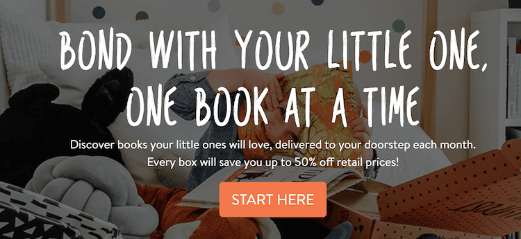
Lillypost uses this catchy language with an emotional appeal. However, their primary headline alone doesn’t address the user’s initial search. Oli and I both discussed this idea of information hierarchy. I encourage you to take a look at your headline and subheadline to see which copy is going to be most relevant and telling to users when they land on the page. See what happens when I simply swap these two headlines:

Now the primary headline addresses exactly what is being offered: multiple books for your little ones in a subscription-based model that delivers monthly.
Sidenote: If you’re a family full of readers like mine, I suggest trying out Lillypost – it’s a fun and affordable way to build your library and most of the time they’re unique books that you wouldn’t typically come across in a bookstore!
2) Benefits
It’s important that users understand how your product or service is going to benefit them. Since they need reason and motivation for purchasing your product, you should be careful not to simply list out the features, but explain why it is truly a benefit to them.
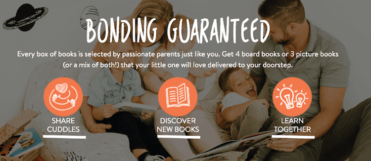
Sticking with Lillypost, they continue to utilize the emotional appeal mentioned earlier. Yes, the product will benefit the kids by the sheer fact that they will be receiving 3-4 brand new books, but Lillypost clearly identifies how this will impact the parents as well. Think of all those cuddles and learning/teaching you’ll get to experience together – cue the warm and fuzzies. In addition to these personal benefits, Lillypost does a great job highlighting the financial benefits and how this will benefit others.

3) Hero Image
You’ll often see discussing the importance of hero images. However, it’s less common to read about the importance of how you select a strong, relevant image tied to your content. Oli gives some fantastic examples in our Summit presentation of stock photos used as hero images and the number of times these images appear on the web is insane.
In my opinion, the easiest way to immediately portray to your users what’s being offered is through that hero image. Combine a solid hero image with a valuable headline and that’s instant clarity. Let’s take a look at Lillypost’s hero image:
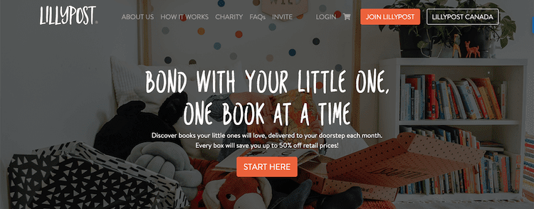
We immediately see a box and we can be fairly confident that this is the subscription box we were searching for. The piece of this hero image that is far less clear is what’s actually included in the box. We have to lean on that hero image + headline combination to gain that clarity. Because the text overlays the very center of this image, the child with his book becomes much less prominent and hard to make out. See what happens when we left-align this text:

It suddenly becomes so much clearer what the child has just received. And look at that joy on his face that we couldn’t see before.
4) Social Proof
There are so many different types of social proof to choose from, including:
- Customer testimonials or reviews
- Trust markers or client logos
- Security badges or certifications
- Success metrics or success stories
Social proof should be chosen and highlighted carefully. The goal of including social proof is to prove your credibility, show customers the success other customers have had with your brand, and to show how your brand has been recognized, if applicable.
One recommendation I give clients often is to try including this social proof without creating more distraction. See Lillypost, for example:
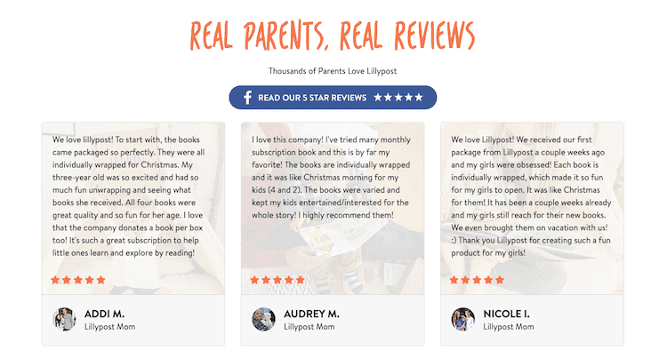
Let’s talk about the pros and cons of this social proof.
Pros:
- “Thousands of Parents Love Lillypost” shows just how many people purchase this subscription box
- These reviews are lengthy and detailed, making them more credible and believable
- The reviews are all 5 stars, which should act as motivation for users
- Though it appears that this Facebook button could link out to more reviews, it does not – this is where you should be careful not to create more distraction by linking to additional review sites
Cons:
- Because there are no dates on these reviews, it may create skepticism on when these reviews actually took place
- Personally, I was subscribed to Lillypost for the last half of 2018 in order to get books stocked up for Christmas – the fact that all three reviews referred to the books as individually wrapped made me a little skeptical because none of our books came wrapped. This isn’t a problem for me but it does make me question a couple of things: 1. How old are these reviews – maybe they used to wrap them but it got to be too cumbersome so they stopped or 2. Maybe this is something new they started doing or it’s an option to have them wrapped
- Each review identifies the reviews as “Lillypost mom” – because they all say this, it doesn’t create added value or credibility to these reviews. Instead, it would be valuable to understand how old their kids are or which subscription box they purchased.
- “Read our 5-star reviews” may create distrust. When we only highlight or call out our 5-star reviews, it instantly makes users question the legitimacy or credibility of the reviews. Changing this to read, “Read our reviews” will put less emphasis on the rating of the review and more emphasis on the content of the review itself.
5) Conversion Goal
Lastly, but certainly not least, is the conversion action. Even more important than making sure a conversion action exists on the page is ensuring there’s a single conversion goal. This is important because the more options we give users to choose from, the less likely they are to actually choose one of these options. It’s called the paradox of choice: consumers become overwhelmed with the choices they have available, unsure which is the best or right option.
Furthermore, when we create a single conversion goal, the users should be certain of a few things:
- What is the next step or action and what will they receive in return?
- Clarity that each call-to-action representing a single conversion goal will actually lead them to the next step
Lillypost has 5 primary call-to-actions (CTAs) on the page that all look the same. The 3 CTAs pictured below all lead users to the desired action but all use different text. This will create hesitation because users will be unsure which action they should take next if they’re wanting to pursue Lillypost.
![]()
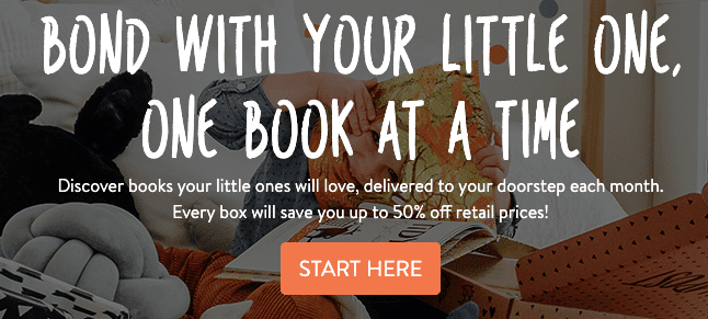

As you can see, “Join Lillypost,” “Start Here,” and “Learn More” are three different “actions” but all take users to the same place. This is the desired action. Two other “Learn More” CTAs exist on the page.
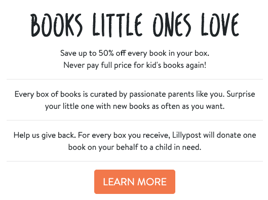

However, these “Learn More” CTAs take users to more information about the corresponding topics. These create additional distractions, deterring users away from the desired action. This is a great representation of the importance behind creating your page around a single conversion goal.
Final Thoughts
To create a successful landing page or optimize an existing landing page, I encourage you to use these five elements we discussed today as starting points. Lillypost was a great example for us to discuss as we were able to highlight each element, identify how that element was currently being featured on the page, and talk through potential improvements. If these examples were helpful, please check out our presentation from the PPC Hero Summit in March – there are so many more examples and concepts you don’t want to miss.


