Part of the fun of PPC management is that it’s as much art as it is science. However, understanding the intricate relationships between various elements of your account requires both experience and a good bit of time for data analysis. If you’re new to the industry, or you just want a quick check-up on account health with some solid suggestions as to areas that could use improvement, the in-depth analysis required can seem daunting.
You may understand that you need to consider click-through rate, but what’s a poor click-through rate? What can you DO about it? Why is it so low?! There are a million questions, and they’re all interrelated. WordStream’s free new tool, the AdWords Performance Grader, looks to address several of those questions in one convenient report. It will analyze several elements of your account and offers comparative metrics (as compared to other advertisers within a similar spend range), as well as suggestions for how to improve each. You can check out the AdWords Performance Grader site for a more in-depth description of each account element analyzed, but some of those which were most interesting to me are described below.
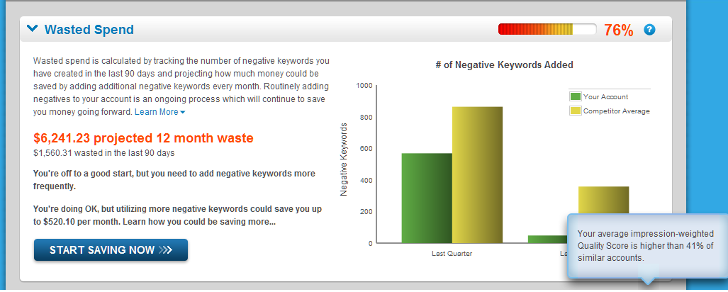
Wasted Spend:
Analyzes your number of negative keywords vs. the average for similar-spend advertisers. This may be important to note if your number of negative keywords is massively different from that of similarly-sized advertisers, however, each industry and account will of course require different numbers of negatives due to its keyword targeting strategy and the broadness of negatives added.
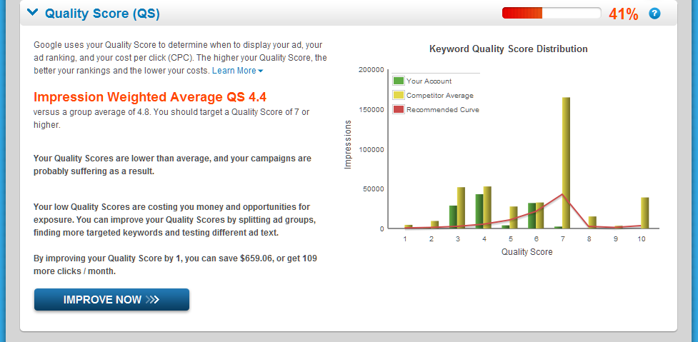
Quality Score:
This section offers a graphical representation of your average Quality Score for various impression-size groups, as well as an impression-weighted average Quality Score rating for your entire account. It is useful to see your average impression number vs the average quality score for that group of keywords, and may help you to understand whether your longer-tailed, less-trafficked keywords have developed sufficient Quality Score to keep your CPC low or not.
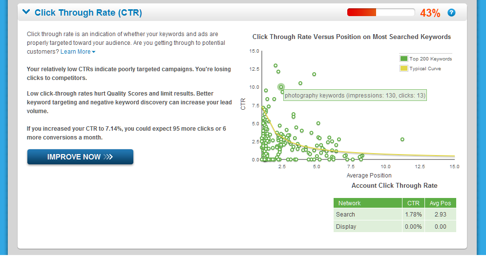
Click Through Rate:
Offers a graphical representation of the top 200 keywords’ click-through rates along with their average ad position, as well as a curve representing the similar-spend average. Each little circle on the graph, when moused-over, will indicate which keyword is represented. This is a very useful visual display of performance differences based on position within your account.
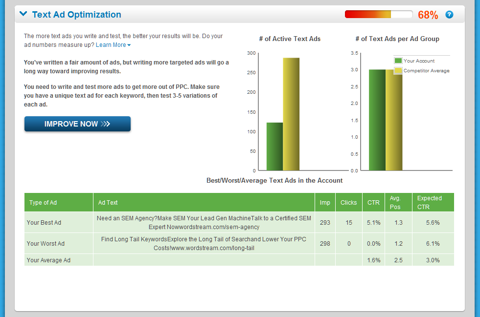
Text Ad Optimization:
In addition to giving a general overview of your number of text ads both active and per ad group as compared to similar-spend advertisers, this part of the tool will indicate both your “best” and “worst” text ad as compared to the expected CTR for their position, as well as an overall account average. This can be a helpful quick overview of ad elements that are working and which are not, if the ads in your account do not vary widely from ad group to ad group.
In the future, I hope that this tool becomes popular enough that WordStream might be able to develop industry-specific data for each budget range, but of course, the ability to do so will depend entirely on participation levels. As it stands, the tool gives a great overview of general account performance and areas of possible improvement, and is definitely worth checking out!


