
It’s all about attention folks.
On a Google SERP, we’re trying to pull in a user by using the words they’ve used and are scanning for along with various other tactics. On Facebook, we’re trying to hook our users into an action while they sit in a mindless browsing mentality. The underlying and crucial principle here is attention.
If you can’t catch a user’s attention, there’s no click, there’s no landing page experience, there’s no conversion. Even worse, if you do hook your user’s attention and bring them to the landing page and then overwhelm their attention with stimuli and actionable elements all over the page, there’s no conversion.
Today, I’m going to share some tips and tricks with you so that you can grab your users’ attention spans and keep them focused!
The First Step is About Catching Their Eye: Get Visual
Catching someone’s attention on the SERP is all about familiarity and real estate occupancy. Matching your user’s search term in your ad is an obvious first step to gain that familiarity footing. If a user is searching for “red shoes” they’ll be scanning the results for “red shoes” first and foremost.
[bctt tweet=”Stay relevant and you can capture at least a fraction of that user’s attention.” username=”katewilcoxkcco”]
Taking up space is another way to increase your chance of addressing your users concerns beyond the general search term, and it also increases your chances to seem important because your ad is higher priority in the visual hierarchy. In the following picture, which shape seems most important?
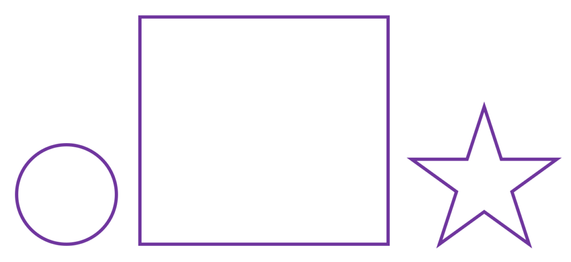
The square appears most important and attracts immediate attention because it occupies the most space. This is a proximal tactic used by humans that is transferred into virtual space as well. Implement those structured snippets and take up some space! As an added bonus, snippets involving reviews will integrate eye-catching color as well as social proof.
Facebook is evolving to a more media-centered platform and thus, we all know that imagery is key here. So are words on a gradient background going to cut it? Not quite. On Facebook, there are analytical scanners and the visual thinkers.
The analytical scanners will most likely read the headline or some aspect of the copy first. Capture their attention by using emotionally targeted and relevant ad copy. People love themselves. Make sure you’re talking directly to your user and they’ll feel more personally engaged.
The visual thinkers will hunt for images and videos in their feed and analyze this media before they jump to the copy for context. You can pull their attention with weird and wacky images, sure. But if that’s not quite your style, try humans. Steer clear of stock imagery. Visual thinkers’ behaviors are heavily rooted in the reptilian brain that’s truly all about survival. Ancient humans (and modern humans) were very socially reliant and pack-oriented. They constantly looked to their brethren for feedback on danger and safety. Thus, humans have become incredibly apt at reading other humans’ nonverbal communications on a subconscious level. We’re drawn to analyzing other humans’ faces out of self-preservation and this ensures that you can at the very least grab someone’s attention by using a human.
The Hard Part is Keeping Their Attention on the Landing Page: Keep it Simple, Relevant, and in the Right Order
You’ve successfully grabbed your user’s attention and you’ve intrigued them enough that they’ve clicked into the pursuit. Once they’re on your landing page there are numerous elements that can all conflict with each other to grab and hold their attention.
Quantity matters.
The quantity of nearly every element on your site conveys a message. Have a lot of imagery? Must not have too much information to share with me. Have no imagery? Do they really expect me to read this wall of text? No security logos? These guys could be sketchy. Too many security logos? These guys are definitely sketchy.
Where attention is concerned, focus on balance. If you have too much imagery, users will ignore most of it. If you have too much text users will scan, then scroll and ignore the rest of it. Keep your page as simple as possible. Every time you want to put something on your page, ask yourself if it NEEDS to be there to convey information concerning who you are, what your offering, or your benefits and values. If the answer is “no” or if the answer is “no, but” don’t put it on the page.
Quality matters.
Users don’t like fluff or filler information and they immediately stop reading once their filler radar goes off. They’re shopping your competitors so they’re searching for differences, not similarities. Based on the Gestalt psychological theory, humans are incredible at spotting breaks in patterns, but not the patterns themselves.
Populate your page with hefty, quality information that is also easy to remember as sound bites. If your products are made in the USA, this can be a huge benefit. So instead of piecing together an elaborate paragraph about your company’s history in the middle of the States, create a more visual text piece that simply states “Made in the U.S.A.” This appeals to visual folks and analytical copy scanners alike and it’s short and sweet, easy to recall.
Steer clear of fluff. Make sure that the information you’re sharing with your users is true and unique. Combine the core functions of your product/service that qualify it/you as useful or functional with features that make it/you unique and stick to it. If you’re selling house windows, every single one of your competitors is going to be using fluffy copy to describe looking out clear windows and seeing chirping yard birds more clearly. Instead, emphasize that your windows have incredible clarity and are also durable for the impending bird to window crashes you may encounter with such clarity (cue Windex marketing).
Order matters.
Ideally, you want to answer the questions your user is thinking of in the order they’re thinking them. While that sounds convoluted, it’s easier than you think when you embrace your inner empathetic side and walk yourself through the funnel. A user is going to pursue information in the order of their mental questions. Most users won’t adapt to the order of your page so your page needs to adapt. Thus, if you don’t answer “What do these people do?” in the first 5 seconds, most users are going to bounce straight off your site.
Visual hierarchy is also something you need to place focus on. There are numerous features of visual hierarchy that can help and harm you and I definitely recommend that you read more on the subject before you rearrange or design any page. Essentially, visual hierarchy assists you in conveying element importance to your users.
Space is a very common feature used to establish visual hierarchy. If you need your value proposition to be the center focus of the initial landing page experience, make sure it takes up space in that hero image and that the hero image itself is quite imposing.
Users will primarily focus on whatever is deemed the most important and then float down through the subsequent elements determined by declining importance. Remember that visual hierarchy also taps into the human brain detecting anomalies rather than patterns. Headlines are scanned because they’re bigger than the rest of the copy. Images are viewed because they tend to be next to text.
In the end…
It’s all about attention. It’s always about attention! Grabbing a user’s attention, while tricky, is the easiest aspect of the equation. Holding their attention and keeping them focused is another challenge that demands constant adaptation along with a rock solid understanding of how your users approach you.
[bctt tweet=”Never forget your users, and never stop optimizing!” username=”katewilcoxkcco”]
