
You spend months testing ad copy and optimizing bids to ensure that your ads are not only visible or relevant, but effective. It’s not about impressions. It’s not even about clicks. The end goal, the cherry on top, is the conversion. That conversion occurs on the landing page.
So how do you choose the page that sends your visitors into conversion land? Do you base your decision purely off of relevance, looking for page copy that aligns with your ad copy? Or maybe you perceive the proper landing page to be a gateway into the full site (and the full array of products of services) and thus, choose the homepage of the site as your landing page.
While these are both fantastic starting points and can be highly successful for specific instances, you can do better. I’m going to provide you with three new mindsets to enable you to whisk your visitors off into conversion land with ease and delight.
1) Designated Landing Pages Get The Job Done
In most cases, websites offer a multitude of products or services and try to present all of them on one page or at least give a user access to all of these at first glance. This tactic is fantastic when a user is in the top end of the funnel.
However, we know that our users via PPC are a little more focused than that. Users click on our ads because (in most cases) we’ve inadvertently told them that we’ve found what they’re looking for and that they no longer have to spend arduous amounts of time searching. We’re going to provide them with a streamlined experience to their end goal. This is evidenced in the fact that our highest performing ads are usually branded ads.
We know our users are searching for something. Providing them with one answer, maybe two, is going to be better received than if we present them with six answers. This is the difference between being seen as an expert and as a generalizer. Who do we trust? The guy that knows everything about one thing or the guy that knows a little about everything? If we’re looking for one thing and we’re focused, the guy that knows everything about that one thing wins. Hands down.
Thus, dedicating a specific page to present the product or service that your user is searching for while presenting this product or service alongside specific benefits and information can be highly beneficial.
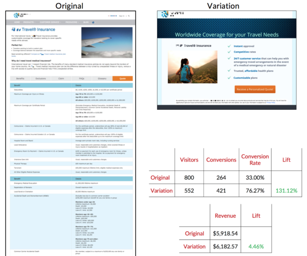
I’ll let the numbers talk for a bit. In the following split test, we experimented with an original page that belonged to the site (the homepage) against a dedicated landing page that was completely separate from the site.
As you can see, the variation of this test significantly decreased the amount of information presented to the user. The page catered the information that was presented to the specific conversion path that we wanted the user to traverse and we saw a 131% lift in conversion rate along with a 4.46% lift in revenue.
2) You Have A Goal (Or Two), So Should Your Landing Page
When you’re optimizing until your little PPC heart is content you have an end goal in mind – a specific KPI that you’re striving to attain. Your landing page should be doing the exact same thing.
The basic rule of thumb here is always “Keep it simple.” This rule is generally followed by ecommerce and frequently broken in the lead generation world.
For instance, if I want my user to complete a form in order to receive a free quote on my services, my whole page should be informing the user why my services are awesome and how those services can directly benefit my user. I should then present my user with a unified message on how to receive a free quote and where they can enter their information in order to receive said quote. I should NOT present a free brochure download and a phone number at which to call me to receive a personalized quote and a support chat box where you can talk with me about your heart’s desires, etc.
The conversion path is a part of the funnel, which means that as users progress down it they are ideally more focused. Do not provide distractions and rabbit trails in a narrow section of a funnel if you don’t absolutely have to. Users love distractions and your conversion rate hates them.
Furthermore, if a user overlooks or bypasses a conversion option once the likelihood that they will repeat this behavior is incredibly high. A.K.A., the more conversion options you present to a user, the more likely they are to ignore every single option. Since they’ve been presented with so many options already they’ve succumb to the belief that when and if they do choose to convert, an option will be there. This thinking inadvertently removes the perception of exclusivity that each conversion option may have presented to the user.
3) Navigation Can Make Or Break You
There are a multitude of theories surrounding when to include navigation and when not to on your landing page. Diving deep into these theories is a post for another day. The bottom line is that your landing page should have enough information contained within itself that your users shouldn’t feel the need to go elsewhere in search of further information and therefore don’t need navigation.
However, there are always exceptions. The biggest exception is a conversion path in which a user will revisit the conversion option multiple times before committing. This path tends to involve heavy-weighted decisions that either involve high-priced products or services or other people (other than the user) that take time to contemplate and come to terms with (diamonds, conferences, or rehabilitation services). In these situations, provide the user with navigation into the full site in order to ensure that they receive ALL of the necessary information.
In almost every other case, navigation is a rabbit trail and/or a distraction and thus, should be removed from the equation. If you insist that your users need navigation, give them navigation after they convert. Place your navigation on the thank you page
However, if you cannot remove the navigation from your landing page you can learn from it. How? Heatmaps or clickmaps.
Find the component that your users are clicking on most heavily in the navigation. Use this to determine what information your users are seeking and then place key points concerning that information on your landing page (but not enough to detract from your main goal).
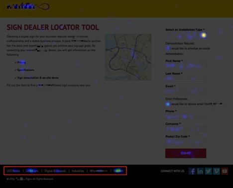
We can see that while we have provided bottom navigation instead of standard top navigation, users are still searching out further information than what is provided. We can learn from this data. The most heavily trafficked component in the navigation is a “Support” link while links containing general information about the product this company sells are second and third. If we were to provide information concerning the basics of the products they sell along with a more easily accessible support system (phone number, chat box, email, etc.) our users would be much less likely to exit the page via these links.
In Summary
In the following example, you can see all three of these principles at work.
We redesigned a mobile page for an app-building service. This mobile page was a dedicated mobile page and simplistic in copy. It was already catered for fulfilling one goal – submitting your app idea via form fill. The irony was that it had five points of navigation that all contained the same catered message. That’s five rabbit trails that all have the same goal. So why not have all of this information with the same message pointing at the same conversion path on the same page? Great idea!
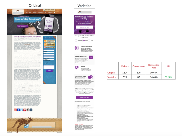
As you can see, this is a dedicated landing page in that it does not connect to the main site (#1). We reduced the goals of the page and the form from two to one (#2). Furthermore, there is no navigation and no rabbit trails (#3). If a user has a strong urge to click, the CTA leading into the conversion path is the spot to click.
Ensuring that our users have a seamless and delightful trip down a conversion path can benefit everyone involved. Sometimes the easiest way to encourage a conversion is to make that conversion simple and blatant. Today, you’ve just learned three ways to ensure that the conversion path is at least a little bit more simplistic and focused for each and every one of your visitors. Now give yourself a happy high five and go dedicate some landing pages.
TLDR; Make sure that wherever you’re sending your users after they click on your ad is dedicated to the same message that your ad is conveying, has a singular goal in mind and presents that goal as such, and removes distractions in the form of navigation when possible.
