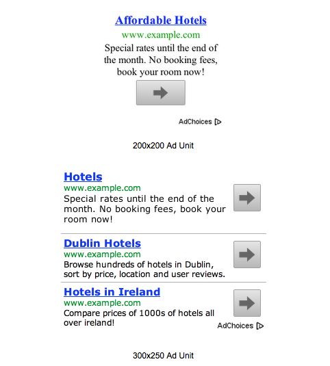
Google announced a change coming to text ads on the Google Display Network, rolling out this week. There will now be a clickable arrow button, as well as slight optimizations to font size, spacing and text layout. Seen here:
Apparently the color of the buttons will be in the same pallette color you’ve chosen for your ad units. The article says,”For instance, if the background of your ad units is white, the icon will be grey; for other background colors, the icons will be a different shade of the background color.” Remember, this is an AdSense blog, so they’re talking to AdSense people!
These changes are happening automatically, and Google expects this will greatly increase the number of clicks for text ads. Yes, you read that correctly. Google is trying to increase your clicks. Isn’t that super out of character for them? *sarcasm detector, engage!*
So, yes, another change that could be cool, or could just blow up your clicks and waste your money. Seeing as how this was posted on the AdSense blog and not the AdWords blog, it seems more geared towards benefiting AdSense partners, yes?
What do you think? Are you excited about this new look?


