The Cohort Analysis report is one of the newer features within Google Analytics. What this report allows you to do is segment your data into Cohorts based on Acquisition Date, and view metrics such as retention rate and transactions / revenue. Setting it up is a breeze, but the report is even more valuable with custom segments layered on it.
Overview of Cohorts – How It works
Cohorts are a relatively new feature in Google Analytics that is used to compare users who share a common characteristic. Access this report by navigating to the audience tab in the left-hand menu, then to Cohort Analysis.
Set Up
Set up is simple, and only requires that you play around with the above options to get the results you’re looking for. Unfortunately, the only Cohort Type option available at the moment is Acquisition Date, which Google defines as “the first time a user is recognized as interacting with your content. When selected in the Cohort Analysis report, the cohorts are grouped based on when users started their first sessions.”
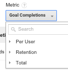
Metrics are grouped into three categories: Per User, Retention, and Total.
Under the Per User section, you’ll find metrics divided by the number of users (i.e., Pageviews per user).
The User Retention metric is defined as “The number of users in the cohort who returned in the Nth time period (day, week, month) divided by the total number of users in the cohort” – in other words, the percentage of users who are returning.
Finding Takeaways
Look for Trends
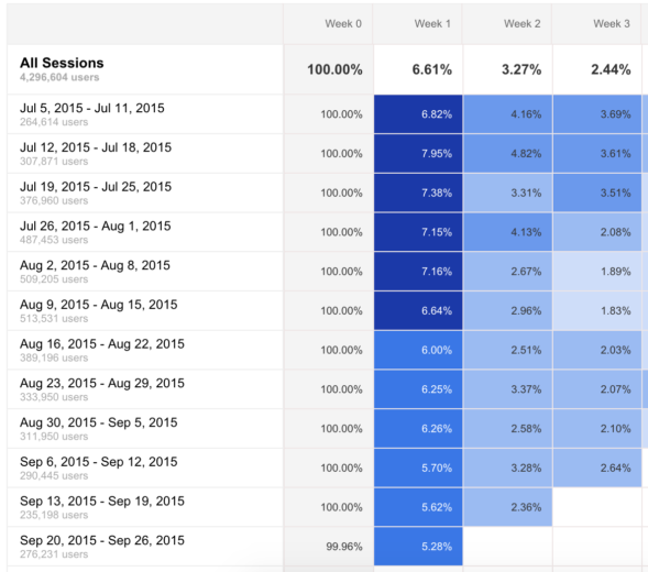
This report is great for looking for overall trends in user behavior. Heat mapping is included, making the data a bit easier on the eyes.
Take a look at this example; notice how Week 1 visits starts to decrease with the cohort starting on Aug 16th? What’s going on here? Was there a special promotion running that ended that week? If not, think about other reasons why this could be happening (or talk to the client about it!).
Use Segments
Another key tip for getting the most out of this report is to use custom segments to get specific slices of data to look at. The segments you choose will vary greatly depending on the account, but think about what users you are most interested in.
Some segment ideas:
- Purchasers (or repeat buyers)
- Specific product purchasers
- Free Trial downloaders
- Paid Traffic
Look at Multiple Metrics
User Retention is the default metric here, but I find that it can be very interesting to take a look at revenue, goal completions, and others.
One option here is to copy and paste the data from the table into Excel (sorry – no export function available) and calculate conversion rates there from sessions and transactions (or goal completions).
Applications / Examples
Example 1:
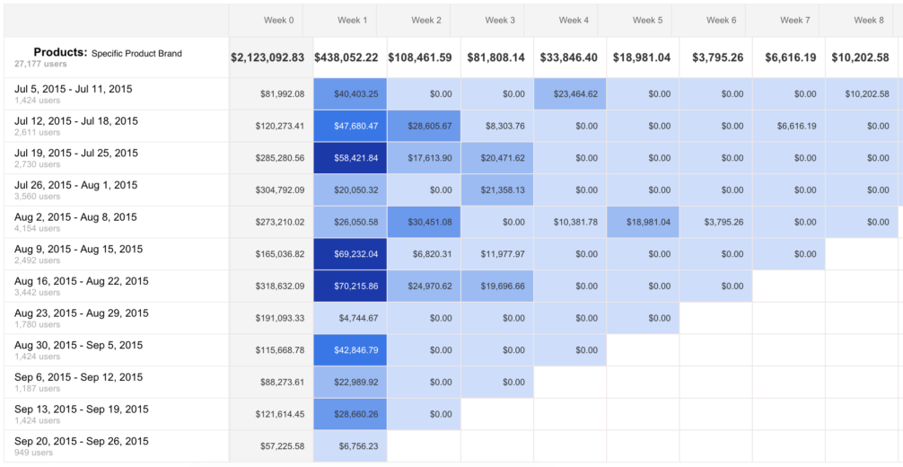
For this ecommerce account, we created a segment to include only users who purchased a specific brand (this brand has been quite popular lately). For our metric, we chose Revenue.
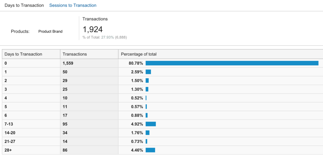
While the majority of revenue happened during week 0 (the week of acquisition), we see a good amount coming in during weeks 1 and 2. Let’s take a look at days to transaction for this segment:
Ah, here we see that 4.92% of transactions are happening in days 7-13, which corresponds with the data in our cohort report.
Another thing you might note from these reports, is that fluctuations in user retention, conversions, or revenue may be the result of a promotion on the site. If your client is running a sale, this might definitely have an impact on how frequently users are returning to shop.
Action Items: Using this data, we’re going to expand on our remarketing strategy to be more specific in our targeting. The goal here is to get these users back to the site in the weeks that they are more likely to convert.
Example 2:
- Remarketing – days since last session
- Conversion Rates
For another Ecommerce account, we looked at behavior segmented by day, rather than week. We learned from the client that users are most likely to purchase again within a 30-day window after the initial purchase. Knowing this, we wanted to know specifically which days we should focus on.
After we pulled the data into Excel and looked at multiple different metrics within the Cohorts report, we decided to put a more aggressive bid modifier on users who hadn’t purchased after 5 days since their site visit.
Example 3:
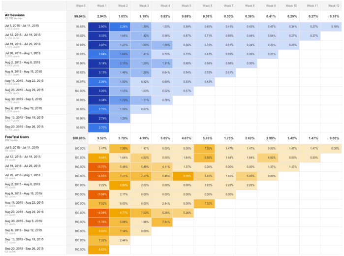
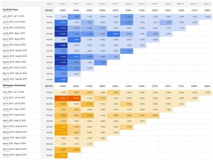
On the lead gen side of things, cohorts can also be used to analyze user behavior for users who submitted a form. This particular client is heavily focused on branding and awareness efforts, so this is a good gauge of whether or not we’re getting users interested enough in their product to return to the site.
When compared to All Sessions, Free Trial users come back at a higher rate, which is to be expected.
Now the reasonable question is, how does Free Trial traffic compare to users who downloaded a whitepaper?
This sort of data is important to look at for this particular account because while the client definitely wants form downloads via whitepapers and free trials, what they are most concerned with is user engagement and branding. That being said, we want to drive users to content that will be most likely to bring them back to the site at a later date.
Closing Thoughts
The Cohort Report provides some interesting data, but what metrics and time periods you use are going to vary based on the client. Think about what segments would be interesting, and then play around with different metrics and time frames. When you get the data, think about what could be affecting the numbers, and turn them into actionable insights for your PPC accounts.


