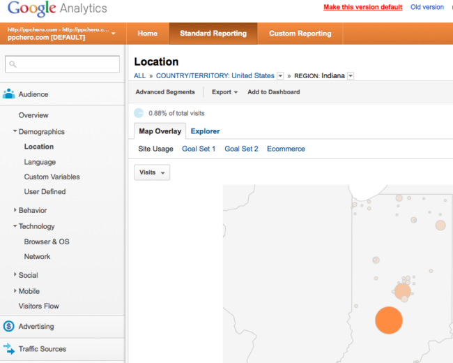
You may have noticed while getting your analytics on yesterday or today that Google Analytics has gotten a new look. Google’s announcement of the change states that they’ve made changes to pretty much everything, which has been confirmed by outside research (and by “outside research” I mean “me”).
If you haven’t taken a tour of the new features, do it already. Google’s post says that their updates have made the interface easy to use, understandable and beautiful. Let’s put those adjectives to the test, PPC Heroes!
Easy to Use: I’ll give this a pass, but the updates don’t really seem to affect functionality. It feels like a cosmetic change to me, and while the information hierarchy has been improved (so says their post), if you used Analytics in the past, this one is roughly the same.
Adjectival Grade: (On a scale from “toddler evaluating food options” all the way up to “octogenarian professor at an east coast university ripping apart a poorly constructed thesis”) Second grade essay about your summer vacation.
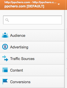
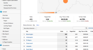
Understandable: This version of analytics is definitely more understandable. It’s just minor tweaks, but they go a long way. The aggregate stats underneath the map or graph were there in the old version, but the changes have made them more prominent. It seems subliminal, but my understanding just feels improved, like how eating off-brand sandwich cookies just feels wrong (nice try, Safeway – you can’t get between me and my Oreos). Also, there are icons on the accordions on the left side of the screen now! Conversions has a cute little flag and there’s a dollar sign next to advertising. Analytics has given us our very own tokens for the eventual release of Monopoly: AdWords Edition. (Don’t say “monopoly” around Google, though. They don’t like that.)

Adjectival Grade: Precocious high school student who has just finished studying for the SAT.
Beautiful: This is the best adjective of the bunch. The new Analytics looks better. A lot better. The old new one reminded me of the new G-mail, which feels too doughy and fluffy on the default settings (if you haven’t yet, change your G-mail over to Compact Display Density – you’ll thank me later). I don’t want to get my Analytics from something that reminds me of marshmallows. Then I’ll end up thinking about marshmallows all day, which I really don’t have time for, especially since mentioning Oreos earlier in the post. I’m pretty busy thinking about Oreos.
Overall, this change is truly beautiful.
Adjectival Grade: College graduation speech from the salutatorian who’s trying to upstage the valedictorian.
All in all, a welcome change from our overlords at Google. What do you guys think of the new look? More importantly, what do you think of the use of the adjective “sumptuous” in the title of this post?


