First Impressions Of The New Google AdWords Dashboard

I started working with a new client recently and was delighted to find that the interface automatically reverts to the new AdWords dashboard. My first reaction went something like this.

But after scrolling around and pushing some buttons, I took the more philosophical approach.

I am confident that the changes Google has made are for the better, and it’s only my muscle memory that is taking a beating. For the most part, the new dashboard does not throw anything at us that we can’t handle, but there are some big bonuses and stumbling blocks I have encountered. For the benefit of any other PPC nerds who have not yet been able to access the new dashboard, here are some of my favorite features along with noticeable updates whose purpose may or may not be clear. Let’s take a look piece by piece.
Google gives me and all new dashboard users the option to flee to the safety of the old familiar interface, but I’ve been playing with the new features lately to form a more concrete opinion of the big changes. I first accessed the AdWords interface in 2007, and first started working regularly with it in 2013, so I have seen many iterations of the dashboard over the years. But the one steadfast feature has been the campaigns listed on the side (with the Shared Library, Bulk Operations, Labels, etc. beneath) and the ever-present top bar listing tabs for Campaigns, Ad Groups, Settings, Ads, Ad Extensions, and so on.
Structure
The new dashboard turns the old layout on its head with a sort of double-decker left sidebar layout very reminiscent of the big AdWords Editor change in late 2014:

AdWords bundles the different campaign types for you (in this case Search campaigns and Display campaigns), so filtering is no longer needed to review performance by unique campaign type.
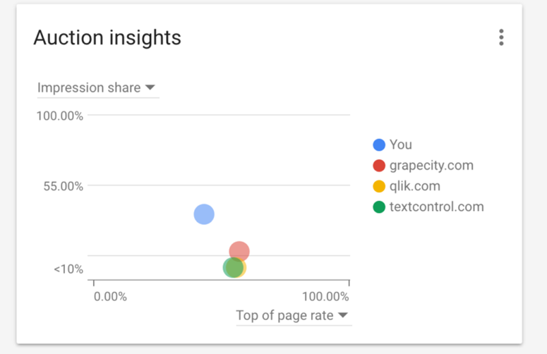
The old home screen has been replaced by an Overview tab, which is simpler and allows the user to get a snapshot of sortable tables with metrics you can personalize. The graphics are pretty slick and often give more in-depth details when one scrolls over them, like the Auction Insights graph here:
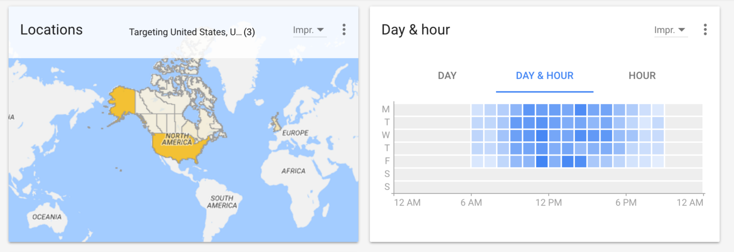
Or the graphical view of hour of day clicks.
You’ll find some headings have been moved away from the sidebar, which is now crowded with campaigns and the second row of tabs that used to live at the top of the screen. Among these, Shared Library and Bulk Actions have been sent to the top right side to live with conversions, setup, billing, keyword planner, and other tools. It remains to be seen where Labels, Experiments, and the Campaign groups will live in the new interface.
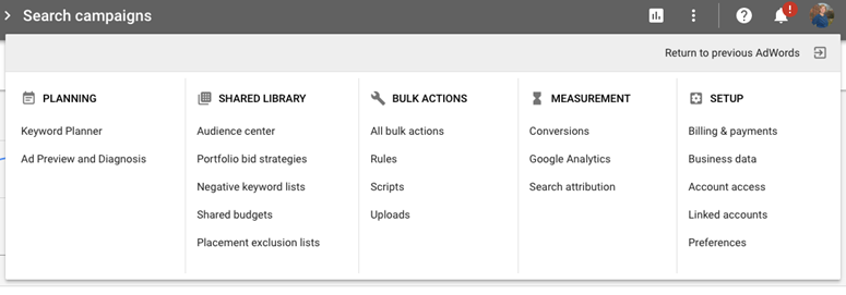
Adjusting to the new layout involves a lot of flipping between the campaign and ad group list and the exterior menu. The former does not disappear until one clicks out of the menu, and once it’s gone you can’t look back to check which ad group you are accessing without re-opening the menu. Allowing the campaigns and ad groups to stand by while editing would reduce the amount of clicking around, however, it may make the actual work screen smaller.
Finding What You Need
The first thing you’ll notice is that all elements are in place, but they just feel slicker. The dashboard scroll is noticeably smoother and many text elements are replaced with graphic buttons, like so.
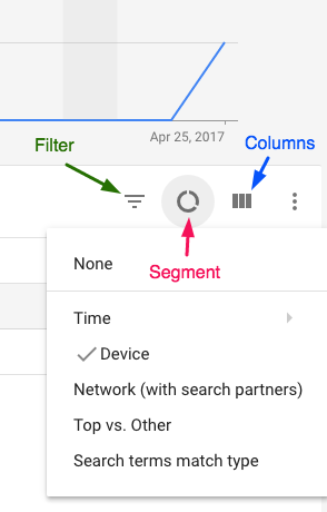
It took me a little while to get used to the new filtering view, which does not neatly categorize the filters as was previously done but instead lists them in one long alphabetical list. Hopefully, Google will bring back categories which make filtering much easier when one is browsing and trying to feel out which filter to pick.
Here’s a laundry list of some more neat features:
- The columns are adjustable, which comes in handy when you’re trying to view the dashboard on a small screen. You can eliminate sideways crowding!
- Ads & extensions are bundled into the same tab (which makes sense, because they live side by side in the SERP.) One drawback is that extension levels are now indicated in the columns, not in a section below the extensions. This makes checking the level of different extensions a bit more cumbersome.
- Change history is much more visual. You can see how many total changes have been made on a campaign basis and by campaign type at a glance.

- The location targeting is super visual now. I would be excited to use this feature in a more locally targeted campaign.
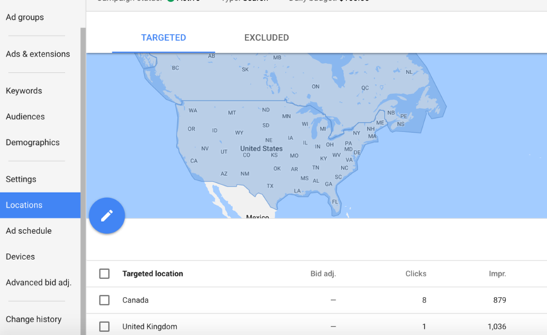
- Creating new campaigns, ad groups, keywords, extensions, etc. is indicated by the always present big blue “+” button.
- Some of the old dimensions from the dimensions tab are missing, but many of those that are present are much easier to find in the places that they best make sense, like when you navigate to “Ad Schedule” you’re given the choice of viewing “Day & Hour,” “Day,” and “Hour.” “Day of Week” is missing. When looking at the “Locations” tab you can see the user locations dimension. I should think that Google will fill in the missing data points as the new dashboard rolls out to all advertisers.
New Filtering Suggestions
The most striking difference I feel are the way filters work in the new AdWords dashboard.
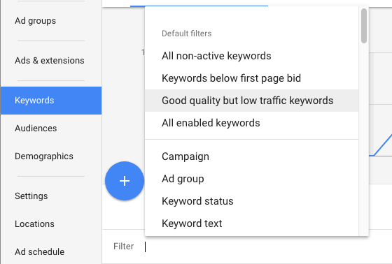
AdWords has added some new filters such as “Good quality but low traffic keywords.” The filter is automatic and fills to the settings of a quality score over 5 and impressions under 1,000. This is an extremely broad assumption to make, depending on what kind of business you are advertising in AdWords and what goals you’d like to achieve. The new default filters have the potential to either be a useful broad-spectrum tool or completely irrelevant to your needs. Be sure to take these new filters with a big grain of salt and review your goals before taking Google’s one size fits all analysis into practice.
Conclusion
The new AdWords dashboard is pretty fun to play with. The graphical elements are stellar, and I can see the overview tab being something I actually use (as opposed to the very old and outdated Home tab.) There are many elements of the dashboard that continue to push AdWords automation which could leave some agency types a bit bristled, but overall I think AdWords has balanced the beginner-friendly elements, such as the Opportunities tab which is front and center next to Overview, with a dashboard that makes moving through options as an expert very smooth.
It’s also nice to find some parts of the dimensions tab in places where they better fit. I hope that all AdWords elements are eventually added to the new dashboard, such as the missing dimensions, labels, and experiments. I’m sure it will feel like second nature after just a bit more practice in the newly designed navigation.


