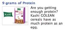
One of the better Facebook ads I’ve seen lately was this ad for Kashi GoLean cereal:

And what struck me was the headline. Not a great headline if you’re not dieting, but if you ARE trying to lose weight, you’re likely on some flavor of high (or at least higher) protein diet such as The Zone or Atkins or South Beath.
And if you are on one of those diets, then the idea of a cereal with 9 grams of protein becomes very interresting — especially if you don’t particularly care for eggs, or have become sick of eating them every morning.
Then agian, it could be argued that the ad burried the lede — that the “as much protein as an egg” is actually a more vivid promise than 9 grams of protein, since a lot of people have no idea how much protein that is.
Still, I’d argue that for those on the aforementioned diets, they DO know how much protein 9 grams represents, and they WOULD find the claim intriguing.
But either way, the image sucks. It’s a classic “make my logo” bigger mistake, in my opinion. What you need is an image that’ll reinforce and hit with as much punch as the headline — but something that’ll get the point across with all the speed of visual communication.
So here’s the kind of image this ad REALLY deserves.
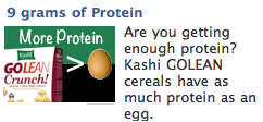
Now we get the “as much protein as an egg” equation instantly.
This also allows the headline to serve as substantiation and the “what cereal IS that?” to serve as the enticement to read the copy.
Of course, Kashi fans will KNOW what cereal that is from the smaller logo, but new prospects will be intrigued to find out.
And that’s how the image/headline/body copy should work — each one pulling the reader along, compelling her to continue “consuming” the ad, and ultimately, to click on it.
In other words, a great headline deserves a great image deserves great body copy. Don’t stop till you’ve optimized all three.
