
A lot of the time when someone is asking me charts questions it’s simply a matter of not being able to find the setting option or not knowing if the option exists.
I am going to share a few tips and tricks that I have in my toolbox that may help you better display your data using charts or even just save you time. I will cover how each differs between Excel and Google Sheets and where to find the settings you need.
Changing Data Label Categories
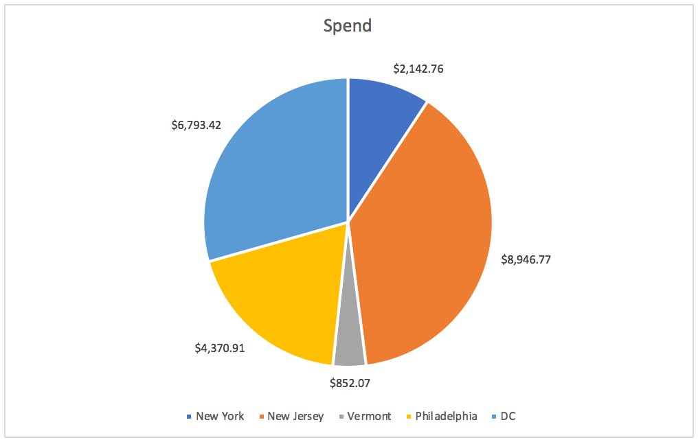
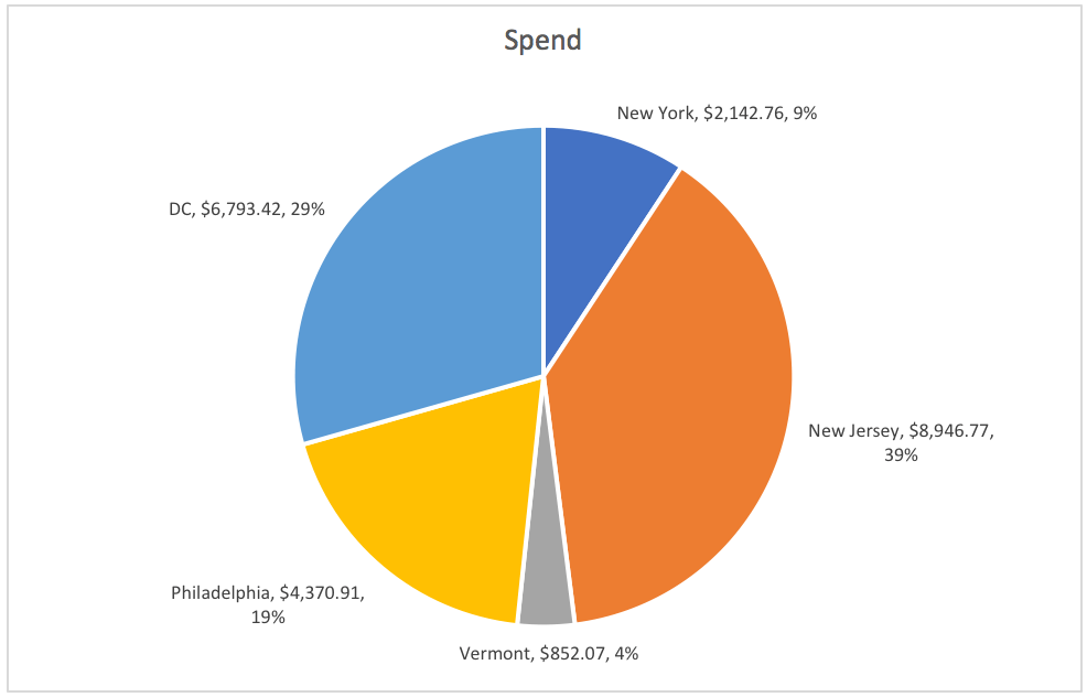
Customizing your data labels can make your chart look cleaner as well as present the pertinent information in a more digestible way. In the pie chart below, the values are listed on the chart while the labels are in a legend below. Visually this does not make much sense as you’ll have to bounce back and forth to match up the labels with values.
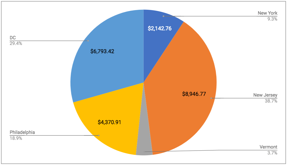
There is a better way. In Google Sheets instead of selecting where to place your legend, you can choose to have the legend show as labels. This will show the categories with percentages and your data labels as values so you have everything you need.
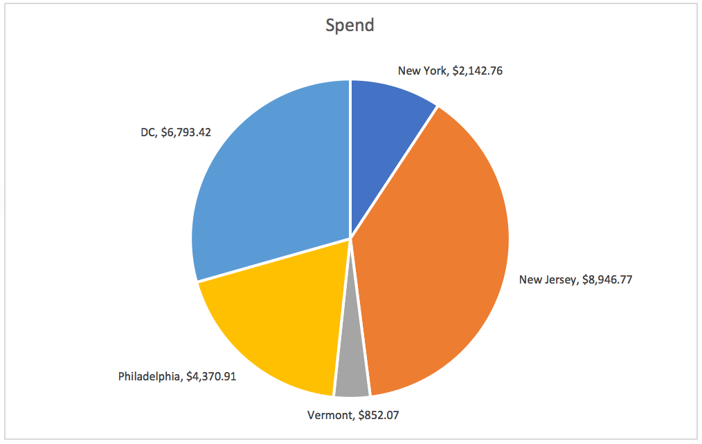
Unfortunately, this is not as easy in Excel as this option does not exist. In Excel, you do have the option to change your data labels but it’s not quite as clean. For example, you can place a combination of your category name, values, and percentages on the chart, but it smooshes it all together. I would recommend sticking with the category name and either the value or percentage, but not both.
Second Axis
Dual Y-axis charts are useful to show the trends of two variables with very different scales and/or with different numerical units, such as currency and number value. This is easily accomplished in either Excel or Google Sheets. Below are a before and after shot of a line chart showing the difference a second Y-axis makes.
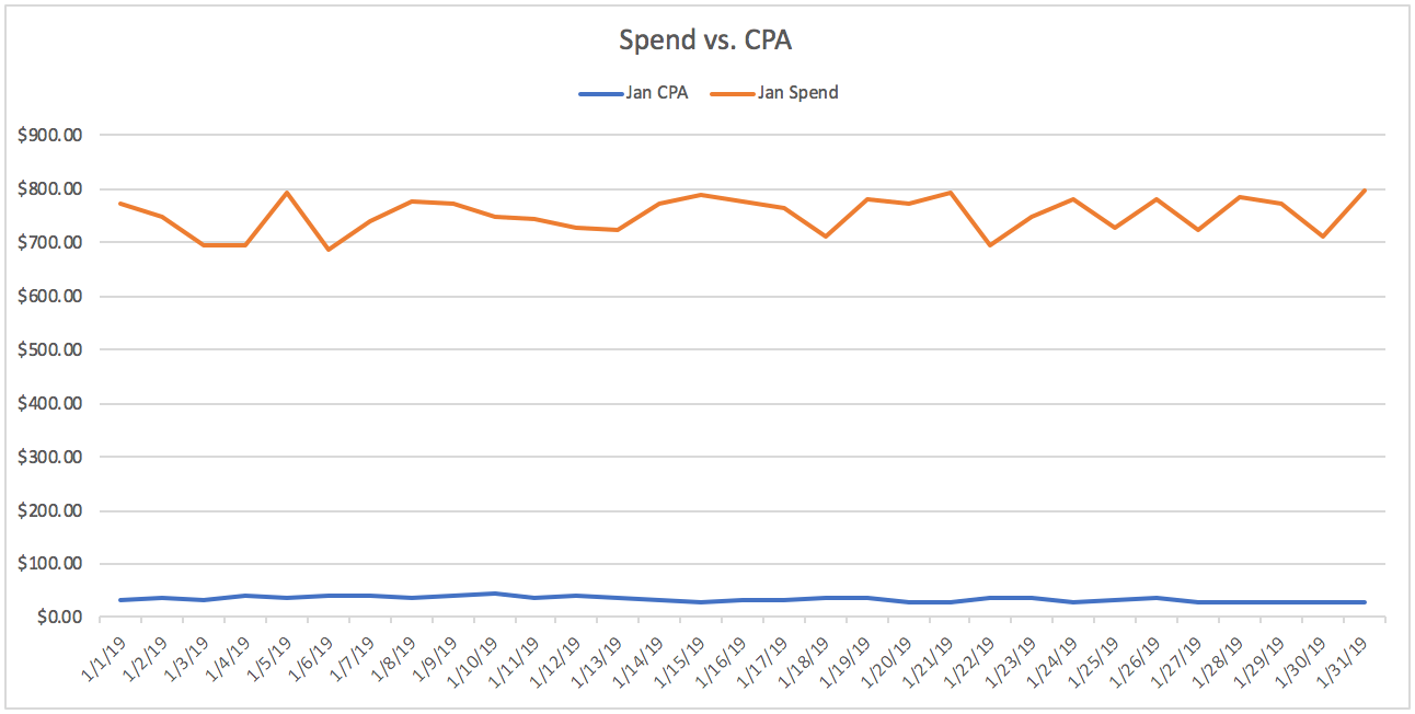

Per the usual, you’ll find navigating to the setting options slightly different between Excel and Google.
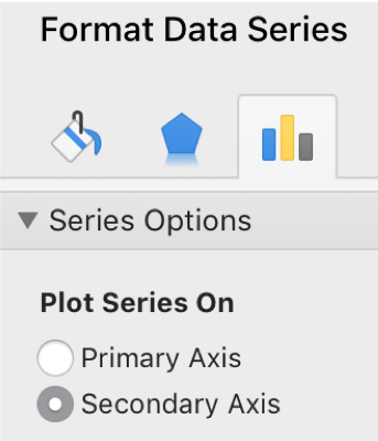
In Excel, go to add chart element –> axes –> more options and then click on the line within the graph that you want to place on a second axis. Select secondary axis and you’re set.
In Google, select the chart–> customize (on the right-hand pane) –> series –> select one of the series –> change axis drop down to right axis.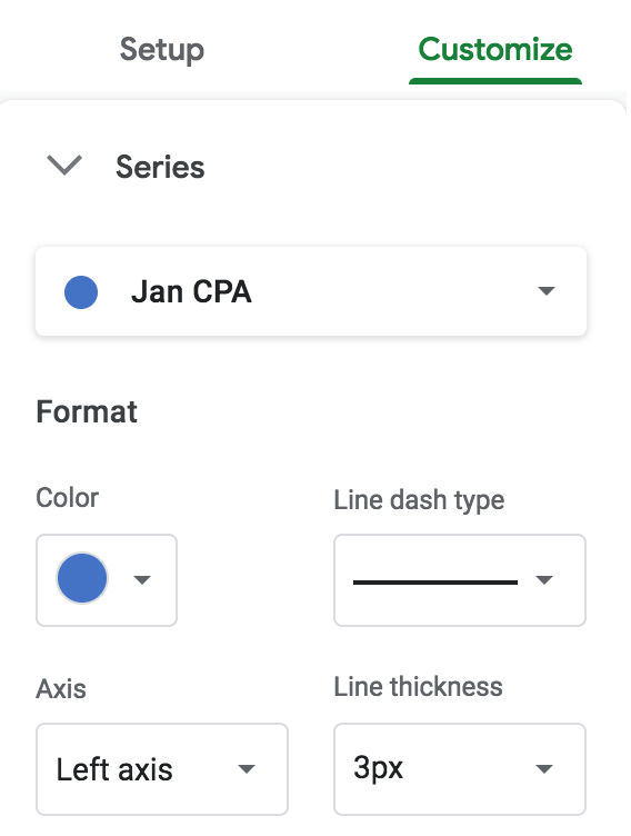 Reverse Y-Axis
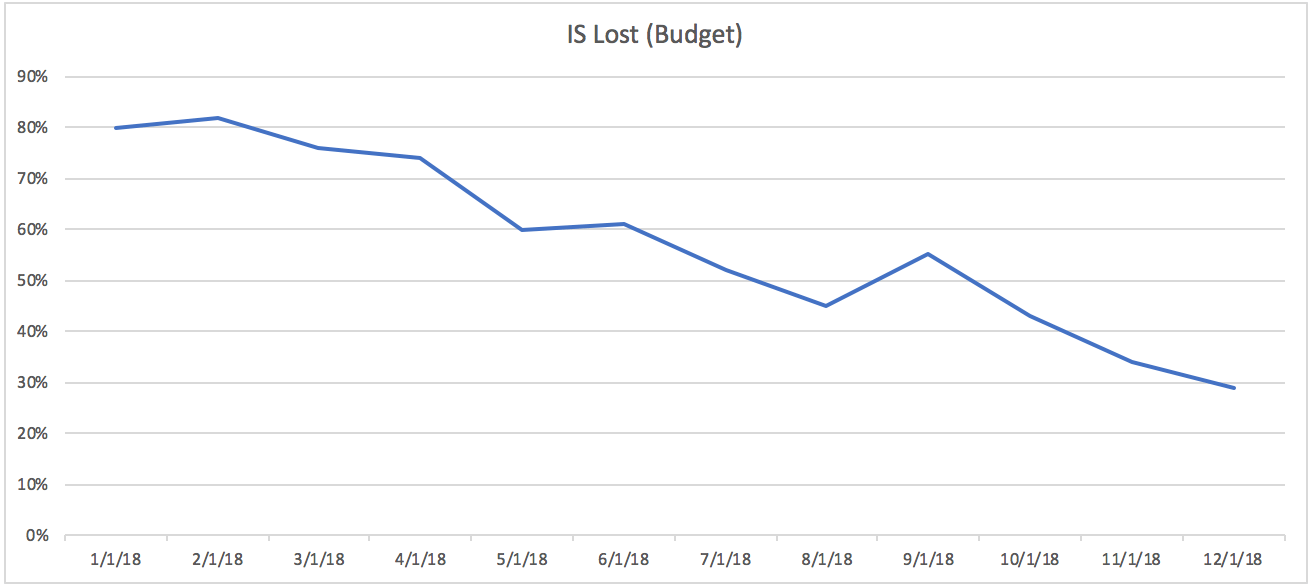
When working with metrics that are represented inversely of other typical metrics, the reverse Y-axis comes in handy. For example, clicks is a typical metric where more is better. On the other hand, impression share lost is a metric where more is not better.
Take a look at the chart below where impressions share lost is in the default chart layout. Glancing over this chart our beautiful human brain initially thinks, “the trend is going down and that’s not good.” This chart is visually difficult for our brains to interpret quickly, which defeats the purpose of charts.
Switch the Y-axis order and you get this:
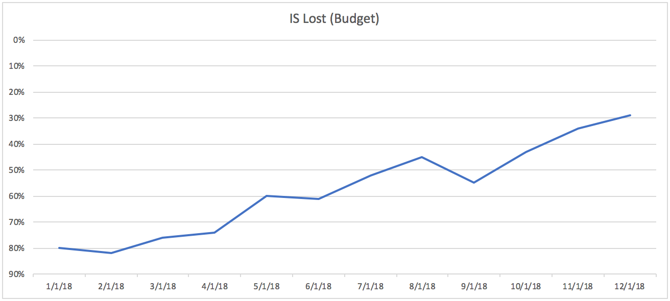
Much better!
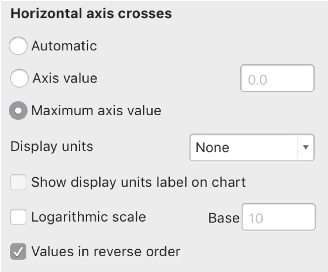
In Excel, select the Y-axis, and check the “values in reverse order” box AND choose the “maximum axis value” option. If you don’t select this latter option it will put your X-axis on the top of your chart.
In Google Sheets, reversing the Y-axis is not an option. Lame, I know. I prefer Google Sheets for most things and this kills me. In this scenario, I pull up my trusty Excel.
Connecting Charts to Presentations
I saved the best tip for last, in my opinion. When creating charts for presentations you can link your presentation charts with your actual spreadsheet charts so that if any changes are made they are updated in your presentation. It sounds like an insignificant tip. But I can’t tell you how much time I have saved by using this feature versus taking screenshots and pasting them only to realize I missed some formatting on the chart and have to do that all over again. Multiply that by 50 charts for a large presentation and it is cumbersome.
You’ll have to pick a favorite and stick with it for your spreadsheet and presentation though. Excel connects only to Powerpoint and Google Sheets connects only to Google Slides.
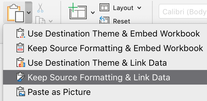
For Microsoft fans, copy your chart in the Excel spreadsheet and paste it into your Powerpoint using the paste special options and select link to data.
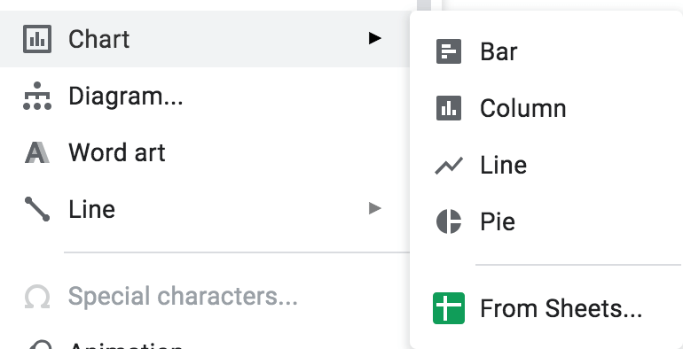
For Google die-hards, in Slides select insert –> chart –> from sheets. It will ask you to select the sheet you want to pull the chart from which you can find searching by file name.
Bonus Tip
While very common and preferred by a lot of people and clients, using a second Y-axis is not the data nerd way of displaying two series. If you want to get serious, read Why not to use two axes, and what to use instead.
Final Goodbye
That’s it for this article but don’t that stop you. Once you master these initial chart tricks keep on finding other ways to create bewitching charts that tell your data story.
