Mobile A/B Testing: 7 Big Errors and Misconceptions You Need to Avoid


It’s no secret that marketing overall rests largely on data. The same applies to mobile marketing and user acquisition. In this domain, choosing the right product page elements for the App Store and Google Play can make a crucial difference to the success of an app or mobile game. Mobile A/B testing is a tool that helps to make that choice based on data.
However, how many times have we heard the argument that A/B testing doesn’t bring the desired results, or that someone is not sure they run mobile experiments right? This often happens due to some common mistakes and misinterpretation of data. In this post, I will cover the biggest mistakes and misleading conclusions in mobile app A/B testing, knowledge of which will help you achieve success.
1. Finishing an experiment before you get the right amount of traffic
This is one of the most common mistakes in mobile A/B testing. In case you are an adherent of classic A/B testing, finishing an experiment before you get the necessary amount of traffic – sample size – presents a risk that you will get statistically unreliable results.
To get reliable evidence, you need to wait until the required amount of traffic is reached for both A and B variations.
If you are looking for an alternative to the classic option, resort to sequential A/B Testing. You will need to start with specifying the baseline conversion rate (conversion rate of your current variation), statistical power (80% by default), significance level and the Minimum Detectable Effect (MDE) – this will help you determine the sample size.
The significance level is 5% by default, which means the error margin will not exceed 5%. You can customize this value along with the MDE – the minimum expected conversion rate increase you would like to see. Note: don’t change the significance level, MDE or statistical power after you’ve started an experiment.
With sequential A/B testing, the algorithm will constantly check your variations on significance level and the amount of traffic left until the completion of the experiment. That’s how it works on our SplitMetrics A/B testing platform.
Lesson learned: if you run classic A/B tests, don’t finish an experiment until the right amount of traffic is reached. Or else, try sequential A/B testing, and you will be able to check the results at any time.
2. Finishing an experiment before 7 days have passed
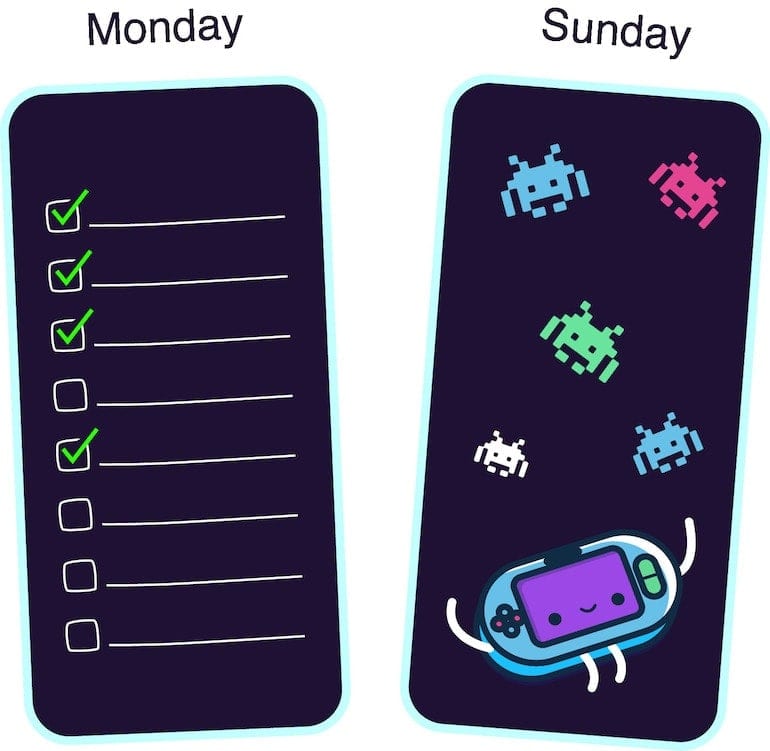
Why do you have to wait for at least seven days? Well, various apps and mobile games experience peaks in activity on different days during the week. For example, business apps watch bursts in activity on Mondays, while games are most popular among users on the weekends.
For getting reliable results from mobile A/B testing experiments, you should capture peak days of your app during an experiment. Otherwise, you run the risk to jump to conclusions.
For example, you run tests for a task management app. You start an experiment on Wednesday and finish it on Saturday. But most of your target audience is utilizing your app on Mondays, so you will just miss the point since the surge of activity hasn’t got into the experiment period. Or vice versa, you’ve been running A/B tests for your racing game from Friday to Sunday: on the game’s peak days. In this case, the results will also be inadequate.
So, even if you’ve avoided the number one mistake and have already got the required amount of traffic on the very first day, don’t stop the experiment until seven days have passed.
Lesson learned: due to weakly peaks in activity that vary for each mobile game or app, do not finish an experiment before the complete (seven-day) cycle has passed.

3. Testing too small changes in design
One more common mistake in mobile A/B testing is comparing variations that look almost the same due to minor differences in design.
If the only difference between the mobile app icons you are testing is a blue background color instead of the light blue, or you have added a tiny detail to another screenshot variation, you are definitely in trouble. Users just do not notice such small changes.
In this case, both variations will show the same result, and it’s perfectly normal. So if you ever tried to run the app store A/B tests but then gave up on them, since variations performed equally, it’s time for reflection on what went wrong. Maybe your variations looked pretty much the same.
To make sure you are A/B testing a significant change, show both versions to your family or friends. Let your colleague look at each variation for 3-5 seconds. If they don’t know the difference, you’d better redesign your visual assets.
Lesson learned: in case you test variations with too small changes in design, you should expect that they will show the same result. Such changes are too insignificant for users, so it’s better to test app icons and screenshots that differ markedly from each other.
4. Your banner ads have the same design as one of the app store visual assets
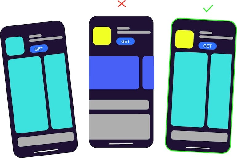
If you use a third-party mobile A/B testing tool, like, for example, SplitMetrics, you buy traffic and place banners on ad networks. The point is that such a banner shouldn’t look like one of the visual assets you are testing, whether it is a screenshot or the same elements on an icon.
For example, you run experiments for your educational app. You design a banner that has the same element, as the icon from the variation A, while the variation B is completely another icon. Variation A will show the higher conversion rate, since it has the same design, as the banner users initially saw and clicked on.
Studies show that if people see something repeatedly, their brain processes information faster, which brings them a sense of liking. You can read more about it here. So, users tend to unconsciously tap on the already familiar images.
Lesson learned: when working on banner ads, make the design as neutral as possible. The banner design should not coincide with the design of your app’s icon or screenshots variations.
5. Testing several hypotheses at once
It makes no sense to make multiple changes and test them within the same experiment. Some mobile marketers draw the wrong conclusions after running a test, since they have made several changes and, in fact, cannot know what exactly affected the result.
If you have decided to change the color of your app store product page screenshots, create one or a few variations with another background color and run a test. Don’t change the color, order, and text on the screenshots at the same time. Otherwise, you will see the winning variation (let it be the variation B), and you will have no clue if it is the color change that actually worked.
Lesson learned: if you test multiple hypotheses at once, you will not be able to understand which one of them is correct.

6. Misinterpreting the situation when two variations are the same but you get a winner
When running A/A tests, you might be confused when an A/B testing tool is showing the winning variation among two identical assets. In particular, this is common for the Google Play Store’s in-built tool for running experiments.
On the SplitMetrics platform, at the 5% level of significance, in such a case, you will see that the result is insignificant.
Small differences between two exactly the same variations are pure coincidence. Different users reacted a little differently. It’s just like flipping a coin: there is a 50-50 chance you’ll get heads or tails, and there is a 50-50 chance one of the variations will show a better result.
To get a statistically significant result in a situation like this, you should get results from absolutely all users, which is impossible.
Lessons learned: if you get the winning variation when testing identical assets, there is nothing wrong with your A/B testing tool, it’s just a coincidence. However, with sequential A/B testing, you’ll see that the result is insignificant.
7. Getting upset when a new variation loses to the current one
Some mobile marketers and user acquisition managers get disappointed when an experiment shows that the current variation wins, which they didn’t expect, and start wasting a budget on more paid traffic in the hope that the new variation will eventually win.
There is no reason to feel bad if your hypothesis has not been confirmed. If you had changed something on your app store product page without testing, you would have lost a part of your potential customers and, consequently, money. At the same time, having spent money on this experiment, you have paid for the knowledge. Now you know what works for your app and what doesn’t.
Lesson learned: everything happens for a reason, and you should not be sorry if your A/B test hasn’t confirmed your hypothesis. You now have a clear vision of what assets perform best for your game or app.


