New AdWords Interface In Beta: See What’s New, Different and Better – Part 1

A few months ago our Adwords reps told us about a new Adwords interface they’re testing out and wanted to know if we would like to be a part of the beta. Of course we said yes, and today I’ll show you what’s different, how it works, and what I think is better or worse compared to the old interface. This is only part 1, so stay tuned next week for Part 2! Be sure to click on any screen shot to make it larger.
Campaigns Tab Features
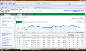
The campaigns tab doesn’t look too different, with the exception of a few new items:
1. Graph above all campaigns (identical to Google Analytics)
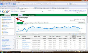
2. Campaign list in left hand navigation
3. Help section in left hand navigation
4. There’s a new Tools tab at the top navigation instead of having all the tools listed as the sub-nav in the campaign tab.
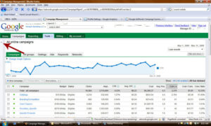
5. New tabs above the graph area that allow you to click on all campaigns, ad groups, settings, ads, keywords and networks.
Left Hand Navigation
I don’t really understand why we have all of our campaigns listed in the middle of the page, then again off to the left hand navigation. I’m guessing because you can switch the middle of the page to show your campaigns, ad groups, keywords, etc. But the good news is if you don’t want your campaigns to show in the left hand navigation, you can click the little arrows button and the left hand navigation will move over and off the page. If you want the left hand nav to come back, all you have to do is click on the little arrows again and it will slide back over. Doing this will also hide the help section located directly below your list of campaigns.
New Graph
For the graph, like that of Google Analytics, you can switch date ranges as normal, and you can change your graph to chart different data, hide the graph or add filters to your graph.
Campaign Status Meanings
The main campaigns section looks very identical with the normal interface, there is one new thing I noticed under the ‘status’ of your campaigns – instead of paused, deleted and active, it’s now paused, deleted, eligible, pending, ended, suspended and budget constrained.
- Eligible status means your campaigns are just that, ‘eligible’ for activation in Adwords, but that doesn’t necessarily mean all your ad groups and keywords/ads are active. They could have issues like low search volume, another keyword in an ad group is already displaying ads for this keyword, etc.
- Pending status means that a campaign may have a start date set in the future and hasn’t begun to show ads yet. Campaign pending can show for an ad group, ad or a keyword that is in pending status.
- Ended status means your campaign has an end date set in which it has already met and therefore isn’t showing ads any longer.
- Suspended means your pre-paid account balance has run out. After you add funds to your account your status will return back to eligible.
- Budget constrained means your campaign is not receiving as many impressions as it could because the budget is too low. In this case you could increase your daily campaign budget and your status should go back to eligible.
Changing (some) Campaign Settings from the Main Dashboard
- Another cool thing that is different on the campaigns tab is that you can click the little drop down off to the left of your campaign name in order to pause, activate or delete the campaign.
- You can also rename your campaigns more easily by clicking on the ‘edit’ button that looks like a square with a pencil in it to the right of your campaign name.
- You can also change your daily budget at the campaign level by clicking the budget box next to the campaign you wish to change in the budget column. I really like this feature!
Adding a New Campaign – Very Cool!
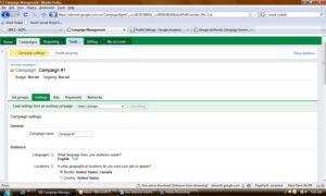
When you click on the ‘new campaign’ button from the campaigns tab, this looks quite different, but really it has the same functionality as the old interface.
1. You can either load settings from an existing campaign to save yourself time. Or you can set up new settings.
2. You start by naming your new campaign as normal.
3. Then set audience languages and locations/geo-targeting options and demographic settings if you wish.
4. Networks and devices are next which allow you the same settings as the current interface; search, content, and devices.
5. Then you set your bidding and budget options. There is a basic option and an advanced option.
o The basic option includes setting your bids manually to what you want, or you can now choose automatic bidding to try and maximize clicks for your target budget. Which essentially means that Google will decide how much you need to bid for each keyword to maximize your daily budget.
o The advanced options you can choose whether or not to focus on clicks and use maximum CPC bids, you can focus on conversions by using maximum CPA bids or you can focus on impressions by using maximum CPM bids. You may notice that some of these options are not available if you do not have conversion data set up, etc.
6. After you set your bidding and budget options, you can set your bid to position and delivery methods. These two options allow you to set up position preference as normal, and delivery method to either standard or accelerated. The standard shows your ads evenly over time, while the accelerated option shows ads as quickly as possible.
7. Advanced campaign settings includes scheduling your campaign start date and end date and ad scheduling, as well as ad delivery, ad rotation, frequency capping.
8. Once you hit ‘save and continue’ you’ll be sent to the next screen to add in your new ad groups. The ‘new ad group’ link works also very different from the old interface.
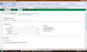
Adding a New Ad Group
1. The first step is to name your ad group.
2. Second is to create your ad in the same screen.
3. And third is to select your keywords again, in the same screen.
4. Towards the bottom of the new ad group screen you can add placements
5. And finally you can set separate bids for your ad group for search, content (manage placements) and content (automatic placements).
My Opinion So Far…
So far, I think the new Adwords interface is pretty cool. I really like the way they have it set up to add a new campaign and new ad groups. Getting to add in your data and settings in one screen versus having to go to multiple screens is great and I think will save people time. Especially when people forget to go back and check their campaign settings with the current interface, now they won’t have to worry about that with the new interface, the settings will be right there in the same screen.
One thing I hate is the left hand navigation with the list of campaigns and help section. Even though you can click on the little arrows to move the left nav over, if you click in that area it pops back over, and I keep having to click the arrows to move it back over again. I almost with they would do away with the left hand navigation altogether.
Is anyone else out there using the new interface? If so, what are your thoughts about the main campaigns tab and campaign creation tool? I’d love to hear your feedback.
Next week I’ll dive into the Tools, Billing, Reporting and My Account tabs!


