Visual Striking Photos: Beyond Head Shots of Pretty Women

This is the sixth in a weekly series of posts from one of our PPC Hero Allies, Jeff Sexton of BoostCTR, where he’ll dissect and analyze ads he sees various places online. Jeff’s “Ads In The Wild” series will give an in-depth look at the philosophy and strategy behind these ads and will provide actionable advice for anyone looking to improve their ad copy.
Before an ad can do anything, it has to be consciously looked at.
And that means the photo had better be eye-grabbing, or at least interesting. And while it’s fairly easy to pick out subject matter that we’re hardwired to pay attention to — stuff like faces and pretty women — you might find that alternative, and perhaps more advanced techniques work even better.
Among those advanced techniques is the use of extreme foreshortening to create visual interest. Foreshortening is a trick of perspective whereby closer objects appear bigger than objects further away. Amplifying this effect, and using it in conjunction with an unusual perspective can ad drama to a photograph or picture.
Here’s how advertising great George Louis describes both this traditional artistic technique and it’s application to advertising in his book, George Lois: On His Creation of The Big Idea:
“…The lamentation over the Dead Christ was on of the last works of Andrea Matnegna, the most sublime of the northern Italian painters of the Renaissance, who created masterworks full of tension through bold use of perspective, and very high or low viewpoints… This great easel painting was in Mantegna’s studio when he died… Unprecedented in the history of Christian art, Mantegna gives us a view of the pierced soles of the Redeemer’s feet, which are hanging out towards us over the edge of a mortuary slab, as his internment cloth molds itself to his body and to the slab as though they were wet. The breathtaking, rapidly vanishing perspective, beginning at the feet of Jesus, forces us to be transfixed by the sight of the wounds to his feet and hands. The skin cracks dryly around each wound, and his body lies pallid on the reddish slab, the figure drained of blood. Two mourners are at the side of Mary, excruciatingly drying her tears, with the composition radically cropped at the upper left-hand corner… In my High School of Music & Art history of art course on the Renaissance, my first sight of the Dead Christ, lying prostrate, hist toes a foot from his chin, absolutely floored me” [Emphasis mine]
And here’s how Lois took this art lesson and applied it to advertising:

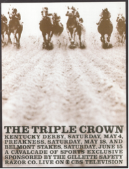
“… I bolted out of the starting gate at CBS Television with the assignment to design a cover to a sales promotion and advertising kit for its most important sports spectacular and ratings winner of the year, the Triple Crown… I dug up a news shot of a phalanx of thoroughbreds pounding around a turn as seen by the hoi polloi cramming the rail. I went out to the Belmont Park racetrack on Long Island to photograph fresh turf, took a ground level photo, in head-on “Mantegna perspective,” and printed the two picture to create one image. You would have thought I had taken the photo lying on my belly on the track (and given my life to my network). The chilling image of a photographer about toe trampled to death obviously caught the eye of the pro news photographers — I was shocked to read in the New York Daily News that my doctored assemblage was named the best sports photograph of 1954 by the New York Press Photographer’s Club!”
And here’s how this same trick of visual foreshortening can be used of Facebook Images:
Notice how this ad goes beyond just a close-up on a child’s face, but ads in the visual dynamic of foreshortening, whereby the slingshot gets magnified larger than life, taking center stage — an effect only heightened by the radical cropping of the image so that practically the whole canvas is taken up by the sling shot and the girl’s two eyes as they take aim at you.
Combine that with the lime green side borders, and you end up with a photo that’s pretty hard not to notice and look at. More importantly, it’s a photo that begs explanation; it has loads of story appeal. So not only do you notice the photo, but you end up reading the ad copy to get some context for this visually striking photo.
But take note: a chubby bumble bee is cute, despite the implicit threat of his stinger, but a lean wasp has passed beyond cute to threatening. In other words, there’s a reason aimClear counterbalanced the “threat” of the slingshot aimed at your face with the cuteness of a little girl.
Just check out how much more threatening foreshortening can be when it’s not mediated by a touch of cuteness:

Yup, there’s good ol’ Eminem daring (or threatening!) you to love Chrysler again. And it’s almost the only part of that ad that garnered a negative emotional reaction. No wonder, right?
So by all means, use some visual foreshortening to amp up the impact of your Facebook Ad Images, just make sure to keep it friendly, or you could make the image to vividly alarming for your own good.


