Analyze Your Account in Minutes With Excel

This week, we’ve been focused on giving you all kinds of tips and tricks with Excel to help you build out your accounts.
- Kayla showed you how to use Excel to estimate new account performance.
- Sean showed you how you can use Excel to find the best budgets for your campaigns.
- Dave showed you some quick tips with Excel filters to quickly structure your keyword lists.
- Amanda showed you how to write ad copy in a flash with various Excel functions.
So now that you’ve projected, budgeted, built out, and written copy for your account using Excel, what’s next?
The long answer? Throwing all of that performance data together to see what you’ve got.
The short answer? Pivot Tables and Formulas.
Use Pivot Tables to Quickly Examine Account Structure
First, you’re going to want to download a Keyword Report using the last 30, 60, or 90 days as your time frame. Make sure it has Quality Score and Match Type information. With this one report, you can generate multiple tables to help analyze your Quality Score and Account Structure.
For Quality Score, I’m going to defer entirely to the great Brad Geddes strategy on Normalized Quality Score as detailed here on PPC Hero. Following his guide should leave you with an actionable list of Ad Groups on which you can focus your Quality Score efforts.
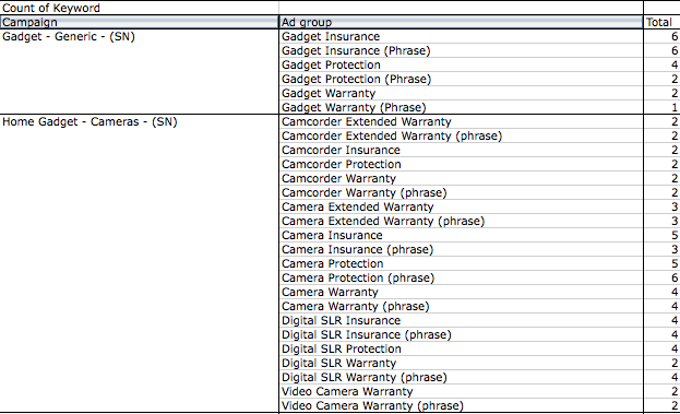
For overall Account Structure, we can use a few other tactics. The first is a simple analysis of Keywords per Ad Group:
- Create a Pivot Table using your Keyword Report.
- In your Row fields, place Campaign and Ad Group (Campaign is optional, but if you have duplicate ad groups across multiple campaigns, it will cloud your data).
- In your Data field, select a Count of Keywords.

This provides you with a quick count of keywords per Ad Group. You’ll be able to diagnose any Ad Groups in need of a breakout in short order. A helpful tip as we go forward, if your version of Excel is anything like mine: Hide Campaign and Ad Group Total rows, they tend to get in the way.
This time, we’re going to take a look at Match Type performance across the account (Or, if you prefer, across campaigns and even ad groups).
- Create another Pivot Table.
- Use Match Type as your primary statistic in the Row field (preceded by Campaign and Ad Group if you’re looking to get granular).
- In your Data field, select Count of Keyword, Sum of Impressions, Sum of Conversions, and Sum of Cost.
- Now, to get an idea of the percentage breakdown, add in another four rows dividing each statistic detailed in the last step by the grand total at the bottom. And remember, placing a $ in front of the cell number makes it a constant, so the formula is a breeze (so the formula would be something like =B5/B$10, as in the example below.)

This gives you an idea of how each Match Type is performing in this account, and an idea of where to focus your efforts. In this particular account, Broad match terms were mainly comprised of branded terms, hence the great CPA. But this is another quick tip to see which Match Types are carrying the load in your account.
You can do a similar breakdown regarding the percent of Low Search Volume keywords in your account, Count of Ad Groups, or any other statistic you can think of all through the magic of Pivot Tables.
Use Pivot Tables to Quickly Examine Your Ad Copy
You thought we were finished with Pivot Tables, didn’t you? No such luck – it’s the utility belt of PPC Heroes everywhere. Next, download an Ad Report over the same time frame.
To start, you can perform another Count of Ads per Ad Group.
- Generate yet ANOTHER Pivot Table.
- Put “Ad Group” in to the Row field (And Campaigns, too, depending on the naming structure you’ve chosen for your Ad Group).
- Then, select “Count” of any of your ad lines for the Data field – it doesn’t matter which, we’re only concerned with how many there are, not their content.

Again, another quick tip to provide you with a breakdown of ads per Ad Group. If any of the numbers are off, you might have some ad tests you need to conclude.
Depending on how you’ve structured your latest round of Ad Testing (See: Amanda’s post yesterday), you have a few options available to you to sort through the data.
First, insert an extra row beside your Description Line 1 and Description Line 2 columns and concatenate the two rows together like so:
=CONCATENATE(C2,” “,D2)
This will provide a handy one-stop shop for you to review your data later on.
Now, you could go through the ad report, line by line, examining each individual ad in painstaking fashion, or you could use some more Pivot Tables.
- Create another Pivot Table out of the Ad Report.
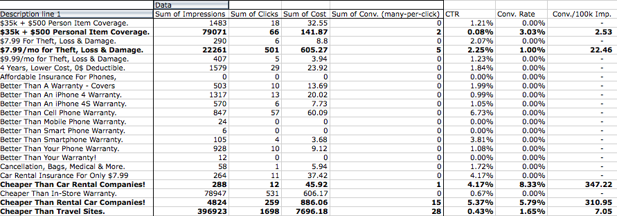
- In the Row Field, place your Headline, Description Line 1, Description Line 2, the combined Ad Copy we just made above, or Display URL. Or, heck, use all of them. Throw in Campaigns and Ad Groups as well if you’re feeling bold – this is more about the overall copy performance, but you can get as specific as you’d like.
- Throw in your performance metrics, specifically Sum of Impressions, Sum of Clicks, Sum of Cost, and Sum of Conversions.
- Then, calculate the CTR and Conversion rate of each ad/ad element next to your Pivot Table.
- Finally, add in Evil Genius Jeff Allen’s Conversions Per 100k Impressions Formula in the last column.

This gives you a quick breakdown of each ad element, either individually or together, and how they perform on an account-wide basis. But, you’re still just looking through copy on a line-by-line basis. There are fewer lines, but we can do better.
Remember that aggregate line of copy we made using the concatenate function? It’s time to put it to use. Examine your copy looking for similar themes and make a list – they could be terms you’ve used, products, calls to action, anything. We’re going to make use of the SUMIF function.
Taking the list you’ve compiled above, create a new tab in your spreadsheet. Enter in the items you’re looking to test in one line, and prepare some columns for your other performance metrics – Conversions, Cost, Impressions, Clicks, etc. Now, use the following formula:
=SUMIF(‘Ad Report Tab’!Aggregate Copy Column:Aggregate Copy Column,”*test copy*”,’Ad Report Tab’!Metric Column:Metric Column)
So… that’s fairly indecipherable, I know. In practice, it will look like this (depending on your column layout):
=SUMIF(‘Ad report.csv’!E:E,”*sign up now*”,’Ad report.csv’!S:S)

Where column ‘E’ is the aggregate copy column, and ‘S’ measures conversions. This will sum up the conversion data for all instances of copy that contain “sign up now”, a call to action in use for this client. You can then change up the text in between the asterisks to test whichever elements of your copy that you’d like in a Darwinian Thunderdome of data analysis, where only the strongest copy will survive.
So there you have it. Excel is easily one of the most helpful tools at our disposal in PPC account management. There are many more complex formulas and tools you can use to help analyze your account, such as VLOOKUP and beyond, but they’re usually in the territory of the North American Bearded Quadlin. As always, if you have any PPC Excel advice, tips, and tricks – leave a comment below. Thanks for reading!


