Data Studio Tips Part 1: Beginner

Welcome to Part 1 of our favorite Data Studio tips!
Google’s Data Studio is a great tool for visualization and reporting, but it comes with its own learning curve. Below are 3 beginner tips that will make your Data Studio life a lot easier.
Learn How to Manage Data Sources
Data sources are the foundation from which Data Studio can work its magic. Without an understanding of how those sources work you won’t be able to change them to fit your needs. Building a basic understanding of this functionality is crucial.
First, you need to see what data sources are currently connected to your Data Studio report. To do this you will need to navigate to the “Resource” section along the top of any page. Then click on “Manage added data sources” to see a list of connected data sources. You also have the ability to add or remove a data source if you choose. If you remove a data source, be sure to verify that it isn’t being used in your report or you’ll break the report.

If you click “edit” you will see all the fields that make up that data source. You can also add a custom field if you need to. These will then be the fields available to you when building out charts or tables in your report. Using this interface to check the fields available to you is a great troubleshooting trick if you’re having trouble finding what you need to build a chart.

One important thing to note here is the “refresh fields” option. This allows you to manually refresh the connection to the data source. Refreshing can be important if there are any changes to the underlying data as Data Studio does not update the connection in real-time. If you are creating dimensions and custom variables directly in the data source rather than Data Studio, this becomes crucial as it allows you to force a refresh and get the changes into Data Studio.
With these basic data source management tips, you can troubleshoot how your data is connected and being fed into Data Studio. For more information, you can check out this Google support page: Manage added reports and data sources.
Page Resizing is a Simple, but Useful Trick
As you start to fill up your report with tables and graphs you’ll often run out of space using the default page size. Your options then become to either add another page or remove tables and graphs. Perhaps you don’t have enough to warrant an extra page, but what you do have is important to the report. It’s here that page resizing becomes your friend.
How do you resize a page in a Data Studio report?
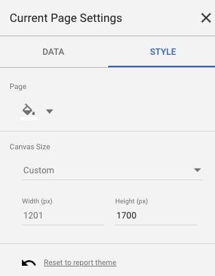
On any page, you’ll need to click on the “Page” option in the top navigation and then “Current page settings” in the dropdown menu. A menu will open along the right of the report and you’ll want to click on “Style.”
Here you’ll see an option for “Canvas Size” with both premade options and a custom option.

With the custom option, you can manually adjust your report’s width and height based on pixels. It’s often best to stick with adjusting the height and keep the width to common monitor sizes. Ideally, you want to keep your report as compact as it can be based on the content you’re filling it with.
Understanding the Basics of Filters
Filters are a game-changer when it comes to tuning your reports and tables with relevant data. They allow you to have a ton of control over what data is available and accessible by those using the report. This can reduce the chance of errors when sorting and interpreting data.
For our purposes, we’ll focus on two aspects: levels of filtering and filter inheritance. These are important concepts to learn before you create your first filter.
The first thing to understand is that filters operate at 3 levels: report, page, and chart. Filters can be created that affect each level. So a report-wide filter applies a filter to the entire report including all pages and charts. Page-level filters affect the page in which they are set, including all charts. Individual chart filters only affect the chart the filter is applied to.
This is important because it is the basis for filter inheritance. Filter inheritance means that certain filters can override other filters in a hierarchy. This looks like the following:
Report Level > Page Level > Chart Level
So if you are creating a chart filter, but a report filter is removing access to certain data the chart filter inherits that filter too. This can be a powerful tool to restrict your access to data, but it can also get you in trouble if you don’t have a grasp on how it works.
For example, it’s easy to have a variety of filters set up at multiple levels and not understand why you can’t see certain data. Perhaps you’ve restricted the time frame at the report level and now you can get the right data in a graph. Or perhaps you’ve restricted a page to a certain geographic location, but want to see data from another location. These are but a couple of examples of where filters might get you into trouble. It’s very important to keep track of your filters!
If you want to dive deeper into filters, there’s more information on the Data Studio filters support page.


