
With the ever-changing PPC landscape, we’re always looking for new ways to access, manipulate, and analyze data. The Account Analyst team at Hanapin has begun working with RStudio as a tool to do just that. This article is a basic intro to RStudio, describing what it does and why you’d want to use it for your PPC endeavors.
RStudio? What the heck is that?
“RStudio is a free and open-source integrated development environment (IDE) for R, a programming language for statistical computing and graphics.” – Source
In a nutshell, RStudio is an interface that enables you to access data and manipulate it via the R programming language. Using an IDE gives better visibility to what you are doing which is great for developing projects and working through a new analysis.
But I like Excel! RStudio Pros and Cons
Pros:
- Pulls data quickly (can pull large quantities of data)
- Can link directly to Google Analytics and AdWords
- Can pull directly from Google Sheets, or an Excel / CSV file
- Generate graphs with simple lines of code
- Repeatable analysis
- Access to wide range of packages
Cons:
- Learning curve – it takes some time to learn and get comfortable with the R language
- Can be tricky to troubleshoot problems
Okay, so what can I do with it?
The short answer is – lots of things! From routine analysis, to regression and statistical analysis, R has a wide variety of uses. So many uses that we could not possibly cover them all in this post, so let’s start with the super basics: a quick look at the interface to get familiar.
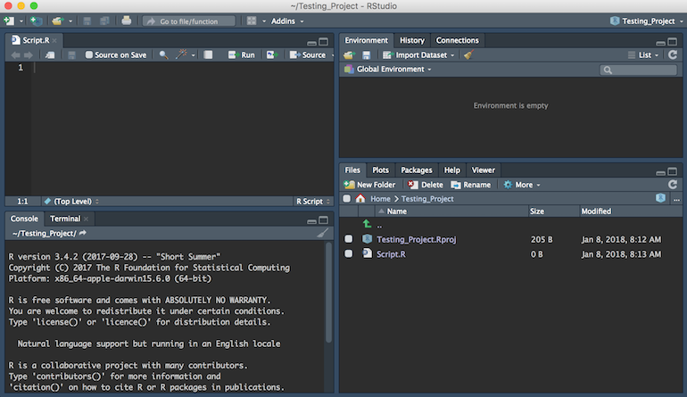
A quick description of the different quadrants:
Upper Left
R Script editor and Data Viewer – write and save your script here and view data sets
Lower Left
Console – you can work directly in the console (for example, if you want to test something out before saving in your script above). When you run your script code this is where your R files will be sourced as well.
Upper Right
Environment – any objects you have loaded into R will be listed here. This includes any variables that you have defined within your script or the console.
Lower Right
Files – this is where you can navigate files located on your computer to load into R
Plots – if you create any graphs or visuals, they are located here
Packages – a list of all the installed packages (A package bundles together code, data, documentation, and tests, and is easy to share with others. Learn more about packages here).
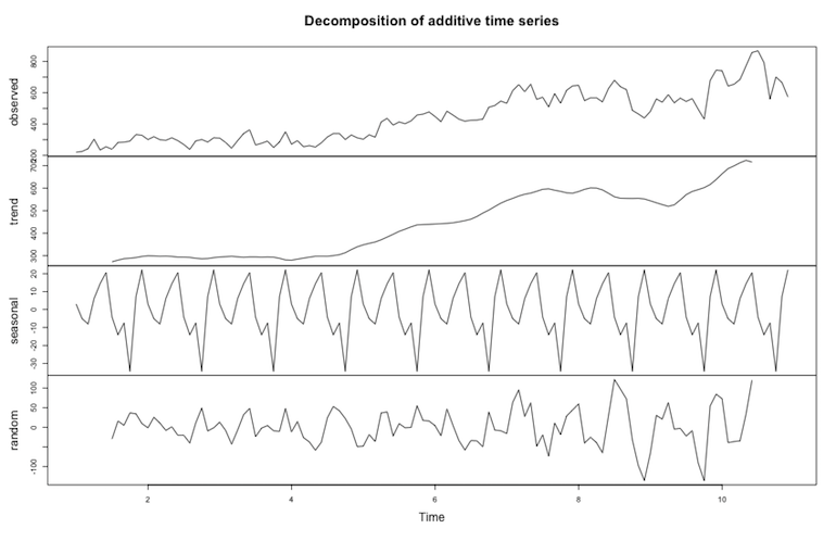
Example: Decomposition
Now we’ll walk through a short example to show you how this all comes together.
The end goal here is to decompose our analytics data to reveal any seasonality and the overall trend of our data.
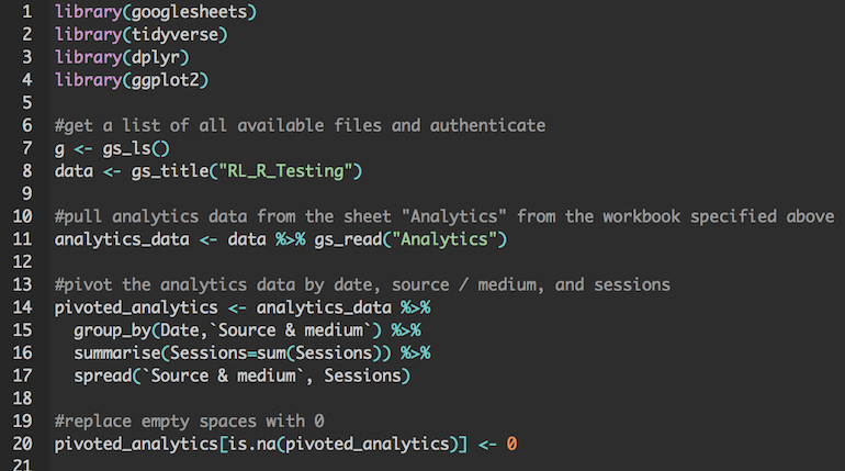
First we need to load the packages that we will use. In this case we’re loading googlesheets, tidyverse, dplyr, and ggplot2.
After we load the appropriate libraries, we can start setting variables and manipulating the data.
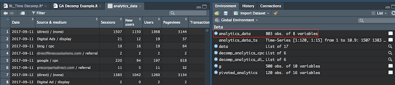
In this example we’re pulling data that has been loaded into a Google Sheet using googlesheets. We authenticate and then call the workbook by name (in this case – “RL_RL_Testing”). Once we specify the workbook name, we specify the sheet name (Analytics). We then assign the contents of that sheet to the variable analytics_data. We can view the contents directly in RStudio by clicking on analytics_data in the Environment window:
Then we’ll pivot our GA data by source / medium, date, and sessions.
To create the decomposition we need to create a time series of each channel in our pivoted analytics data.
Once we do that, we use the decompose() function to process the data. If we want to share the graph, we can define the file name and size and save the file to our machine. Then we call plot() to plot the graph which will also appear in the bottom right quadrant.
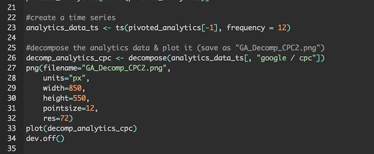
Here’s the end result – four graphs that show observed, trend, seasonal, and random.
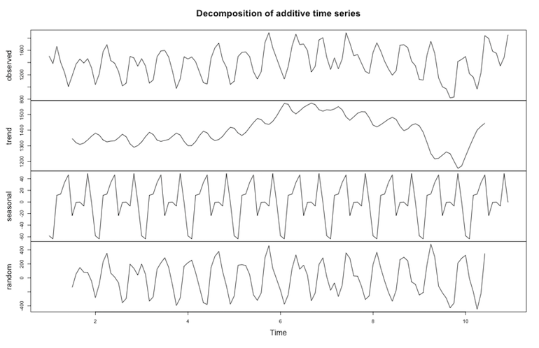
We can repeat the process for (direct) / (none) to compare our CPC data to direct traffic.
As I mentioned before, this is just one of many use cases for RStudio. With RStudio you can also build reports and widgets using Shiny and R Markdown. This allows you to build reproducible, visually appealing reports. I won’t get too much into that in this post, but some resources are listed below if you are interested in trying this out.
Learning Resources
GA & R – an overview of using R with Google Analytics
RStudio Cheat Sheets – handy, easy to read informational sheets
Swirl – a fun way to learn R directly in the RStudio platform
Intro to R Markdown – learn how to write an R Markdown report
Interactive documents: An incredibly easy way to use Shiny – learn how to use Shiny
Closing Thoughts
If you are looking to broaden your programming skills or are just looking for a better way to manage large data sets, RStudio might be right up your alley. I’d recommend checking out some of the resources above and start with some simple tasks once you get familiar with how RStudio works.
Interested in more posts about RStudio? Let us know!
