Create Visually Appealing Reports With Google Data Studio
When we talk about what tasks tend to eat up a significant chunk of time, reporting is surely mentioned. You find yourself slaving away day after day pulling numbers, calculating CPCs and CPLs, only to end up with a mediocre looking report.

But wait. There has to be a better way.
Let’s explore another option: Google Data Studio.
The Interface
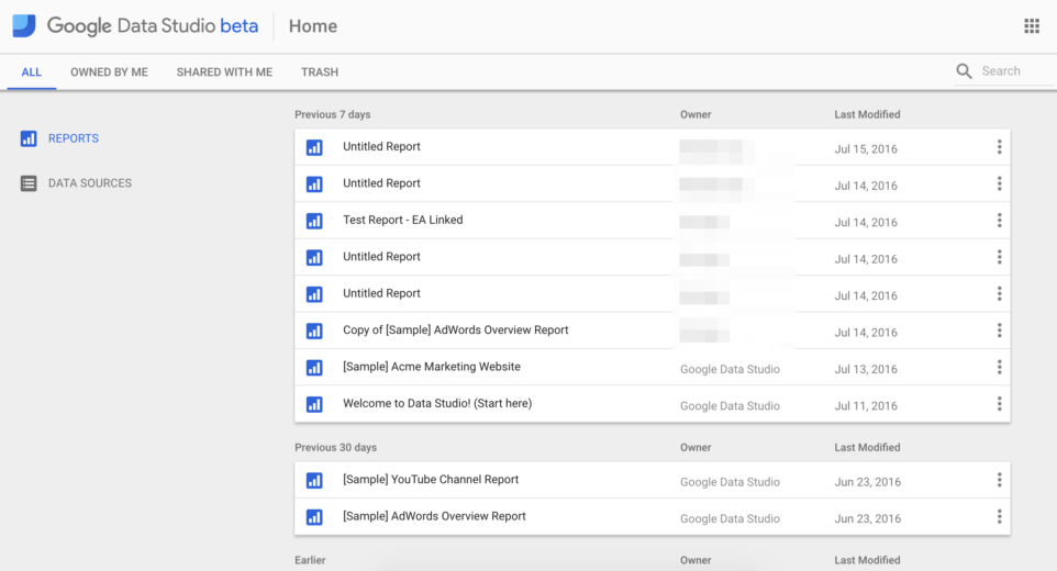
When you log in, you’ll see the following screen:

On the left, you’ll see where you can navigate between Reports and Data Sources – which are exactly what you’d expect, linked sources that Data Studio pulls information from.
If you find yourself needing some reporting inspiration, check out the sample reports that Google provides:
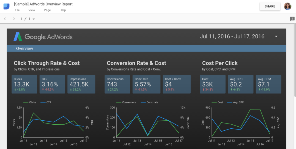
Pretty snazzy, huh?
Adding Data Sources
To add a data source, click the big round blue button in the lower right-hand corner. Then you’ll choose a connector.
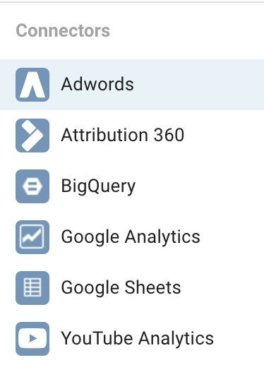
If you are using third-party platforms, the Google Sheets functionality will be handy for you. Simply have that platform export to Google Sheets (if it has the ability) or copy and paste it in there to pull the information into Data Studio.

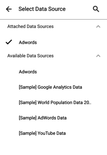
From there you’ll filter through accounts to choose the one you want, and then select a type of report. Note that if you select “Account Performance” you will not have campaign level data. You can, however, add more than one data source to a report. Lucky you.
Once you create the data source, to use it you must add it to a report.
Editing Reports
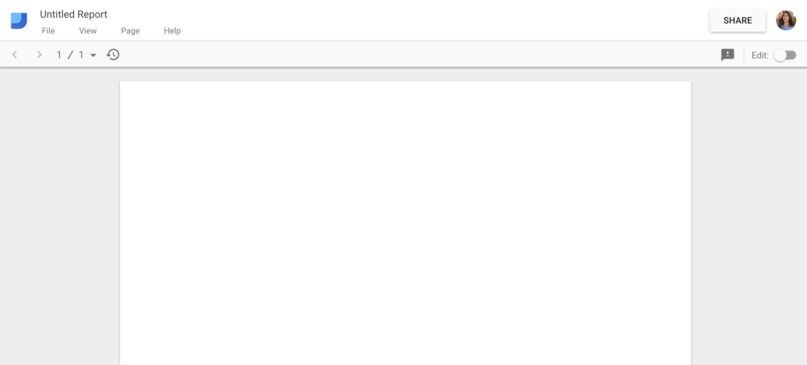
When you open up a new report, this is what you’ll see. Not much to look at, right? Just a simple, white page.
Simply toggle the “Edit” button in the upper right corner, and suddenly a menu of reporting options appears along the top. The white page will now show a grid to help you place and align report elements.
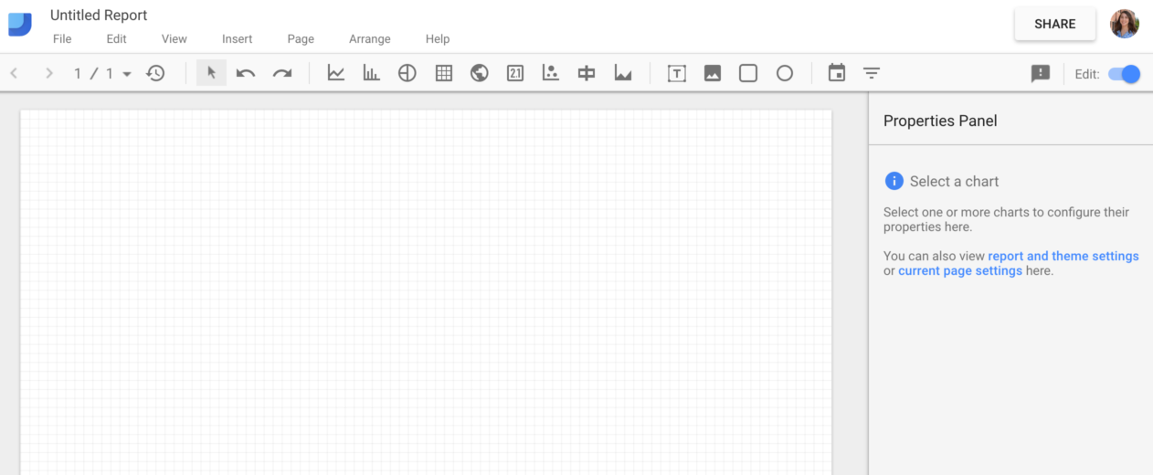
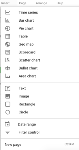
The icons correspond to the type of graph/chart. Click the one that you’d like to add to your report, then click and drag in the body of the report to add. Here’s a snapshot of all the available elements:
Here’s an example of a Time Series graph.
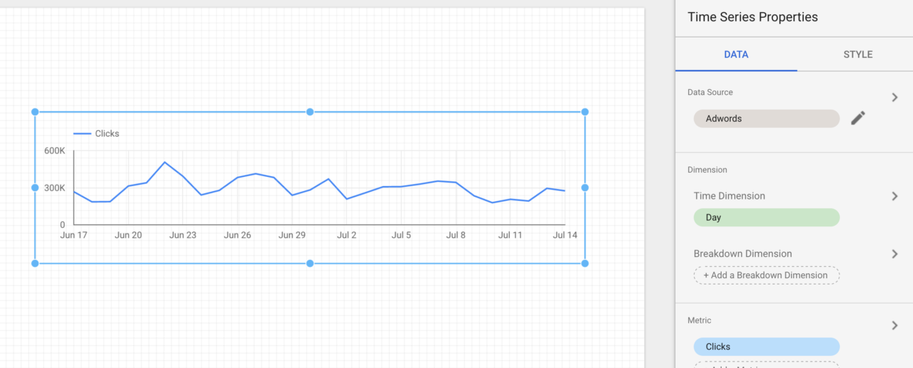
Once you’ve got your graph placed, select the appropriate metrics on the right-hand menu.
You can also add a date selector to your report for the user to choose a date range. This icon looks like a little calendar. It will change the metrics in all report elements that have the date set to “auto.”
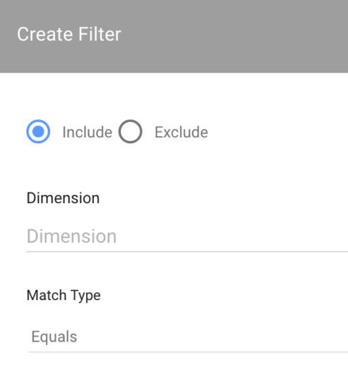
Adding a filter to any report element should feel very familiar if you’re used to working within Analytics:
Creating Custom Metrics
To create a custom metric, such as a calculated field, simply click “Create New Metric” under the Metric Picker. Once you click that, you can create your new metric. As you start to type in metrics, it will autofill for you.

Make sure you check the formatting of the number and set it to currency if needed. Then click “Create Field” and you’re done.
Style And Formatting
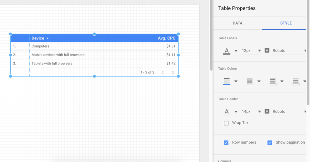
When you have an element of your report selected, click the Style tab on the right-hand menu to change colors, fonts, etc.
Miscellaneous Items
Note that when you add an item to your report, it doesn’t come with a header or a title. You’ll have to manually add in text boxes to title them. While it may be a little extra work, I recommend doing it so it remains clear what exactly you’re showing (example: what campaigns are you showing?).
Overall Thoughts
If you give it the time and energy, Data Studio can create good looking reports.
Pros
- Very customizable
- Integration with Analytics & Google Sheets
- Appealing visuals
Cons
- Some bugs popped up here and there, configuration errors are common
- Can be time-consuming to make pretty (maybe too customizable?)
- Adding data sources isn’t always intuitive
While I did get some errors, this tool is still in beta. In time, I’m guessing Google will work out some of the kinks. If you’ve got a client that needs fresh reporting, or a particular report that you’ve been meaning to put together for some time, try Data Studio.


