
Once again, monthly reporting is upon us. This is our opportunity as digital marketers to show and explain the fruits of our labor. That being said, it’s important to make sure you put the time and effort in making these reports clear, easy to read, and informative. Here are some questions keep in mind when putting together your monthly (or weekly) PPC reports.
1) Would A Person Who Doesn’t Know PPC Understand The Report?
Sure, your client or immediate supervisor might understand PPC, but their boss might not. It’s important to have your reports be straightforward enough that they can be passed on to others and still be understood.
How do you make your report reader friendly? Provide enough explanation! Make sure you explain the report in a digestible way that details what the data means for their business. Instead of just saying that a search query report was performed, explain that by analyzing search queries we are able to make exclusions and additions as necessary to increase the quality of traffic, thus better targeting our audience.
2) Do You Have Enough Data (That The Client Cares About)?
This one relates heavily to the point mentioned above. Are you reporting on things that actually matter to the client? Don’t waste valuable time and space by including a bazillion charts about something the client doesn’t care about (hint: ask them what they would like to see on the report!). On the flip side, if you know a client will want to see numbers about a particular initiative, you better include that somewhere in your report.

3) Are You Representing The Data In The Best Possible Way?
This is a big issue I see in reports. Different types of data require different visual representations. When choosing a type of graph or chart, think about what kind of data you have, and what you are trying to show with visualization. Each chart or graph should have a clear purpose and be easy to read and understand. Avoid super cluttered graphs, but also be sure to include enough data to show the whole story.
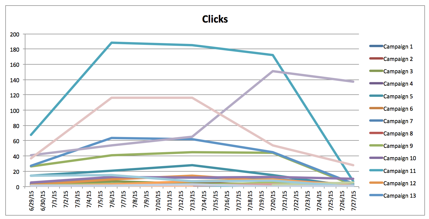
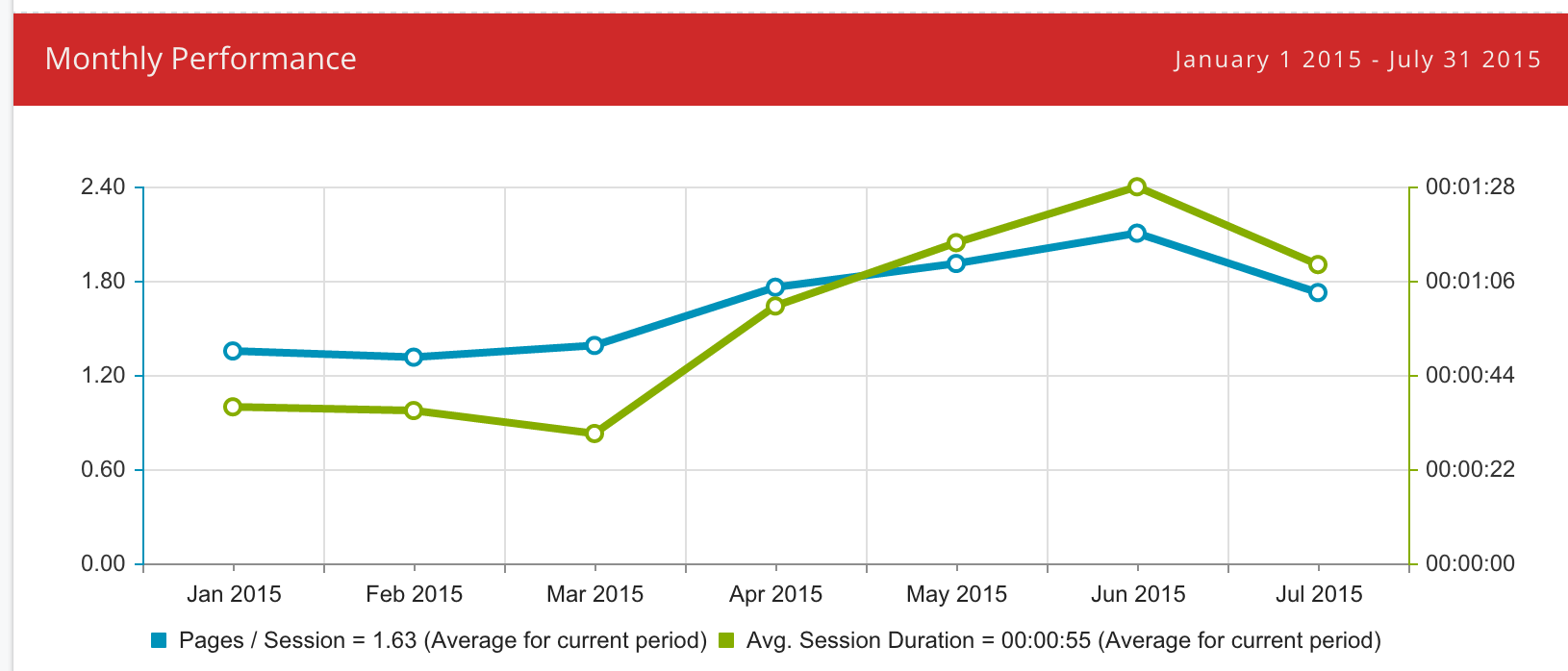
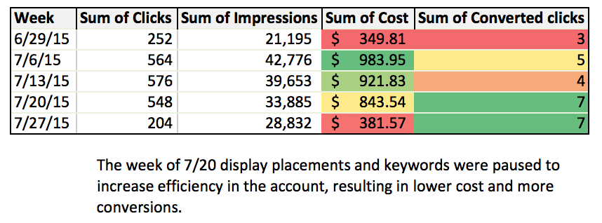
Line graphs are great for showing changes over time while pie charts are great at showing different parts of a whole (think of each campaign’s share of total conversions). Tables are great if you have more than a couple metrics that you want to display, just be sure that the order and layout make the most sense and is easy to read.
4) Do You Provide Enough Explanation?
Lucy, you’ve got some ‘splainin to do. Charts and graphs won’t necessarily mean much or tell the whole story of what happened for that particular time period.
A good summary includes what performance was for the month, how it compares to the previous period, what tasks or initiatives were completed and how they impacted performance, and what the plan is for the next month. Be clear and concise, and, of course, use proper grammar.
5) Do You Avoid Poor Performance?
Poor performance happens. If you don’t address it within the report, it’s only going to raise more questions. Acknowledge the bad, but also provide a plan of action to improve results. This lets the client know that you understand that performance wasn’t ideal, but you’ve put some thought and energy into creating a plan to pick things back up. This provides a great opportunity to create or adjust your strategy for the upcoming month. You know how the saying goes: if you fail to plan, you plan to fail.
6) Does Your Data Backup What You Are Saying (And Vice Versa)?
After you’ve written your summary, it may be a good idea to go back and read it while looking at the data you have in your report. Does the story match up to the numbers? I know, the answer is probably yes, but it’s always a good habit to get into to verify that there are no numbers that conflict with the words you’ve written.
7) Are There Typos, Misspellings, and Errors?
Perhaps the most important part of putting together PPC reports is checking your work. This means proofreading, double checking numbers, proofreading again and having others look it over. Errors have a funny way of sneaking into your reports, and even small ones like an incorrect date or a typo make a big difference in your report.
![]()
Oops! Don’t forget to change the title of this chart!
Having a peer review process in place can really help to catch silly mistakes like this before the report lands in the client’s inbox. Having another set of eyes that isn’t familiar with the account look over the report is also a great way to make sure that it’s easy to understand and there isn’t anything obvious that needs to be addressed (i.e., why did performance drop in this campaign?).
Closing Thoughts
Creating and talking through reports can be stressful, but it doesn’t have to be! As long as you put enough thought into creating the report the first time around, the data you include within the tables, charts, graphs, etc., should make it easy to update summaries and key takeaways. Your summaries and interpretation should be supported neatly by the data, with no more or less than is needed (think goldilocks and the three bears, find what works just right!).
