My Experience With Landing Page Best Practices And The Failures That Ensued

Hopefully, you’re well aware that taking best practices with a grain of salt is a best practice in and of itself. Best practices are great guidelines, right? But that’s it. They’re guidelines. Best practices are not absolute. They don’t always work in every situation. And this is why we (join me in this one, let’s say it audibly) always test everything.
But if you are not of this mind or if you honestly believe that everything you change on a landing page does not need to be tested first then please, please read on.
Today, I’m going to show you why implementing best practices into your landing page instead of testing them first could be a great way to figuratively shoot yourself in the foot. How do I know this? It’s great that you asked! Because I’ve tested best practices and many of them have failed. Failed! They have lost in A/B tests with varying degrees of “loss” ranging from “Oh that’s not so bad” to “Ouch. I’m sorry conversion rate. We can learn from this.”
Failure #1 “Secure” Checkout
Best Practice
Users want to feel secure when they’re checking out and essentially handing their card information over to the waiting arms of the Internet. There are many ways we can allude to security using any page in the checkout process.
What Happened
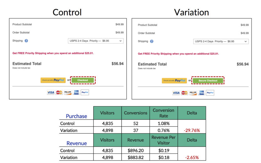
In this specific instance, we chose to alter the call-to-action copy on the cart page of a large ecommerce client from “Checkout” to “Secure Checkout” as pictured below.

Adding the word “Secure” to our CTA dropped both purchase volume and revenue. Thankfully, the drop in purchases was deeper than the drop in revenue, but drops are no fun.
[bctt tweet=”Best practices are not absolute. They don’t always work in every situation.” username=”katewilcoxppc”]
At approximately the same time, while this “secure” language was failing for one client it was succeeding for another client. Specifically, it was raising our conversion rate by about 6.79% with statistical significance.
Why?
There are a multitude of reasons why this specific attempt to allude more security to our users failed for one client and succeeded for another. One big insight that we pulled from this test was that the failing brand was well established and the users entered the site already trusted the checkout process. Thus, drawing attention to an element of the site and brand that was already present could have caused users to stop and think about security, if only for a second. Stopping and thinking really isn’t what we want our users to be doing because in most cases thinking = friction. The succeeding client wasn’t as established and the secure language most likely gave users a needed security nudge.
Failure #2 Prevalent Benefits
Best practice
Benefits should be present nearly everywhere on your site. Users should be aware of why you’re awesome and why they should choose you. Placing these benefits throughout the site enables repetition and can also enable smoother memory recall.
What Happened
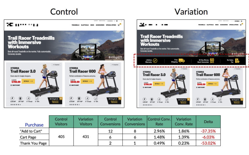
We decided to test a newly created banner of benefits on the category pages of an ecommerce client. Note that there was no mention of benefits on this page until we started testing the banner. I will caution that this test is currently running with approximately 4 days of data. However, the data jumped out of the gate negatively and continues to do so.
As you can see below, the numbers are low but there is consistent dislike throughout the purchasing funnel alluding that users don’t need or want that banner of benefits.

Why?
The category pages of this site are packed with all sorts of information and the addition of another element may cause it to compete with the details of each of the products. This addition causes a disjunction in not only user scanning path, but also mindset and intention. A user clicks on a category page and wants to see the products, not the benefits. The benefits presented in this fashion may not be subtle enough.
Failure #3 Single Intention Form
Best Practice
Each conversion option should solely be focused on itself. You don’t necessarily want to place multiple, unique CTAs right next to each other because they have the potential to compete and nullify each other.
What Happened
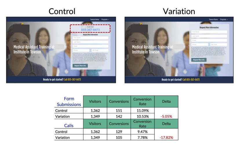
This client has two main conversion options that are both important: calls and form submissions. On their landing pages, their form is capped with a click-to-call CTA. So these two conversion options are competing with each other at this spot on the page. We tested removing the click-to-call CTA in order to focus the attention of the form onto the form. There is another click-to-call CTA in a banner immediately below the hero image so we didn’t feel as though this action would detriment our call conversions.

Needless to say, we decreased both types of conversions. That’s right. We decreased calls and form submissions. Here’s the really interesting part, though. We decreased the number of form submissions significantly on desktop. Yes. Desktop. We know that mobile users are more likely to convert via the click-to-call option. However, we did not know that the click-to-call option also influenced form submissions for desktop users. The more you know, right?
Why?
While our desktop users aren’t primarily converting by calling, a significant amount of users find the click-to-call CTA on the form necessary in order to convert. This could be because the phone number carries a weight of personalization – the assumption that as a user they can call and talk to a real human being. Because this client is an educational institution that is not incredibly popular or well-known, they benefit from personalization and bringing humanity to their brand. It drives away any “scammy” feelings. This click-to-call CTA was most likely acting as a nudge right next to the form driving users into the form submission conversion.
What We’ve Learned Today
I am in no way shape or form telling you to toss out everything you know about best practices and go put yourself in a corner because everything is a lie. Frankly, we’ve had many tests that stem from best practices and win. I am, however, vehemently telling you to test everything. I mean it.
[bctt tweet=”Just know that best practices will never be a guarantee for a conversion rate lift.” username=”katewilcoxkcco”]
You can deeply dive into your users’ brains and understand their behaviors and desires on an incredibly intuitive level, but you will never be able to consistently predict their behaviors. This little nuance is what makes humans. We have the power to choose and sometimes (most of the time) our choices are not logical.
The bottom line is that best practices are quite frankly guidelines. They are a great way to build a foundation for a test. Just know that best practices will never be a guarantee for a conversion rate lift.
Now go out into the digital world and learn about your users and their little hearts’ desires and remember to test everything. Everything.


