
As we move into a new month, the joy of end-of-month reporting is still fresh in my mind. Each report is its own animal with varying platforms, date ranges, charts, metrics, you name it. However, the common denominator that I think we can all agree on is that each report takes time. Whether it is daily, weekly, monthly, quarterly, etc., reporting takes time out of other opportunities where we could be strategizing or optimizing. Despite the obvious downsides, it is still a necessity, especially if there are other stakeholders on the account.
With the realization of this time-consuming necessity, shouldn’t we all be open to opportunities that could save time and add efficiency to reporting? If you answered yes to that question, great…Enter Google Analytics Custom Dashboards.
GA Dashboards are often one of the most overlooked features within the GA. At first look, they do seem like added fluff to the interface and a little underwhelming. However, with a few tips, I can defend why the case is the exact opposite.
GA Dashboards > GA Custom Reports
First and foremost, yes that is a situational statement laced with a little bit of subjectivity. It is important to keep in mind that my examples are only the surface of options available in GA Dashboards and mainly focus on examples of what I use in some of the accounts in which I work. But, before you bash the dashboard and hop on the custom report train, hear me out.
One of the main reasons I quit using custom reports was because there is no easy way to have different filters per each report tab. You essentially have two options:
- stick with one filter for all tabs, or
- adjust the audience segments each time you want to look at the metrics under a different lens.
With dashboards, you can have multiple widgets of data, all with their own unique filters. The filter limitation also makes it hard to share custom reports with your team, clients, etc. A PDF of a custom report would only be under one lens, whereas a PDF of Custom Dashboard would have multiple widgets, each with its own filter.
Aside from the filtering havoc, GA dashboards are easier to use in general (see some instructions below). Plus, I find them more aesthetically appealing. Easier to use, better to look at, less tedious to create and share – all good things. Essentially, it is a finely-tuned report of the GA metrics you need, all in one place. But, that’s a pretty broad defense, so I’ll highlight some specifics.
Creating The Dashboard
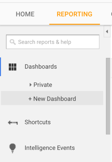
To navigate to the Dashboard option, simply find the top left of the menu bar once you’re in the “Reporting” tab view. From there, select “Dashboards” and hit “+ New Dashboard.”
Once you have created and named your new dashboard, the next step is choosing either a “Blank Canvas” or a “Starter Dashboard.” I prefer the “Blank Canvas” because it allows me to specifically call out what I care about, in the layout that I desire. However, the “Starter Dashboard” does offer some good insights and can be a good reference for practice or just starting out.
Creating A Widget
Assuming you choose to take the “Blank Canvas” route, the next step is creating a widget. After selecting the “+ Add Widget” button, you will be presented with these options:
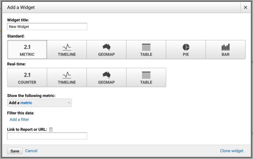
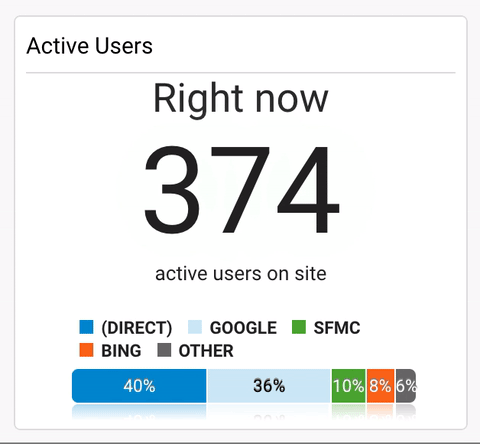
From here, you can go as simple as “Revenue = x” or as far as a bar chart that breaks down revenue by its source. While key static metrics like revenue, cost, clicks, etc., are important, the dashboard also offers real-time features that can be beneficial when analyzing your site. The difference is choosing between “Standard” and “Real-Time.” For example, this widget looks at current people on your site and provides their source:
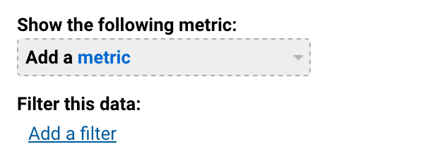
After choosing between the standard or real-time options you have to add a metric. Essentially this can be any metric or insight that you can find within GA. You can then choose to filter the data, which shapes how you look at the metric. For instance, I could select revenue as my metric. If I chose not to use a filter, it would show overall revenue from all sources. However, I could choose to filter by “Source/Medium containing Google” which would show me Google revenue. Or I could filter by “Campaign containing Shopping” to only look at revenue from shopping campaigns. Again, it all comes down to what you want on your dashboard.
The options are nearly limitless based on what you have synced to your GA account. With my reports, I am able to pull almost everything into one or two dashboards. Whether you use the actual dashboard or not for the final report, it is a huge time saver. You can have most of the data you need for reporting at one click of a button.
Dashboard Segments vs Widget Filters
In this case, segments and filters are used interchangeably. What separates them is how they are implemented. You can find the segments at the top of the dashboard. These segments will be consistent with the segments you have available throughout the rest of the GA interface.

These can be good if you have a broad range of metrics like Revenue, transactions, clicks, etc., and wanted to look at them through different scopes like paid, desktop, or mobile, for example. Also, the segments can be customized. For example, you could create a segment for an audience that took a certain action on your site, but did not fill out a form. However, a widget filter would allow you to look at all of these things simultaneously. For example, right when I click on my dashboard I can have a widget for Desktop Revenue, one for Mobile Revenue, one for Google Revenue, and beyond. With Segments, I would have to constantly select a new segment to get the different revenue numbers. Again, you can find the widget filters once you elect to create a widget:
Long story short: Dashboard Segments are better for looking a group of metrics under the same lens, whereas Widget Filters are better for looking at a smaller set of metrics, under multiple lenses.
Sharing/Automating
If there is one piece to GA dashboards that is the most underutilized, it is the ability to share and automate. Not only can you reap the benefits of custom dashboards, but your team and/or clients can as well. All of these options can be found near the top next to the option to add a widget.

There are three options under “Share.” You can share an object (which is essentially sharing a widget), you can share a link to the dashboard, and you can share the dashboard publicly. Sharing publicly means the template of your dashboard would be an option for other GA users to use on their accounts (your account information and data would not be shared).
The “Email” option is what it sounds like. Simply click “Email” and you can send a PDF of the dashboard to anyone, with a custom message. Exporting will create a downloadable PDF of the dashboard.
There are two ways to look at automation and dashboards. For one, if it is set up correctly, your report will automatically be there for you whenever you navigate to the dashboard. One of the accounts I work on has 90% of everything I need all on dashboards. Since moving to this system, I have shaved about 45 minutes off of that report. The other side of automating comes back to emailing. Within the email option, you can choose from a frequency drop down. It gives you the option to send the report once, daily, weekly, monthly, or quarterly.
For the accounts I work on I use the automated email to send me updates of KPIs from the previous day. It adds an extra line of defense to help me catch any red flags. However, if you are lucky enough to get all of your report onto one dashboard, you could even automate sending your report out. While I do not recommend full automation, a report that generates and sends itself is cool to think about.
Final Thoughts
I highly encourage you to try out Custom Dashboards in your accounts. Play around with creating widgets and discover what custom, insightful metrics you come up with. Set up automated reports to help keep a tab on KPIs. They can be as simple or as complicated as you want them to be. Whether used as a daily checkup, a piece of reporting, or an all-out report that is automatically sent on a weekly basis, Custom Dashboards can offer time-saving efficiency to any account.
